Design Tide 2012
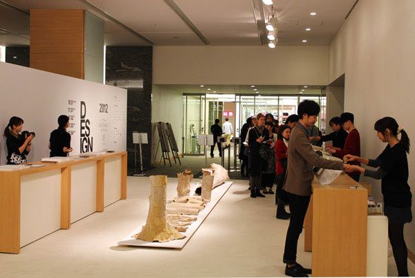
This year Design Tide returned to Tokyo Midtown Hall in Akasaka, Minato-ku. It’s smaller than Tokyo Designers Week, and I think more focussed. Both events run at about the same time, and their promotional aims are roughly the same—so I’m working on the inevitable comparison… which should be the next post.
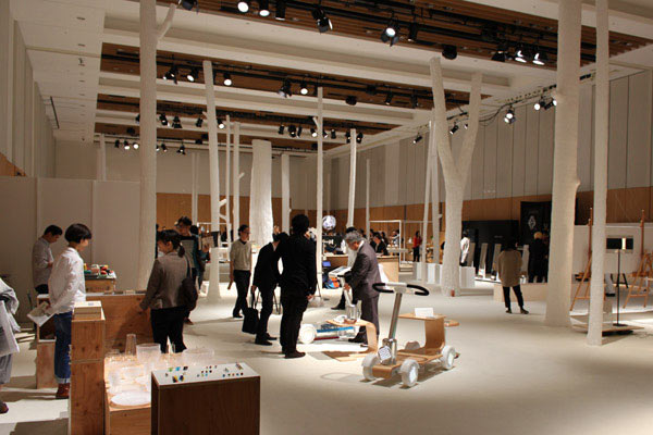
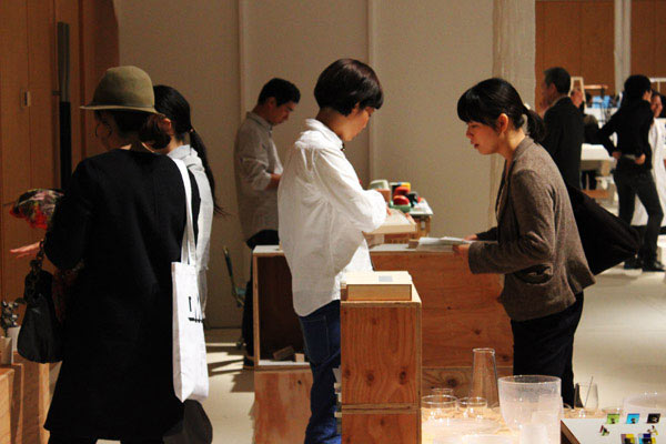
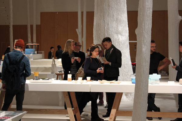
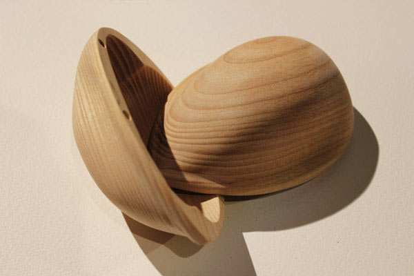
Above and below:
Prototype objects by Foodwork, a group of 8 Norwegian designers.
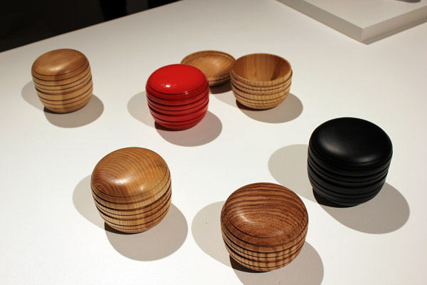
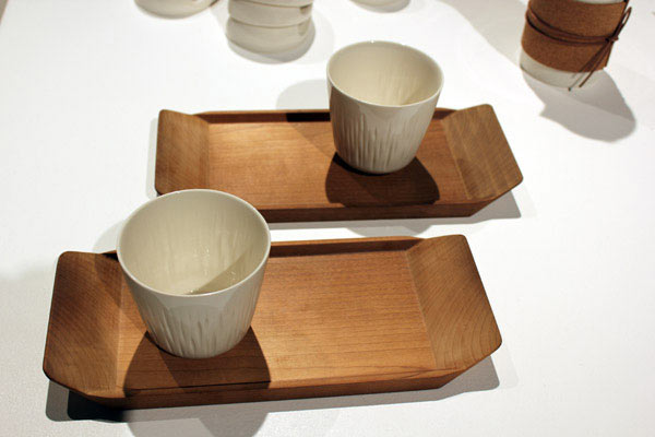
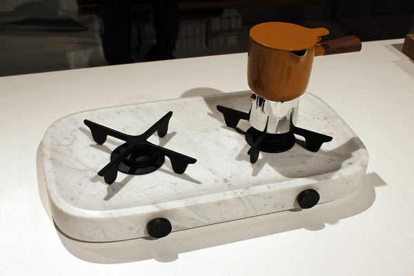
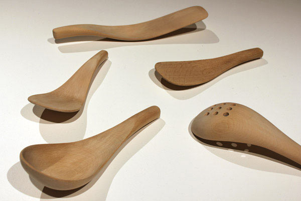
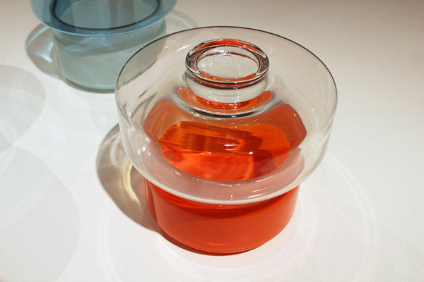
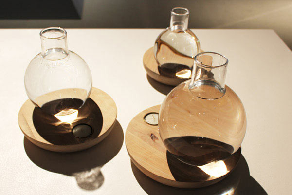
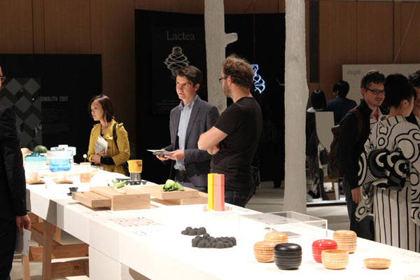
Foodwork’s table.
x
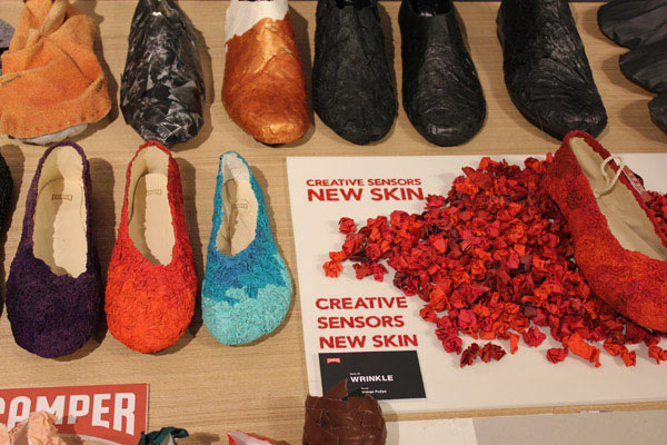
Above and below:
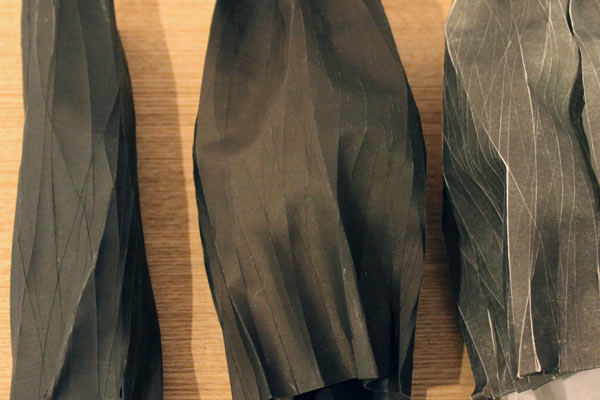
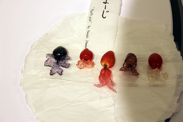
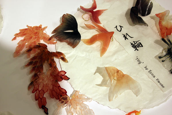
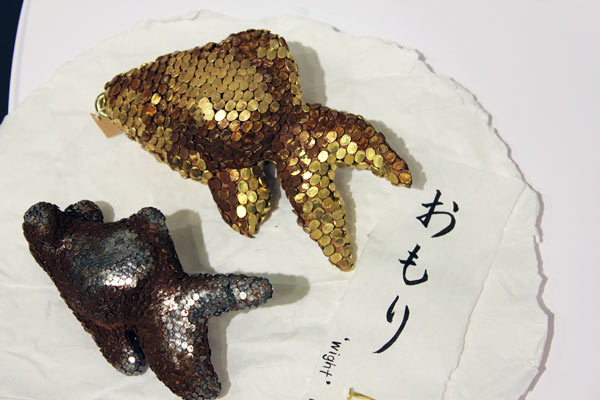
Student works.
x
Above and below:
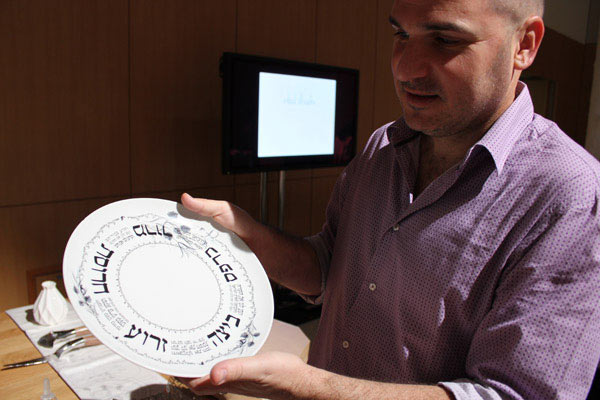
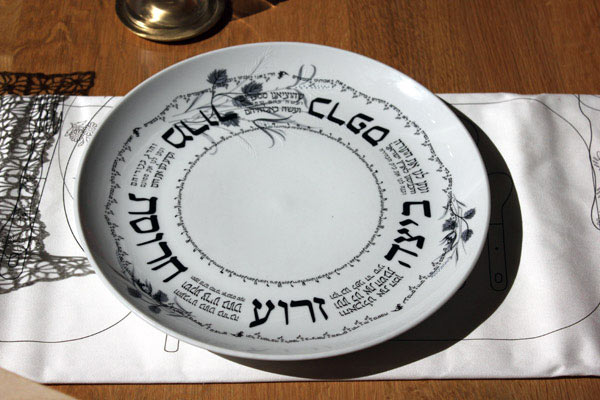
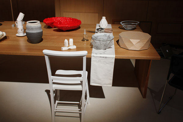
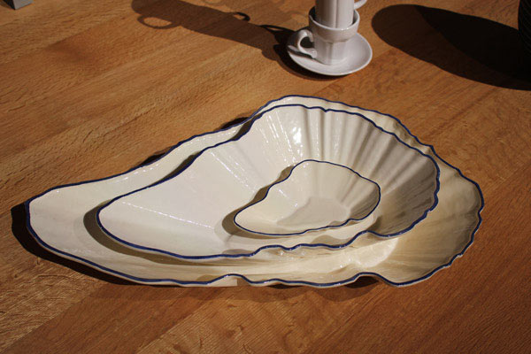
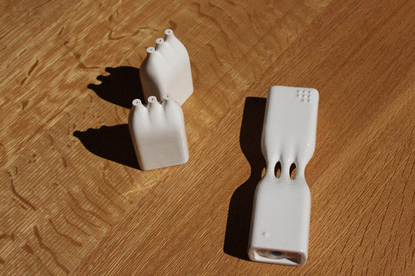
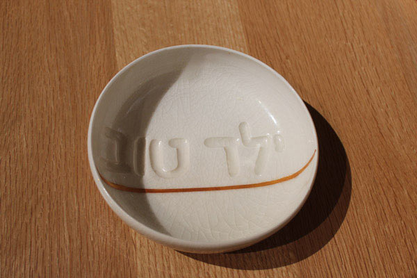
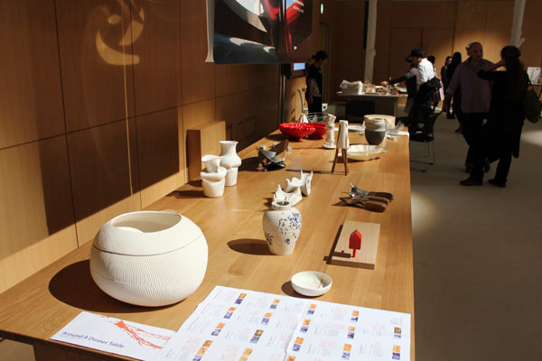
Around a dinner table
Works by Israeli designers and artists based on the Jewish Friday meal and curated by Design Museum Holon.
(Above: Tomer Spector from Design Museum Holon)
x
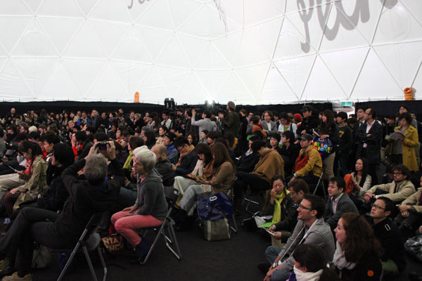
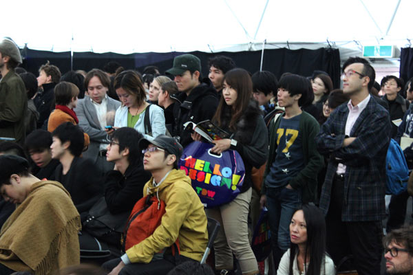
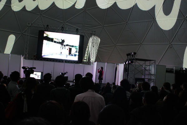
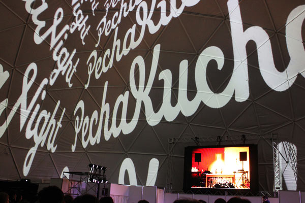
Pecha Kucha at Tokyo Designers Week
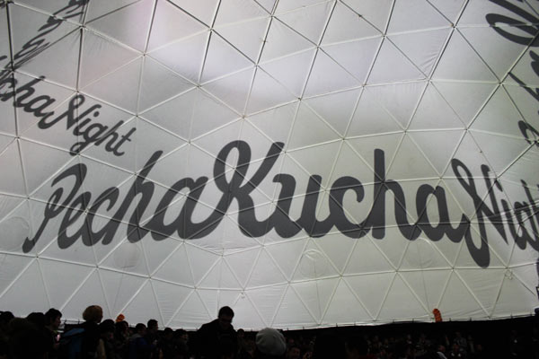
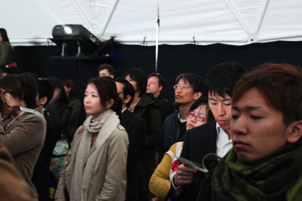
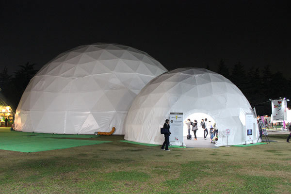
The 20 slides x 20-seconds-a-slide show and tell format for designers, artists and anyone with something to say began at Tokyo’s Super Deluxe, the bar/club/live venue that’s ‘open most nights for thinking and drinking’. Now it happens in about 500 places around the world. In October one was held in a bubble structure at TDW.
x
Tokyo Designers’ Week 2012
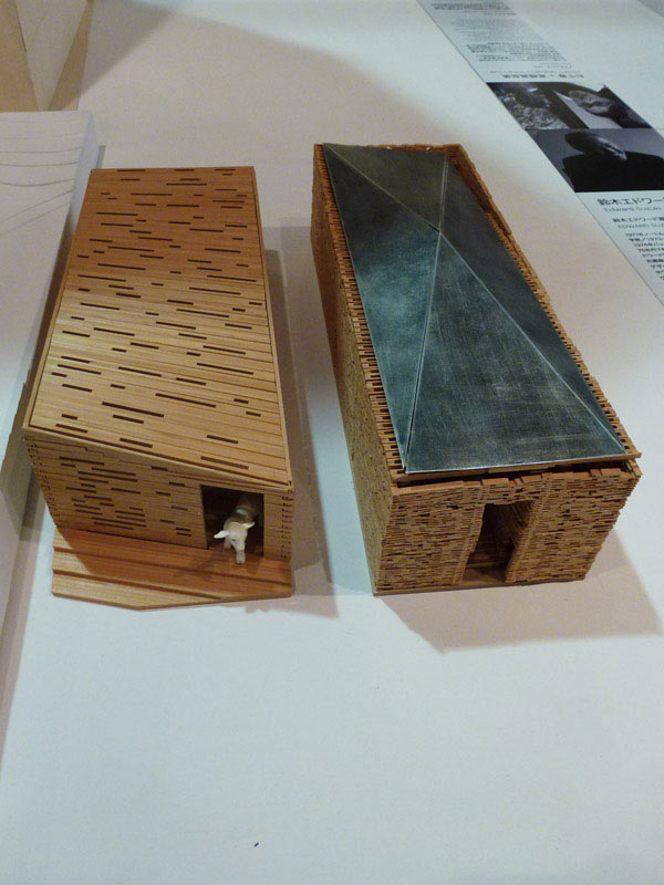
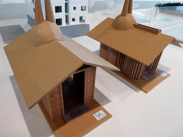
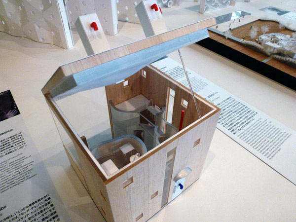
Tokyo Designers’ Week 2012 was at Meiji Jingu Gaien in Aoyama. The themes house and play were explored over a range of events and exhibitions. Highlights, for me, were (just) a few pieces in the professional exhibition, an exhibition of often exquisitely beautiful architectural models and an exhibition of design and artworks inspired by the Edo period painter, Ito Jakucho.
From the professional exhibition
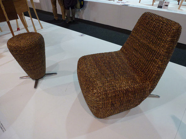
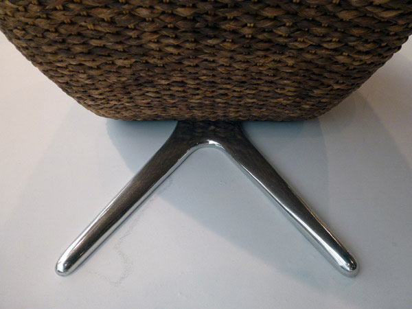
Hotei Chair and Otei Stool
Toshiyuki Kita
IDK Design Laboratory
Kita worked with a Thai producer using water hyacinth: the aquatic plant that infests many rivers and lakes around the world.
x
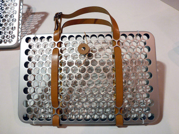
Laptop computer carrying bag
Hikaru Yamaguchi
Cultural and creative arts, Yamaguchi Prefectural University
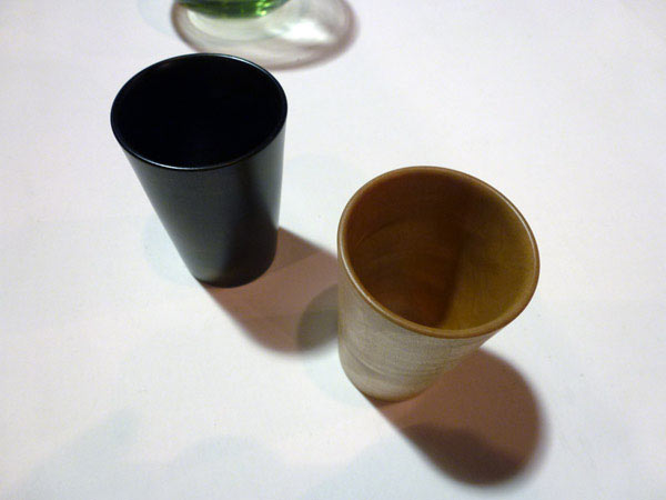
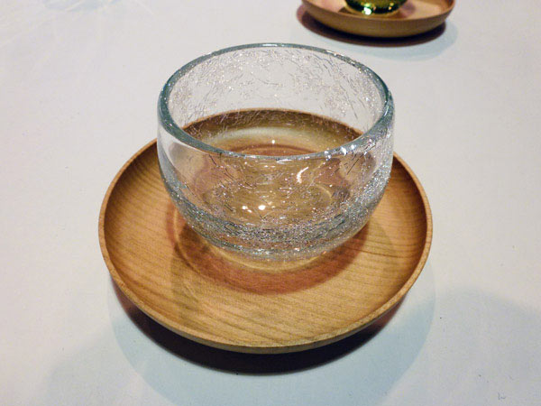
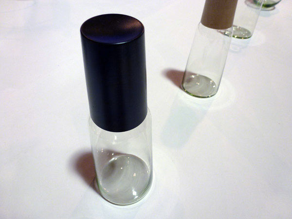
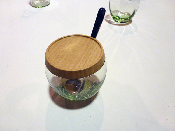
From the exhibition object label: The bag ‘utilises the same hand-made aluminium sheet metal technology as that used to manufacture the Shinkansen bullet train. The Hagi glass [below] is hand-blown hard glass made with melted quartz basalt produced from the volcano in Hagi.’
The combination of timber and glass and the way they are finished is particularly beautiful.
x
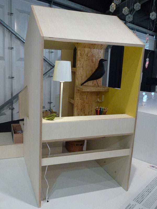
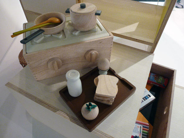
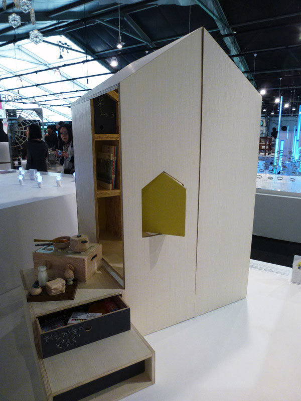
Kids’ Nest
Kaori Shikichi
Kaori Shikichi Architect Office
Prototype desk and chair for children with a half tatami mat footprint.
x
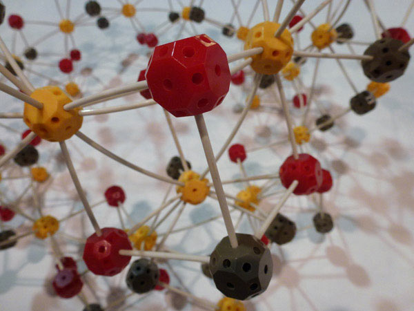
From the models exhibition
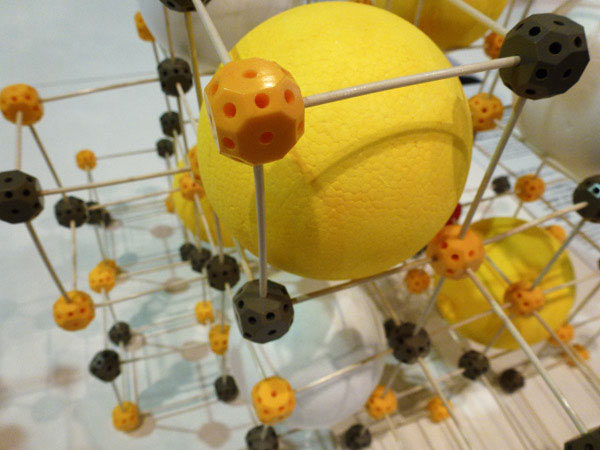
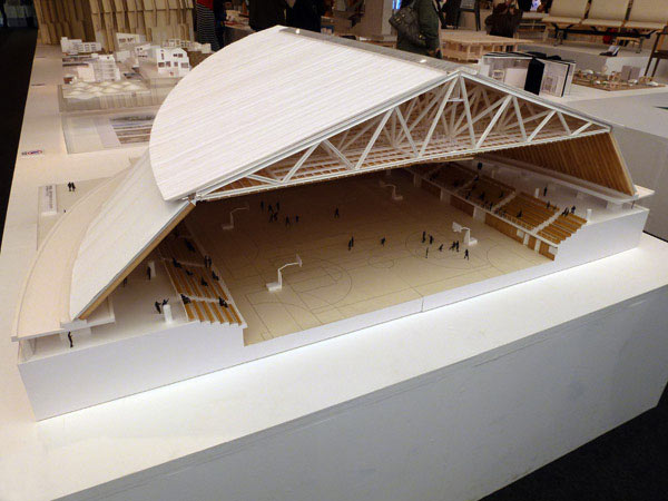
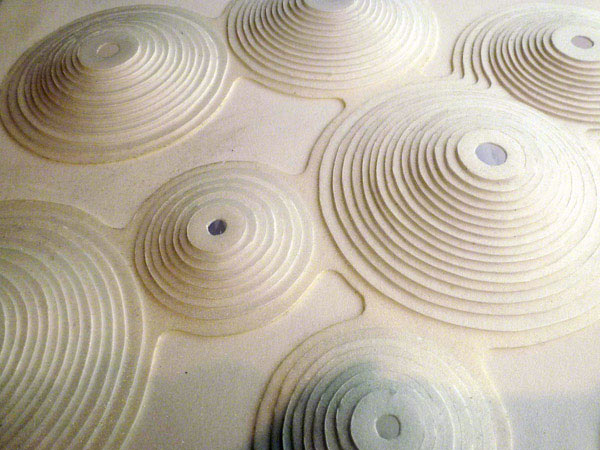
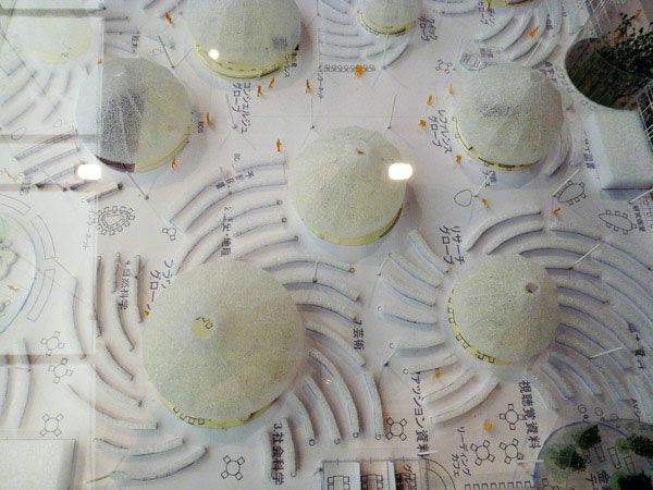
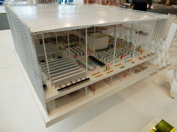
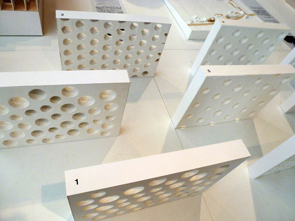
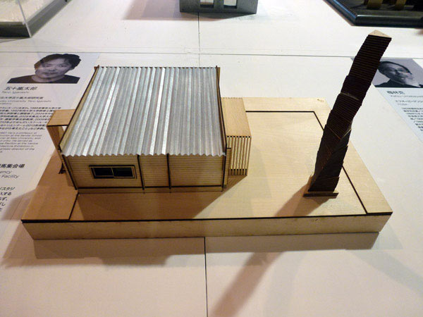
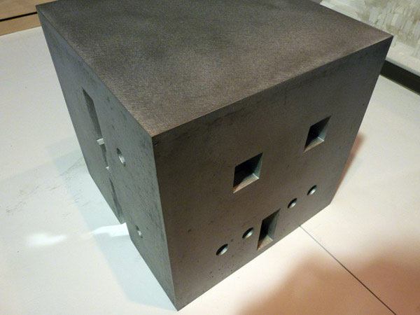
x
From the Ito Jakuchu inspired exhibition
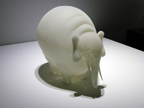
Soul Mosaic
Yukio Hashimoto
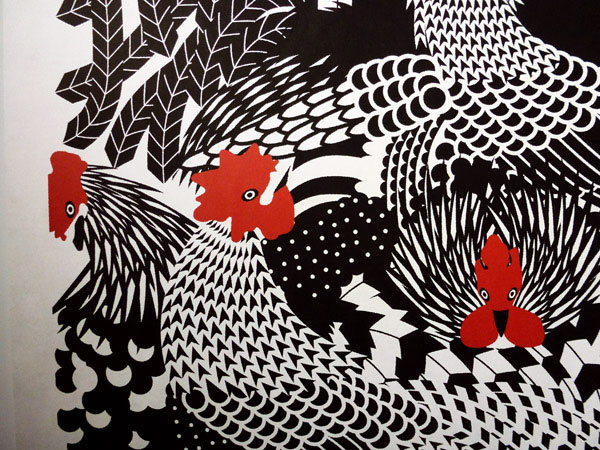
The combination of colours and form and patterns
Masaaki Hiromura
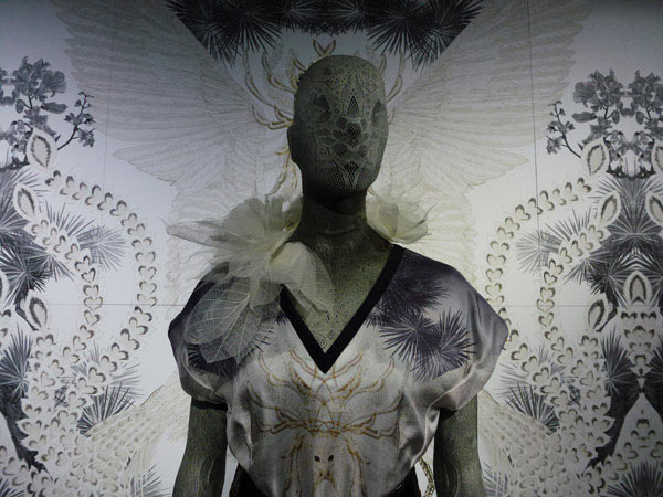
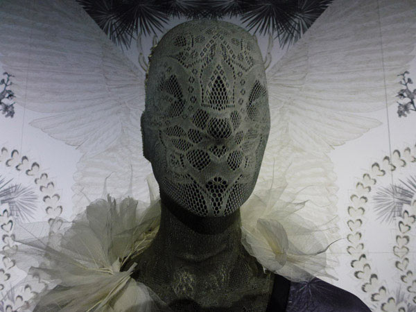
White Phoenix
Tamae Hirokawa
x
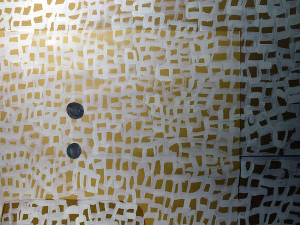
An image becomes energy
Katsuhiko Hibino
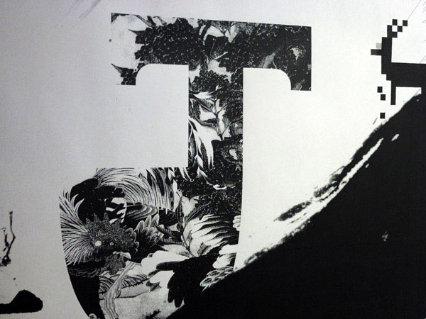
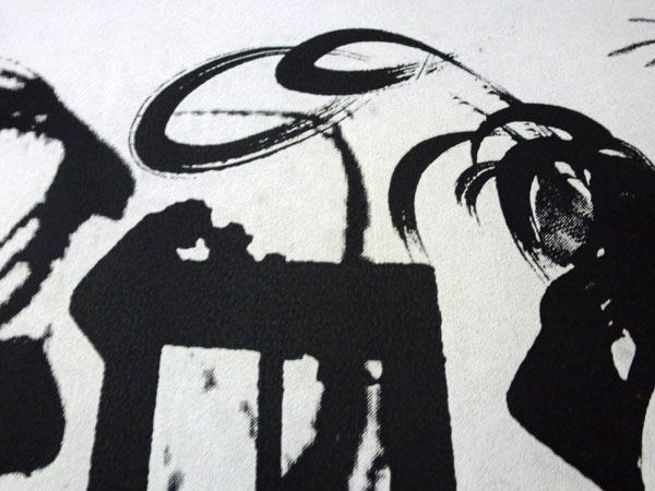
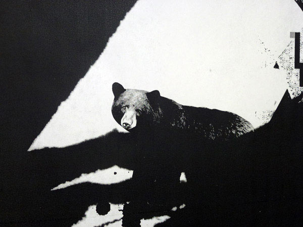
Jakuchu 2012
Kenjiro Sano
x
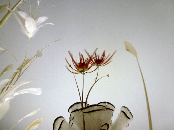
Lifelog_mobile
Kosei Komatsu
x
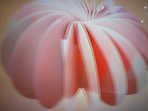
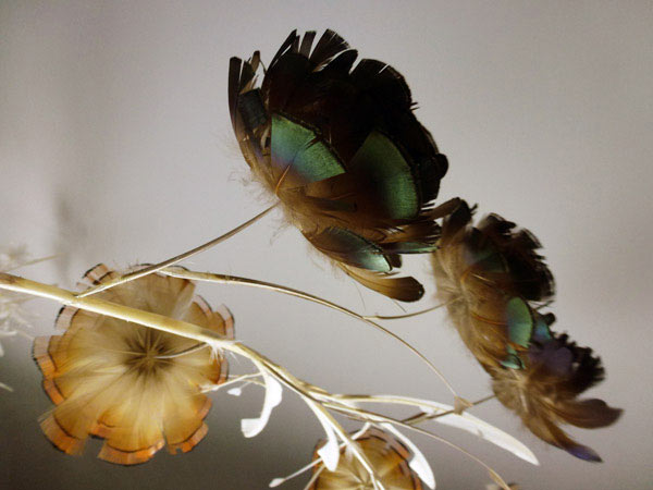
Red&Black&White: 2D<->3D
(film)
Kazuma Morino
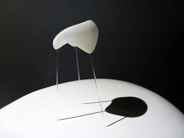
The Shinki of Chairs
Zhang Ke
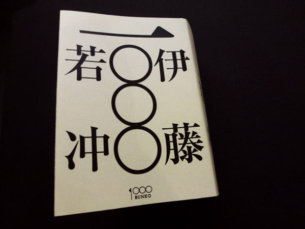
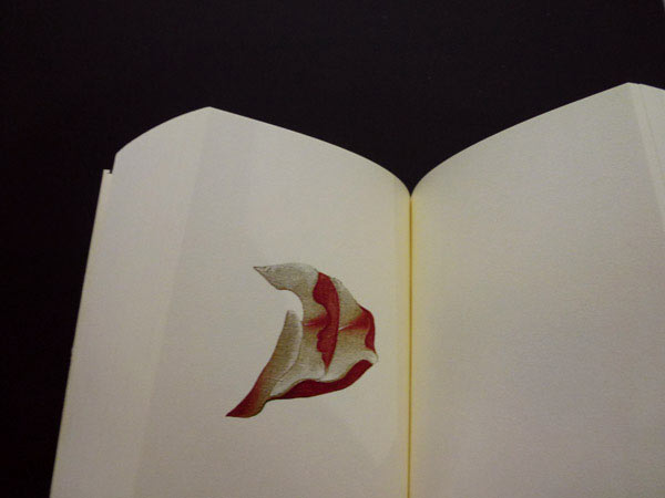
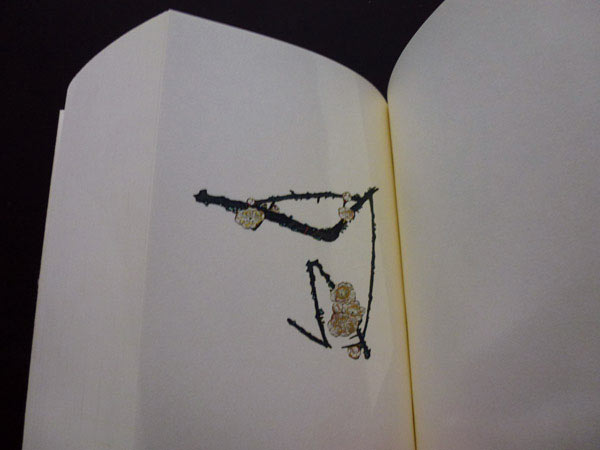
1000 Jakuchu Ito
(book)
Gento
x
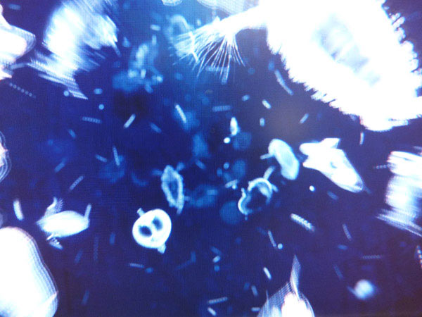
Transmission
(film)
WOW Inc
x
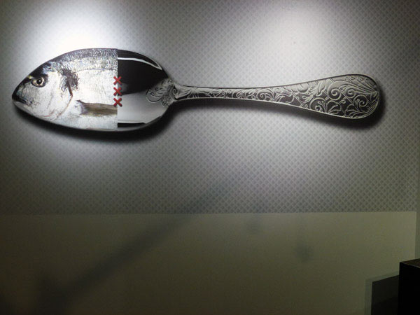
Connecting Polarity for Andaz Amsterdam
Marcel Wanders
Lubok revisited
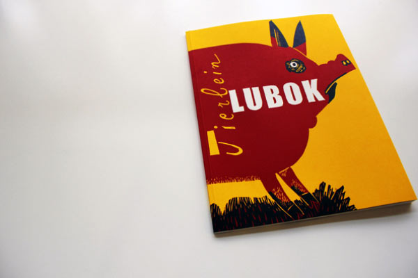
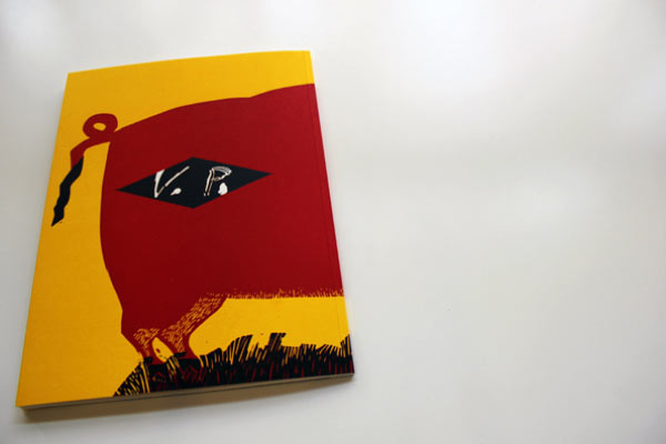
Tierlein
Volker Pfüller
Named as one of the most beautiful German books, 2009, by Stiftung Buchkunst.
Printed as tricolour linocuts.
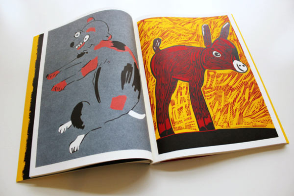
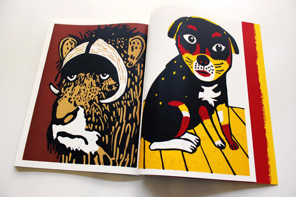
x
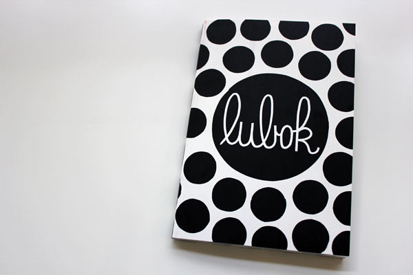
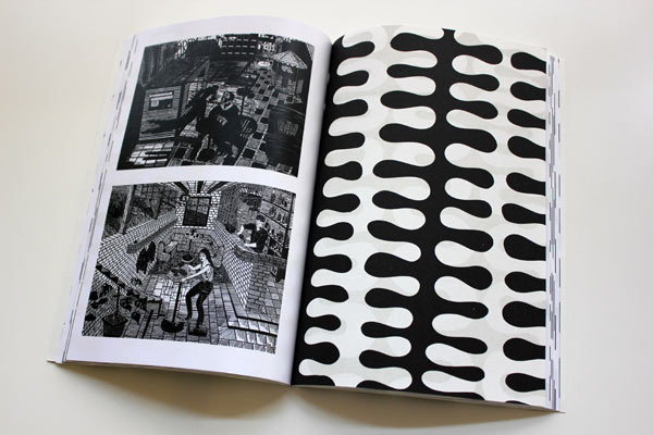
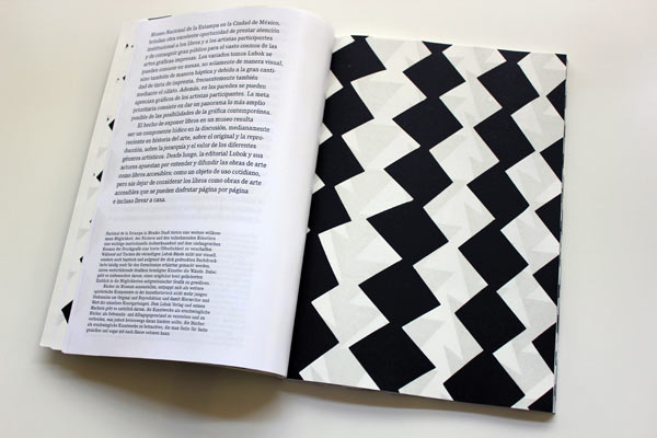
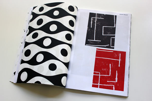
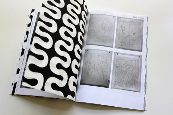
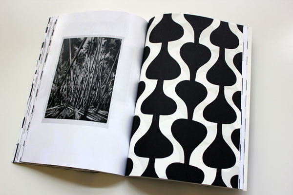
Lubok in Mexiko
Various artists
Released at the same named exhibition at Museo National de la Estampa, Mexico City, 2012.
Designed by Andrej Loll.
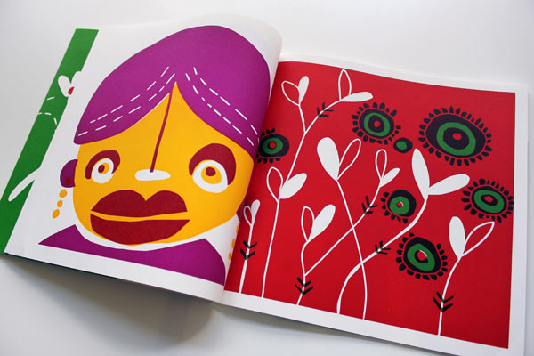
Four colour offset with black and white linocut-printed pages. I particularly like this juxtaposition.
x
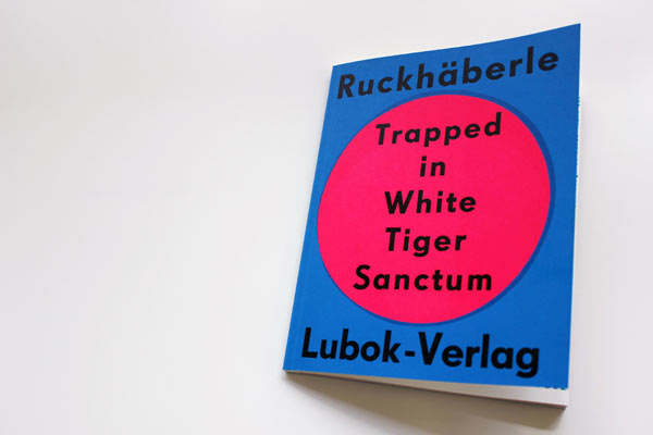
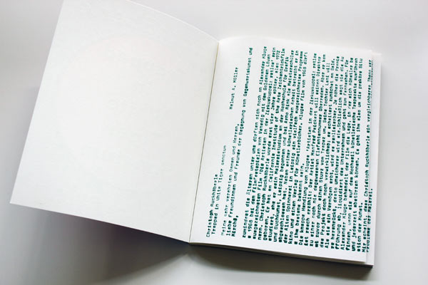
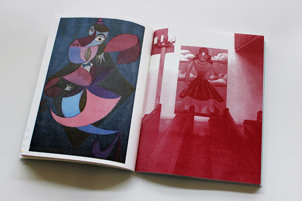
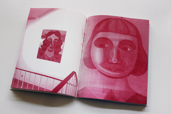
Trapped in White Tiger Sanctum
Christoph Ruckhäberle
Text by Helmut A Müller.
Released in association with the same named exhibition, Hospitalhof, Stuttgart, 2010.
Printed from polymer plates.
x
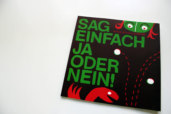
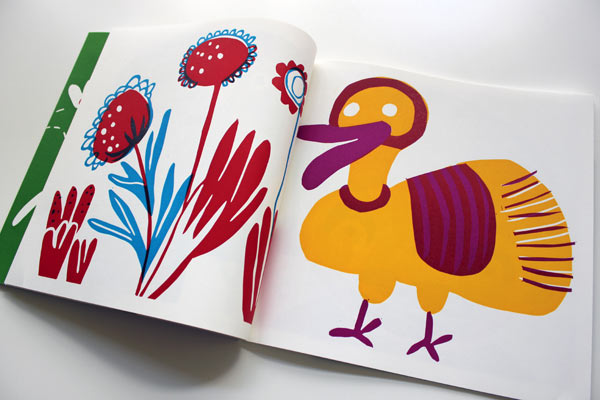
Sag einfach Ja oder Nein!
Katja Schwalenberg
Printed as linocuts, 2009.
x
Kombi
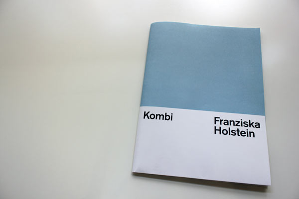
Franziska Holstein
Released with the same named solo show, Galerie Christian Ehrentraut, Berlin, 2012.
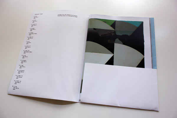
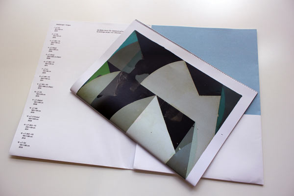
Printed offset. Folded sheets held by an elastic band.
x
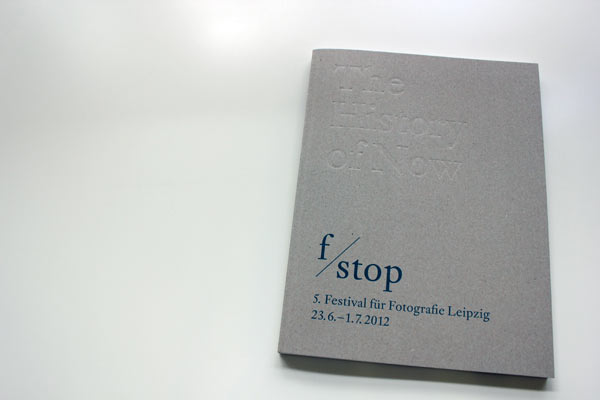
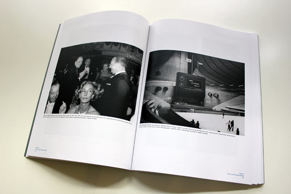
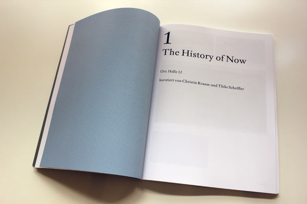
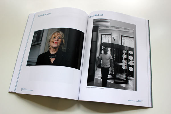
f/stop – The History of Now
Catalogue for the 5th f/stop Festival for Photography, Leipzig, 2012.
Designed by IG Grafik / Altevers / Detlefson / Fiedler / Koehn, Berlin with texts by Stephanie Siegel, Christin Krause, Thilo Scheffler, a.o.
Four colour offset.
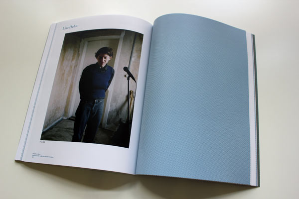
x
Lubok Verlag
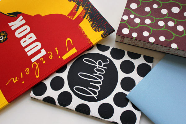
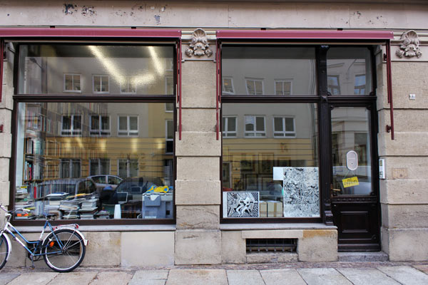
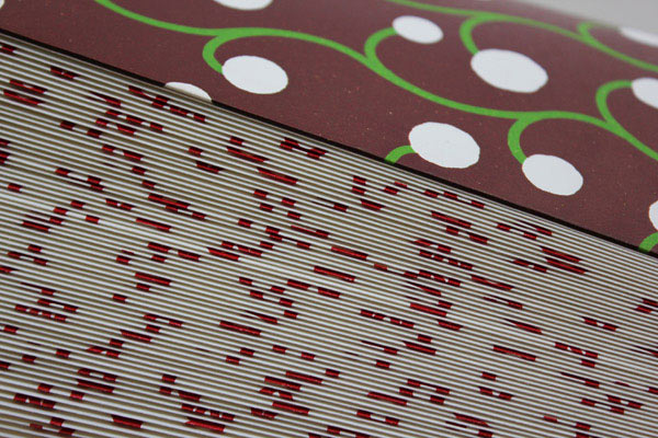
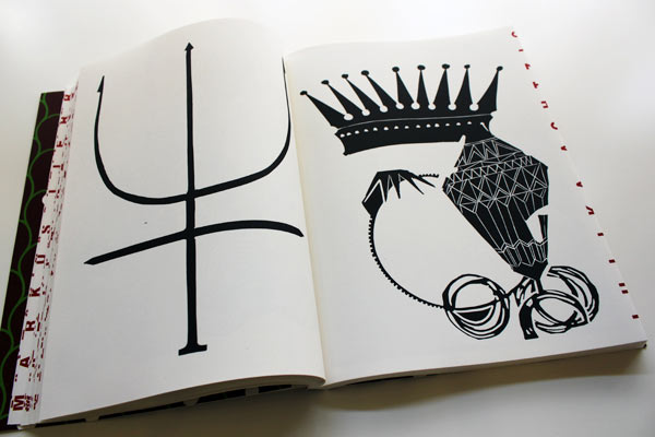
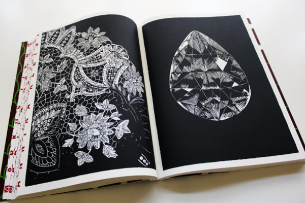
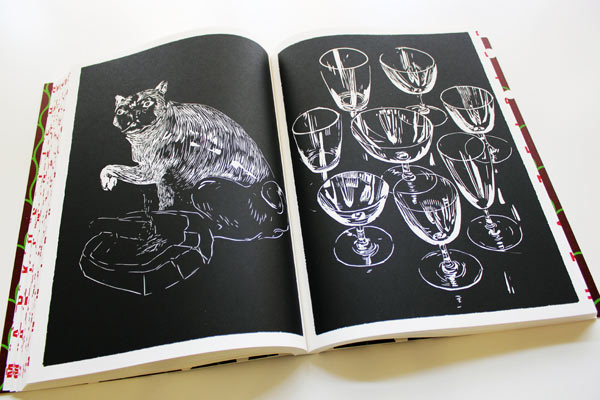
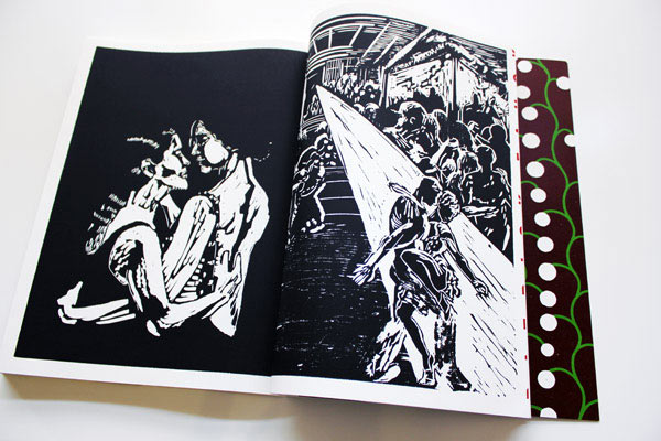
Lubok is an independent Leipzig publisher of (mainly) artists’ books. Particularly beautiful — in look, feel, even their smell — is their series of original linocut books printed by Thomas Siemon of the print workshop, carpe plumbum.
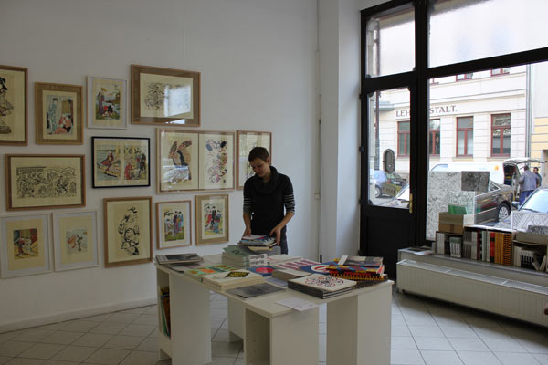
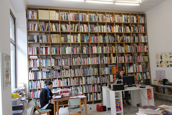
Henriette Weber at Lubok Verlag’s office in Leipzig.
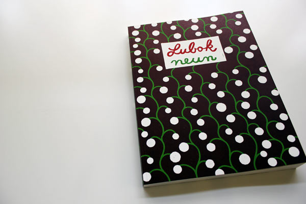
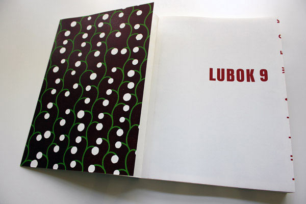
Lubok 9
Christoph Ruckhäberle (Ed)
Linocuts by painting students at the Academy of Visual Arts, Leipzig, 2010.
Printed from the original linocut plates by Thomas Siemon on a Präsident-cylinder letterpress.

x
Miss Read and abc
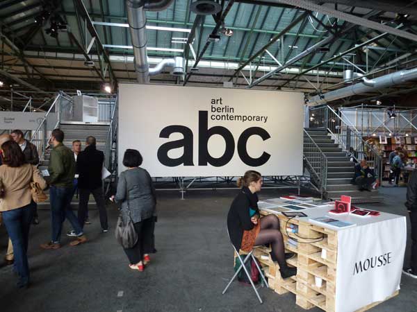
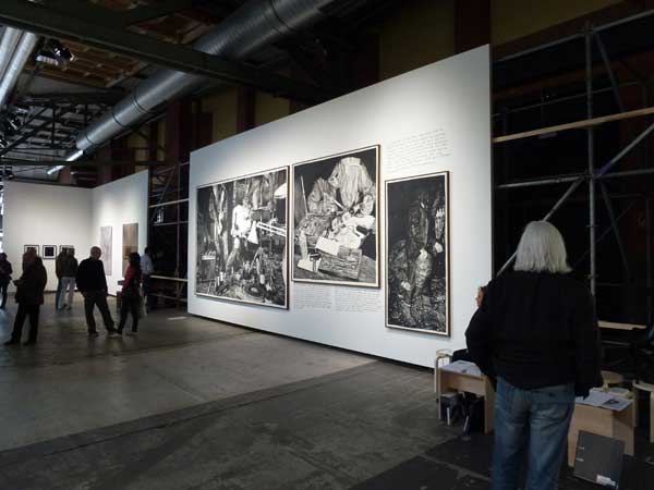
Arrived in Berlin on 15 September at the end of Berlin Art Week and decided to catch Art Berlin Contemporary on its second to last day and was too jet lagged to take much in, but I liked the simplicity of their display and signing system — bootprints and all.
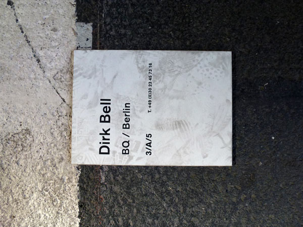
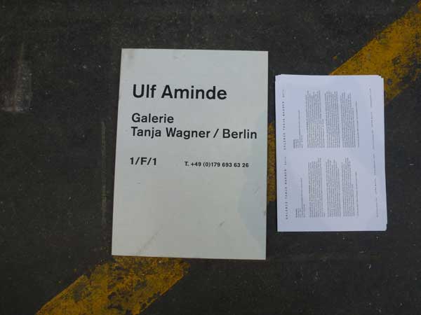
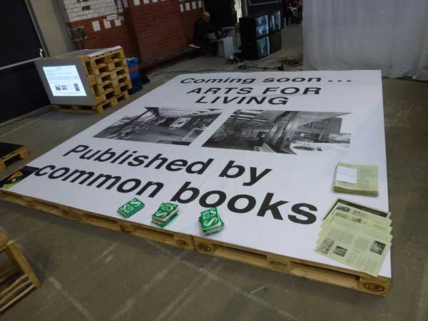
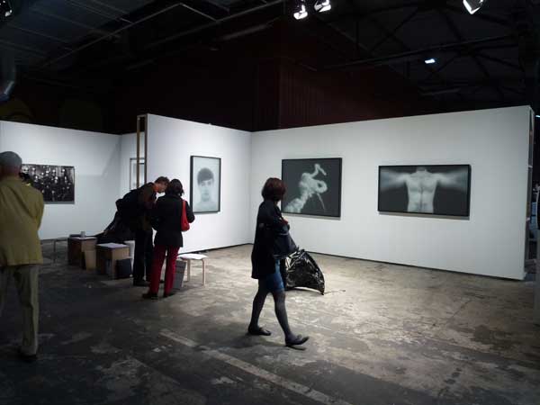
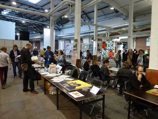
Not so great for display systems and signage was the artist book festival attached to it called Miss Read. Most publishers literally had to be interrogated to find out who they were and what they did —but it was worth it, and the real reason for my visit on the day. More on independent publishers later.
Pirate story
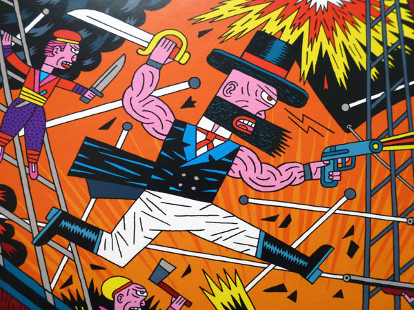
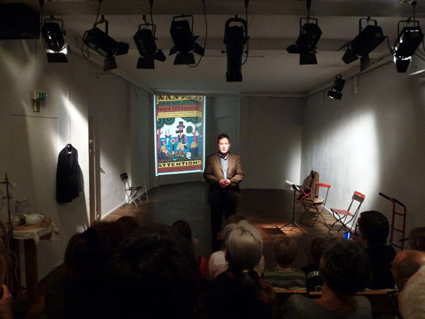
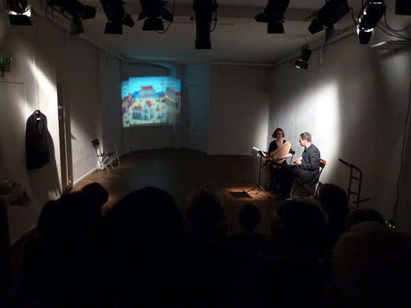
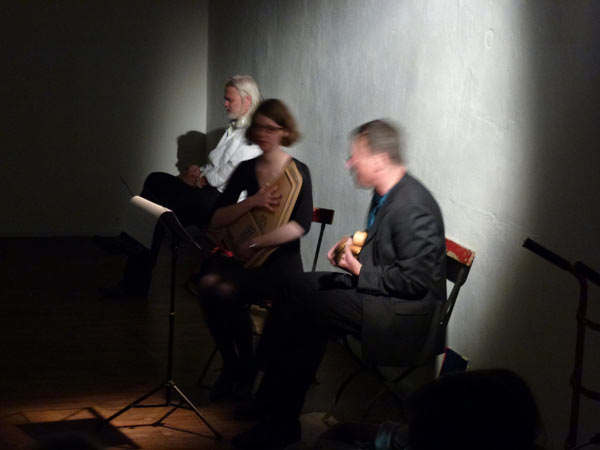
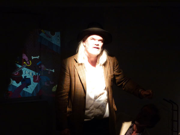
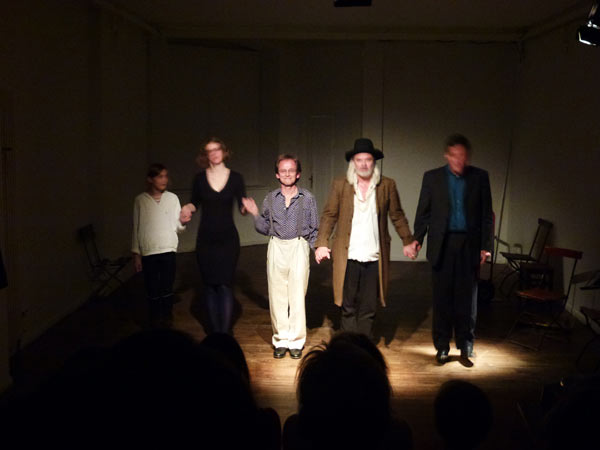
Henning Wagenbreth’s theatralisch-illustrativ-musikalische buch-premiere was in a tiny Prenzlauer Berg theatre that could only hold an audience of 50. Henning played mandolin and his partner, Sophia Martineck, played chord harp while 2 actors, Albrecht Hirche and Günther Lindner played the pirate and pharmacist in Robert Louis Stevenson’s The Pirate and the Apothecary: translated and illustrated by Henning. A nice way to launch a book — and a cute little bar downstairs of the same footprint size as the theatre. (My photography isn’t great because my point-and-click level of expertise doesn’t work for low lighting).
x
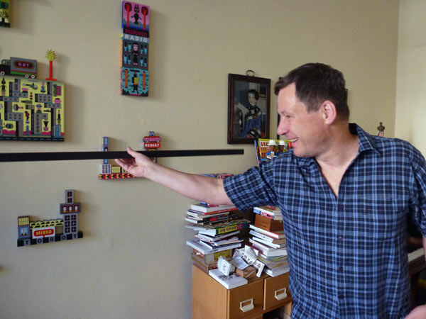
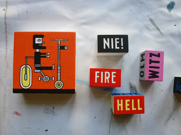
Working on some 3D blocks for a show called Memory Palace at the V&A, London.
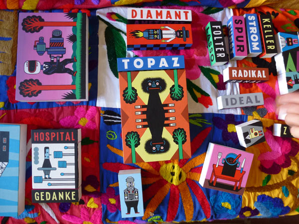
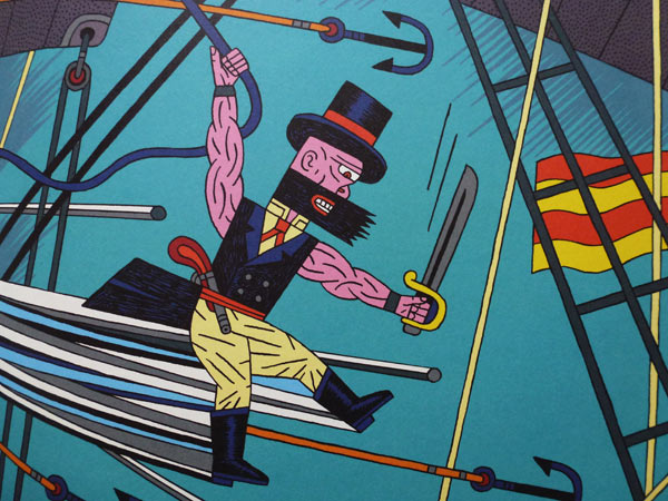
Robert Louis Stevenson
Der Pirat und der Apotheker
Illustrated and translated into German by Henning Wagenbreth
Published by Peter Hammer Verlag
Table setting
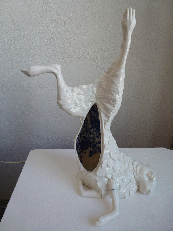
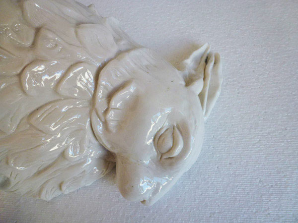
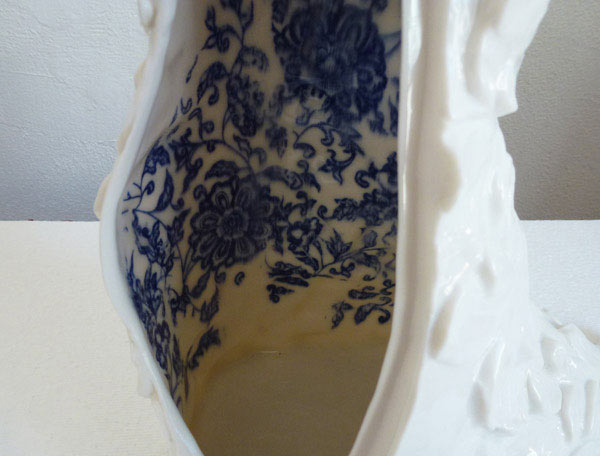
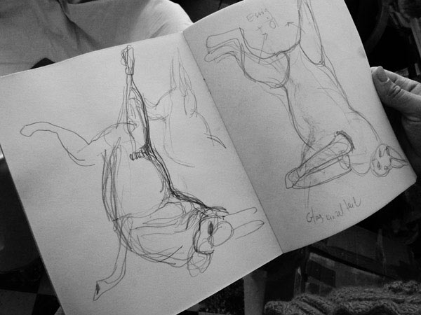
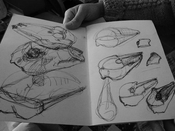
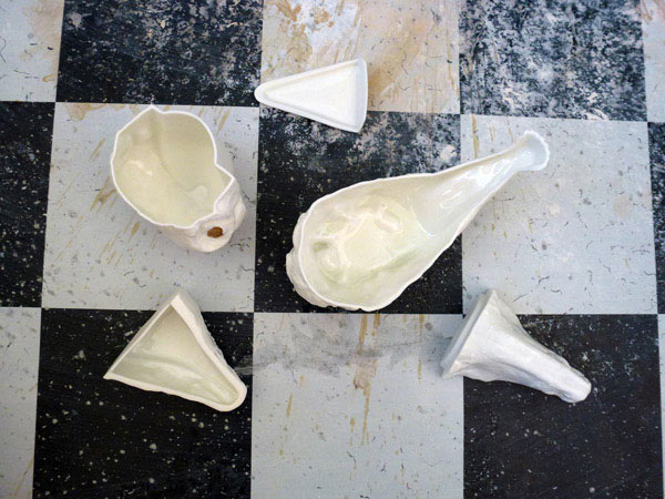
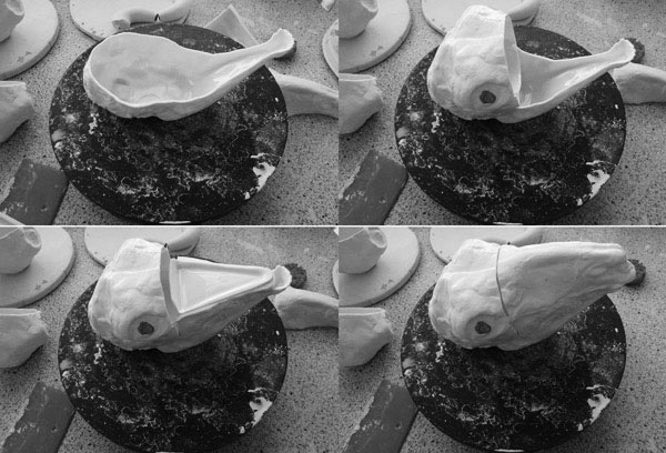
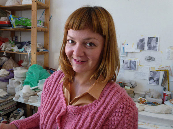
Test firing (hence some cracking) of one of a series of new objects for a table setting by Maria Volokhova.
An interview from last year.
x
Please disturb
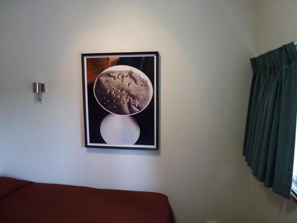
Graeme Smith: Thomas Demand, The Dailies, with contributions by Louis Begley and Miuccia Prada, Kaldor Public Art Projects, Commercial Travellers’ Association (CTA), MLC Centre, Martin Place, Sydney, March 23-April 22.
For better exhibition photography than mine please visit RealTime 109, June 2012.
Observation
When Sydney people walk into an unfamiliar room the first thing they do is head for the window. Everything—including the art on the walls—is sized up only after a quick assessment of the quality of the view. Sydney is a view city—even beyond white yachts bobbing on a sparkling harbour.
The ‘Rear Window’ effect of looking into the rooms of others, the lovely mute blankness of windowless brick, a neighbour’s frangipani or the shiny seduction of a retail strip all make good views, as they would in other cities, but in Sydney it’s more important. The view reigns. Sydney seems to look outwards; looking inwards is inappropriate behaviour. Disturbing. As is randomly opening the door to a hotel room you haven’t booked.
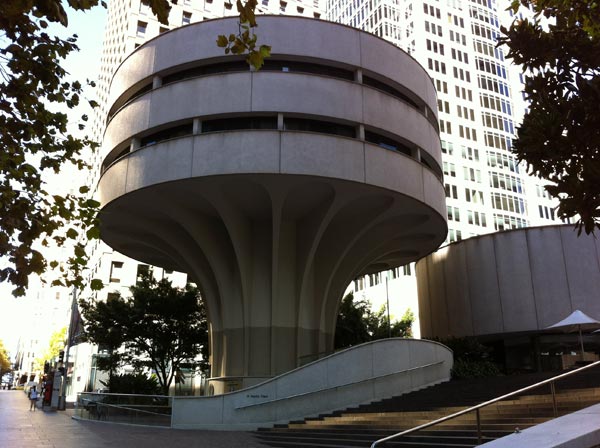
The Commercial Travellers’ Association houses a little-known, little hotel—a mid-70s Harry Seidler designed concrete mushroom in the centre of Sydney’s financial district. On one of the above ground floors, 16 little bedrooms look out radially onto the high-end retail and grand bank facades of Castlereagh Street and Martin Place. This was the setting for German artist Thomas Demand’s, The Dailies, and where a polite attendant in black invited me to start anywhere—so I opened the door to room 413 and went to the window.
Through the window
Prada, in an Art Deco building, Martin Place.
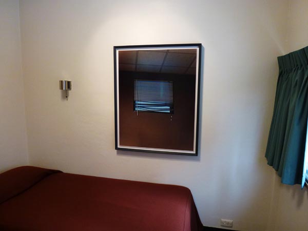
On the wall
A photograph of a window in a brown wall. The window has a cheap-looking venetian blind covering it. The lower third of the slats is dishevelled—a word normally used for hair or clothing that also works for mussed up venetians. The ceiling is standard office-commercial. Cheap. Utilitarian. All of the above is meticulously constructed from paper, photographed, then beautifully and expensively printed using an almost obsolete process called dye transfer, by Thomas Demand. The result is a slickly real image that doesn’t quite add up.
On the dresser
A tiny electric jug (everything is tiny in these rooms), a little telephone, a small bottle of wine, one glass, a laminated sheet of house information that ends predictably with…
“THIS IS A NON SMOKING ROOM
THANK YOU’
and laminated in the same hotel-room manner, a story fragment by American novelist Louis Begley…
“THE WHITE CORRIDOR WHEN
THEY ARRIVED AT
GREGOR’S FLOOR
MAKES HIM THINK OF A HOSPITAL.
HE TELLS THAT TO LENI.
She explodes in laughter and explains
how on every floor the corridor circles the building.
On some floors there are only double rooms.
This is the floor of singles.”
In the air
A fragrance designed or specified (not sure) by Miuccia Prada.
The Dailies
One circular floor, level four. Sixteen rooms. Fifteen, each with a photograph, a fragrance, a view and a fragment of story about Gregor the commercial traveller and Leni the receptionist. One room is locked, a red swing tag on the handle reading, “Please do not disturb.”
Begin
Turn the handle and push against one of the tightly sprung doors; so tightly sprung that it feels locked, until the attendant in black tells you to push a bit harder. A touch of guilt about randomly barging into a hotel room that isn’t yours, then a hint of relief in discovering that no one is there. The lunchtime city outside is soundless through the double glazing. The only sound in the room is the humming of the air conditioner through the grate in the bulkhead, sounding for a moment like a shower running in the room next door. Look at the photograph on the wall above the bed. Read the text on the dresser. Look out the window. Step back (not far in this tiny room) and frame all three—the picture, the dresser with the text, the window—in your field of vision. Turn back to the door. Turn the handle, open, realise it’s the door for the bathroom, and a slight sense of disorientation sets in.
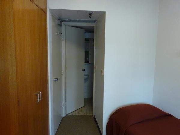
Few of us miss this point, that regardless of where you are in the world, these mean little hotel rooms, apart from all looking the same, have one other thing in common: they’re non-places. Places between other places. In The Dailies, Demand’s photographs pick up on this and push the fourth floor into another level of disengagement.
Loaded emptiness
Demand has described his subjects as simply places you pass by, things that are formally interesting (no more than that), revisited memories fixed in photography or the nuclei of narratives. The refreshingly non-interpretive John Kaldor calls them little observations in the city, and this is essentially what they are. But it’s the effect of moving through the gaps, being in-between these little stories, that draws you in to another, less worldly place. A description I once heard used for the loaded emptinesses of Berlin comes to mind and seems to fit the feeling perfectly: ghostly present absences; and picking up on the theme I did find myself doing this door-to-door visitation a bit like a commercial travelling wraith. Cut off, removed, silenced, disconnected—but at the same time hoping that the group of jabbering school kids I saw earlier had finally pissed off and left me to wander alone—to be trapped in the gaps between someone else’s story, each door opening to reveal just a sampling of what wasn’t there.
Give and take
Begley was delightful. His words played with me—and the building, and Sydney, and Australia, and readers, and Kafka, and airports, and commercial travellers and lousy little hotel rooms. Regretfully, Prada’s fragrances didn’t do a thing—but only because of the limiting effects of asthma and a cold. On the other hand, Thomas Demand seemed to be provoking a type of reflection, and presumably insight, that only comes about through displacement. Demand gives, prescribing the vision, as he says, and Demand takes, handing you the moment and at the same time cutting it away. The subject in the photograph is a construction. It has an aura of reality but at the same time it doesn’t add up. It’s the slightly disturbing, preternatural silence of the spaces that exist either side of these disconnected moments that I find overwhelmingly seductive.
Graeme Smith, RealTime 109, June July 2012
Goodbye Matthias
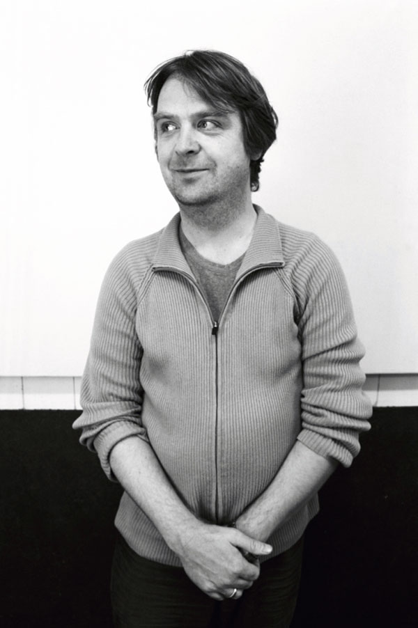
Matthias Rick, Raumlaborberlin, died 28 April 2012.
Photo: Rosa Merk.
Interview with Matthias.
