Local
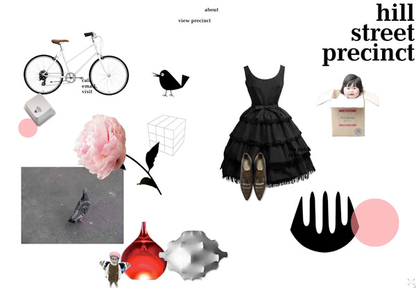
The new site for the Sydney precinct where we work will be up by Tuesday 11 May.
Both the Hill Street Precinct and the Tokyo Bike sites reflect some of our current explorations and likes: little videos of small places in cities, bikes, a kind of elegant disorder…and dots…
Conceptual approach: Heidi Dokulil, Graeme Smith. Editing and writing: Heidi Dokulil, Graeme Smith. Web design: Lee Wong, Graeme Smith. Creative direction: Graeme Smith.
Please visit
hillstreetprecinct.com
Tokyo Bike launch
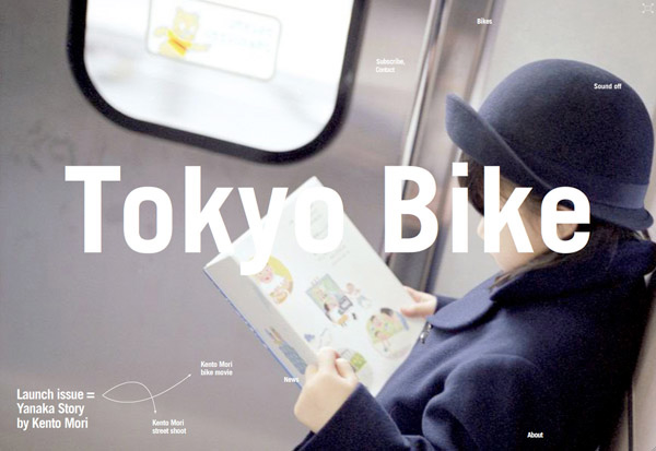
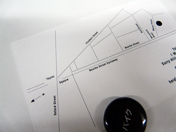
Tokyo Bike launched in Marys Place, Surry Hills, on Saturday 8 May.
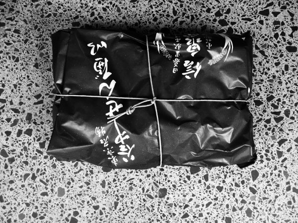
Besides showing a range of beautiful, pared-back bikes and some smart (and kooky) accessories, the web site will run a series of feature stories throughout the year. The first is Yanaka Story—a story in still photography and video by the Japanese photographer Kento Mori.
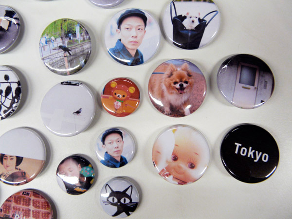
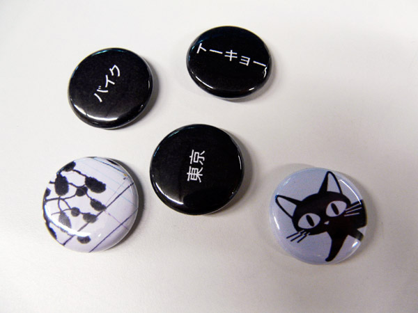
Conceptual approach: Heidi Dokulil and Graeme Smith. Editing, writing, photo direction: Heidi Dokulil. Web design: Lee Wong, Graeme Smith. Identity design, creative direction, Graeme Smith. Principal photography and filming: Kento Mori. Shop design: Richard Peters, Heidi Dokulil. Badges: Beatrice Chew.
x
Clear Paddock Creek
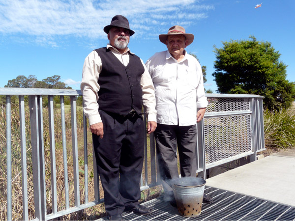
In April I met two Aboriginal Elders who had just performed a smoking ritual as part of Lao New Year celebrations at a Buddhist temple in Edensor Park, Sydney. When the speeches were over they walked slowly through the park at the back of the temple with a big, fragrant clutch of eucalyptus leaves smouldering away in a perforated metal bucket.
Lao New Year (my first experience of it) appears to be a happy time; the reverence is clearly there but it’s colourful, crowded, family-orientated, and tolerant (someone had managed to give the littlest kids balloons with the Uniting Church logo on them but no-one seemed to mind)—and with non-stop music and a high volume public address system going full pelt with announcements…it’s loud.
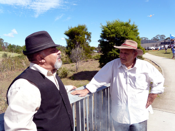
What struck me then, was how the two elders—Uncle Greg and Uncle Wes—just quietly got on with it. I don’t think anyone else noticed them as they slipped away from the reception tent and walked along the path towards the bridge, cleansing the park with smoke along the way.
The bridge they’re standing on is over Clear Paddock Creek. I haven’t researched the name but I can guess how it happened and I wonder what the creek was called a few hundred years ago, before the bush was taken away to turn it into pasture. As obvious as it is, it always intrigues me that names are echos of things that went before. Clear Paddock Creek runs into Orphan School Creek which becomes Prospect Creek then the Georges River and Botany Bay.
At the end of their walk Greg and Wes stopped at the bridge for ten or so minutes, allowing the smoke to drift through the steel mesh, and talked about the polluted appearance of the stream. Bits of plastic and food wrappers had snagged in the flattened reeds and the sluggish creek had that dull-grey, soapy bathwater look that indicates nothing much in it is likely to be alive*. Uncle Greg said, “You could drink that water once.” Uncle Greg is the one in the vest.
*
Fairfield City Council has a project called Restoring the Waters. Sections of Clear Paddock Creek and the land it runs through have been turned from concrete drains in bleak settings back into a more natural form. The Restoring the Waters site says, “The Project has developed an urban landscape of bio-diversity with clean, clear waters to be enjoyed by all.” Looking at this, and their Creek Care Program it’s easy to see that they have completed an enormous list of works.
Tokyo Bike
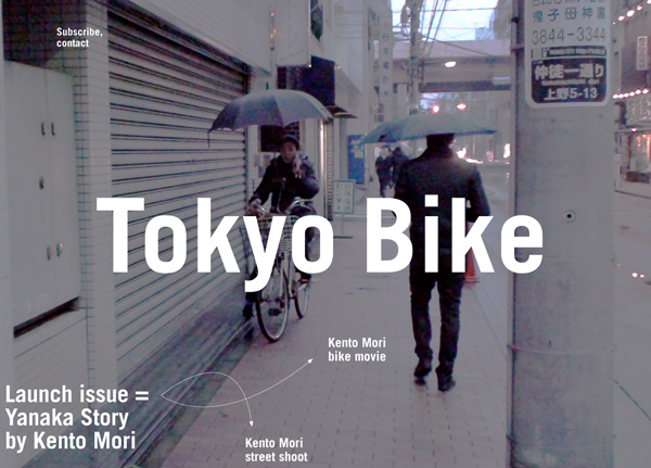
Bike riding in Japan is part of life, it’s about enjoying the ride, exploring the city, and the freedom that goes with that.
Tokyo Bike is a small and independent bicycle company which launched in the old Tokyo suburb of Yanaka eight years ago.
More about slow, than fast, Tokyo Bikes were designed for a city where destination is only part of the story, and losing yourself in the small back lanes and expansive parks and gardens is a way of escaping the crazy pace of Tokyo.
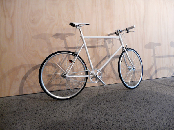
Tokyo Bikes are light in weight (between 9 and 11 kilos), easy to carry up to your apartment, and light on graphics and logo, with new colours released each season.
Tokyo Bike opens its first shop in Australia in May 2010.
Writer/photographer: Heidi Dokulil. Designers: Graeme Smith, Lee Wong.
A holding page giving access to more information will be up after Friday 19 March.
Safe spaces for taking risks

In most visual communications companies, graphic design firms, branding consultancies—call them what you will—much emphasis is placed on making connections with the values of the client. While understanding the values of a client and working hard to convey them is a necessary (and obvious) task for a communicator for commerce, I want to suggest that another responsibility also applies: you need to connect to your own values as well.
This post started as an idea to give three new UTS graduates some presence on our industry association’s website*. I saw their major project work in two stages of development, listened to what they said about it, liked it, then decided to show it with some brief notes attached. It wasn’t only that the results of their work were worth showing; something else in the way they tackled projects in a personal way—sometimes building around a seemingly arbitrary framework, sometimes working through an obsession, discovering correspondences or simply beginning with something that felt right—made me think about how easy it is in an industry environment to pass by the rich sources for designing that already exist in our heads, our memories and within the intimate realm of our senses. It’s a pity that the spaces made in design colleges for healthy experimentation are not always found in companies that design communications. In my own experience, my personal take on the world, and in particular the experiments, including a long, long list of false starts and dead ends and some pretty dumb but never-the-less transporting (they took me to somewhere better) notions have been the unanticipated origins of works that—I think—really did work because people recognised something of themselves in something in me. In essence, design as a social connection.
Of course, the word ‘experimental’ when you’re dealing with a conservative client feels risky. The idea of generating lots of dead ends and false starts unsettles when the deadline is unreasonable, the fee lousy, and another lease payment looms; and the thought of giving someone a space within a commercial project to find themselves or to connect with their own values can sound scarily considerate. But it’s precisely these ‘safe spaces for taking risks’ as one UTS lecturer put it to me, that, when built into commercial practice make for keener observations, more sparkling distillations, more useful syntheses and often mean the difference between a stale but on-brief job and an extraordinary result. How many times have you heard the term ‘on brief’ used to justify the dead-boring, or as a box-ticking excuse to forget it…too hard…move on?
I have a feeling that a powerful desire to experiment is already wired in to the psyche of all graphic designers, and for that matter everyone, but they sometimes find it hard to satisfy it because little opportunity has been left to shift the boundaries of the space allowed for thinking. Should I also mention…rigid briefs that presuppose too many things, bottom-line mantras, clients who have been convinced of the necessity for big, swaggering logos and silly colour schemes, the pseudo-science that thrives in many aspects of branding, pyramid-shaped diagrams by pop-strategists, and the notion that branding can solve pretty-well everything from low sales of me-too products to shaky personal relationships and win acceptance by the people for unjustifiable wars?
I just did.
Personal values in designing is worth talking about more—in a place with more space than this blog.
Graeme Smith February 2010

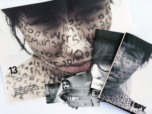
‘I Spy’
Emma O’Brien
UTS Visual Communications graduate 2009
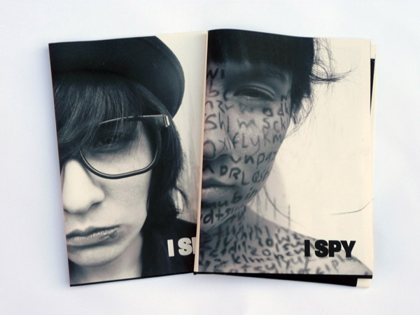
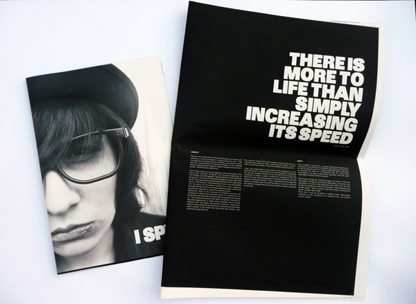
A one-off printed publication to explore the connections and disconnections between self (personal life moments) and collective global experience. Although it needs no relevance to real world publishing, for anyone requiring it, it has an aim that some publications could be enriched by—to get people to consider each moment by noticing things differently. O’Brien set up a framework for generating and identifying categories of experience by playing off the personal against the global.
GS: So what do you think you got out of working through this method? Do you think it’s going to influence the way you work in the future?
EO: Yes. Because doing it this way it got me to notice things differently and took me on different tangents and ways I hadn’t explored before in other projects—and I liked the way it was a bit airy-fairy at the start until I got the idea towards the end and it all came together.
GS: What do you think the advantage is in noticing things differently?
EO: I think from it, not necessarily more, but better ideas are likely to come. You’re just not going down the same path you always would. You’re letting yourself open up to things and the results are more interesting.
Design and photography: Emma O’Brien
Images supplied by the designer (includes introductory image)
© Emma O’Brien
Next
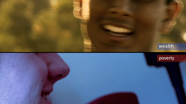
‘Wealth and Poverty’
Helani Sarath-Kumara
UTS Visual Communications graduate 2009
A video campaign, primarily for wealthy countries, to encourage people to reconsider ideas of rich and poor, and to eventually effect a change in attitude.
GS: What’s it about?
HS-K: It’s to get people to see the similarities. That lives are similar. To get people to look at their own lives and the practices they lead and not always be searching for more. In my research I found that your wants slowly turn into your needs. Then when your needs are taken care of you get new wants that become needs. It’s like this never-ending cycle of consumerism.
Film and direction: Helani Sarath-Kumara
Music: Jacob Stretton
Video supplied by the designer/filmmaker
© Helani Sarath-Kumara
Next

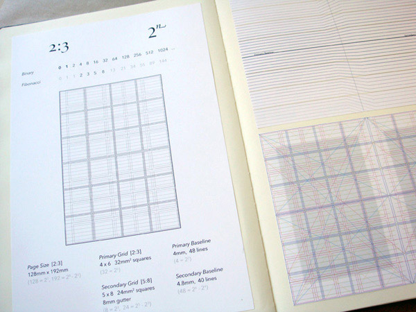
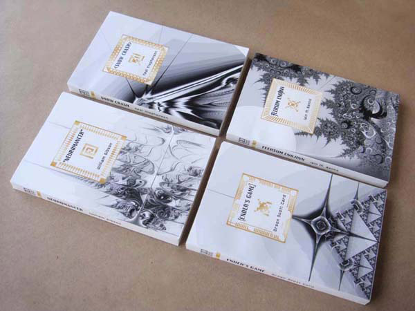
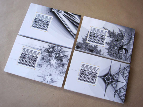
‘Binary Books: The Cyber Collection’
Kristina Flanagan
UTS Visual Communications graduate 2009
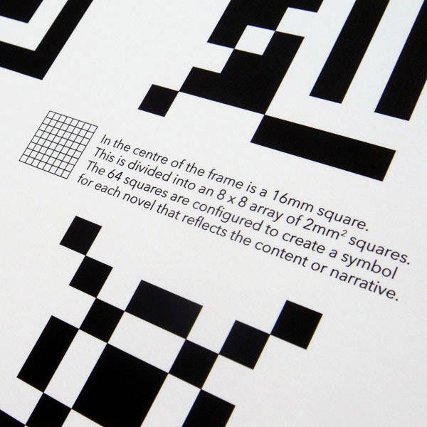
A range of existing science-fiction titles, redesigned to elevate them away from prejudices and low-brow perceptions associated with the genre.
GS: I noticed in your work process you had a few minor obsessions… grids?…numbers?…the Fibonacci series?…
KF: At first I copped a bit of flak for that, which is quite ironic, because it’s the first time I’ve ever used a grid in any of my design work. It’s not something I would have even espoused before…I’ve always thought grids were quite restrictive and a little bit anal retentive…but I guess with this project all the research I did into computer technology, binary…really felt like the way to go because computers are very structured, mathematical, logical, symmetrical…and also classic book design is very heavily grid-based. I thought there was a nice connection between the very mathematical structures within computer technology and literature.
Design and photography: Kristina Flanagan
Images supplied by the designer
© Kristina Flanagan
*agda.com.au
