raumlaborberlin in Sydney
User Generated Architecture
Works by raumlaborberlin in collaboration with locals.
Curated by Joni Taylor
Tin Sheds Gallery, University of Sydney
until 15 November 2013
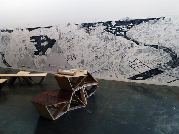
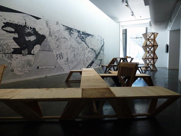
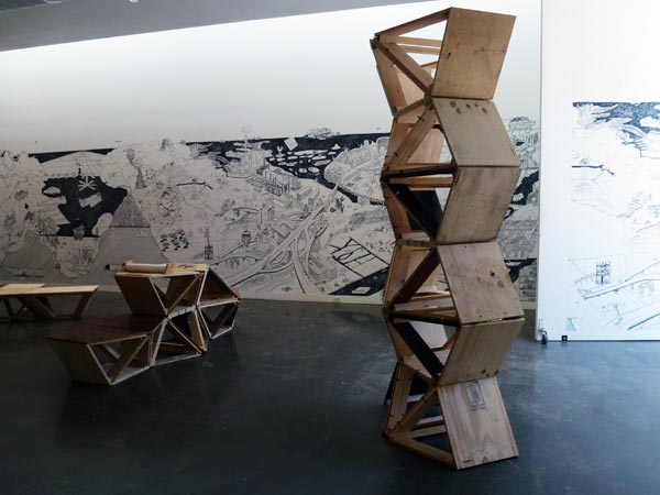
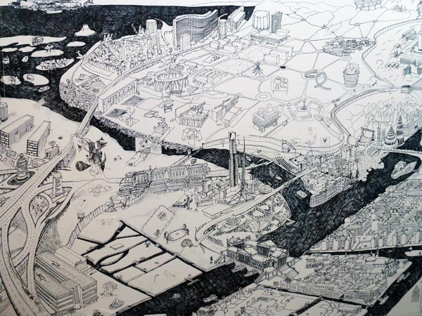
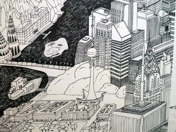
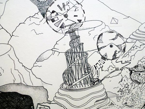
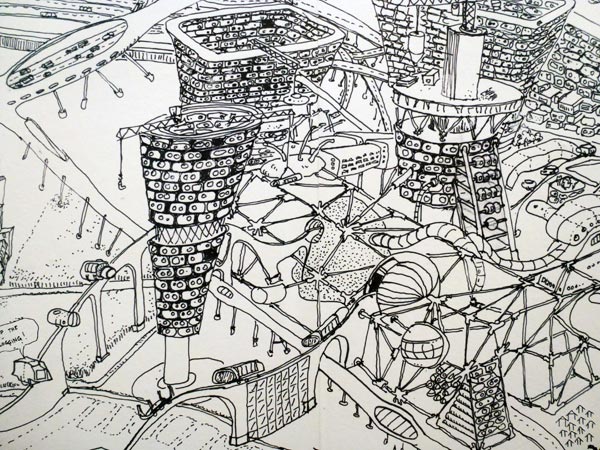
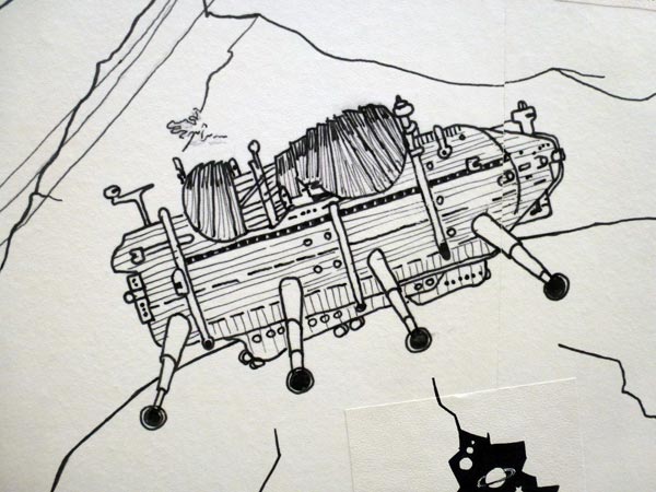
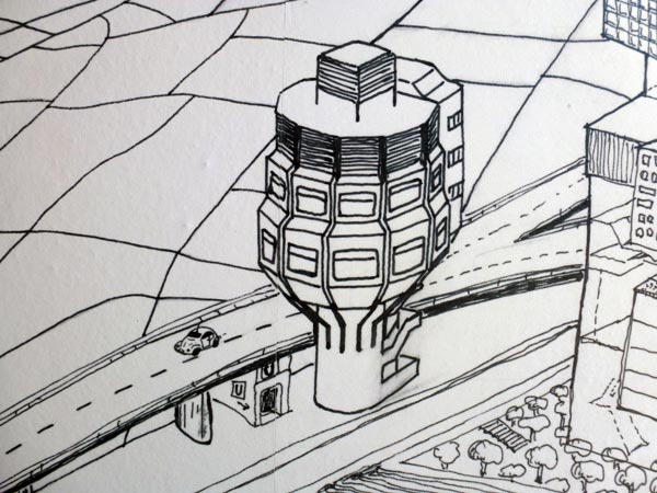
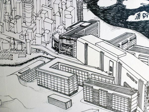
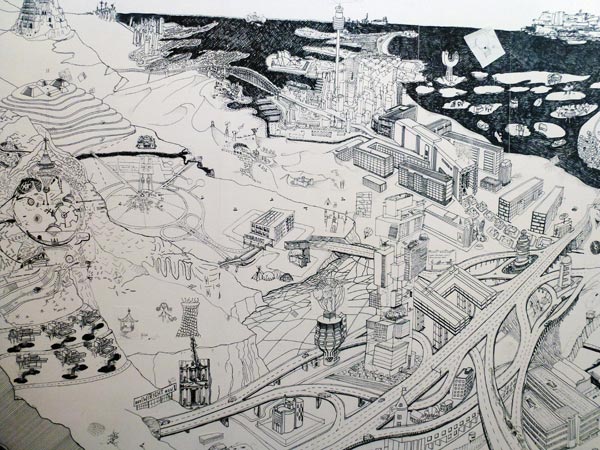
Stick on City
Wallpaper, timelapse videoloop 2013
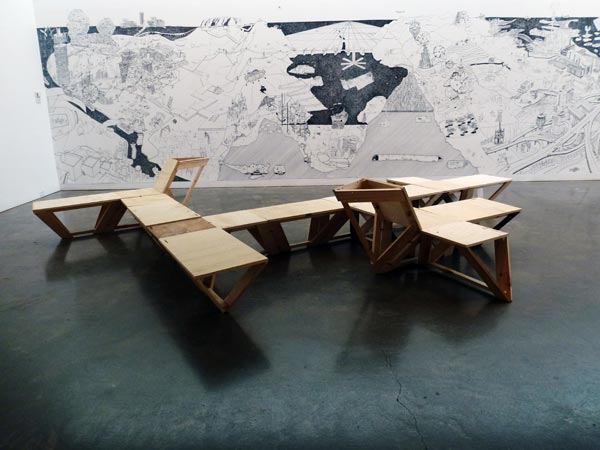
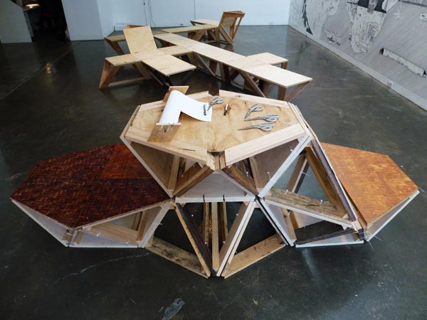
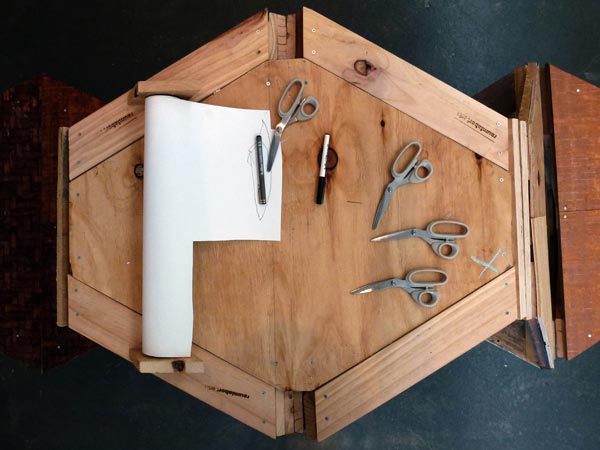
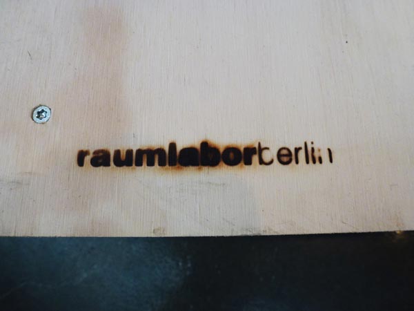
The Generator
Mobile furniture made from plywood, recycled wood, cable-ties.
(Created as part of the raumlaborberlin Generator workshop, 13–14 October) 2013
Not shown here are their wonderful videos!
x
Reading cities
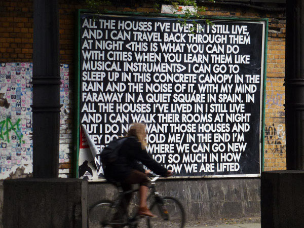
Echoes of Voices in the High Towers, Robert Montgomery at the former Tempelhof Airport, Stattbad Wedding and 20 billboards across Berlin. July–October 2012. Presented by Neue Berliner Räume.
Reading Cities
A city may be read through its geography, its infrastructure and social structures, its propensity for happiness (or gloom), the quality of its food or manufactures, the attractions it offers tourists, the stories of the lives of its inhabitants, its number of days of sunshine, its ability to make trains run on time, the record of its triumphs and catastrophes… many things.
It can also be read in less direct ways; avoiding the indexes through which cities are typically assessed.
Displacement, incongruity, impermanence, the vast worlds hidden in small gestures and modest objects, emptiness, incompleteness, uncertainty, accidents and incidents of happy chance, the silences and false starts intrinsic to creative process; the dead ends of the day’s challenges; the beauty of melancholy; and all those things thought of as poetic and inevitably regarded as useless are also the things from which new understandings and richer definitions of ‘city’ emerge:
lab city;
screen city;
garden city;
kitchen city;
city as dance;
city as palimpsest;
city as artwork or gallery;
city that reads as a chronicle of longings;
city you can learn like a musical instrument.
When we travel to other places, more often than not we spend much of our time in cities. It’s not only the speed and energy of the world’s great cities that attracts us but also their ability to slow us down, to intensify perception, and allow us to have a sense of the gift of things we may otherwise overlook or undervalue.
x
Boxed sets
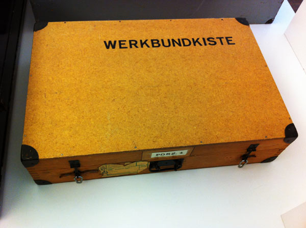
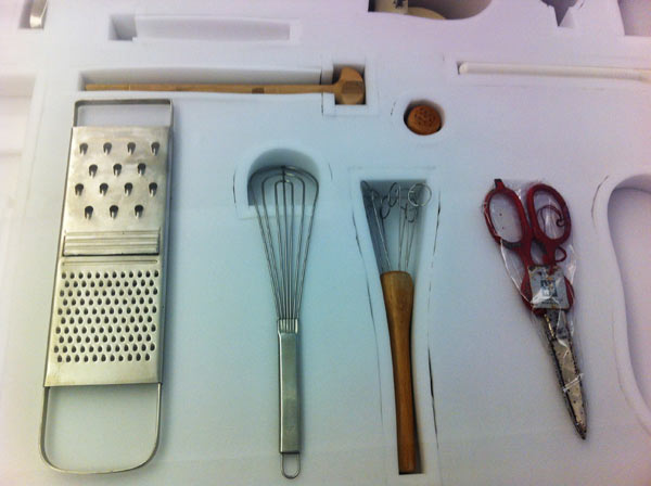
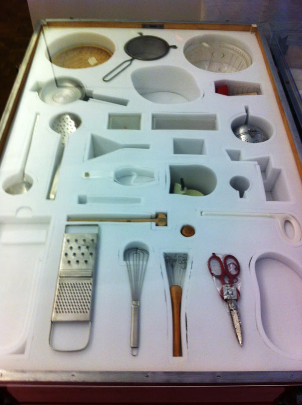
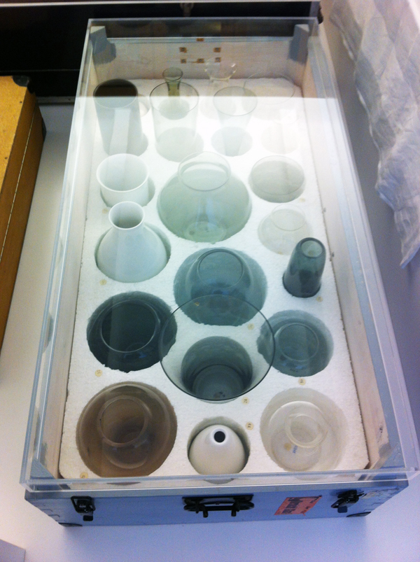
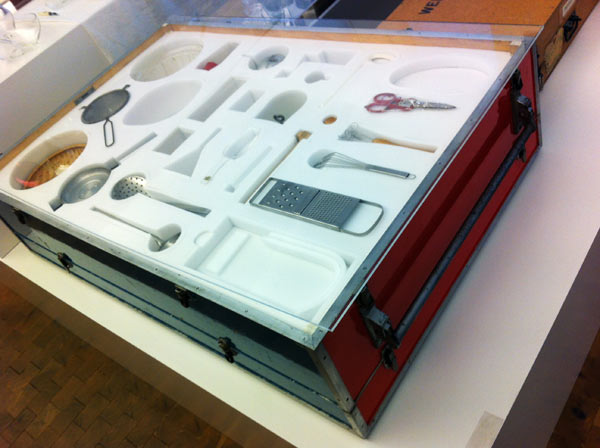
Boxed sets produced for schools by Deutscher Werkbund. At Berlin’s most fascinating museum, Museum der Dinge (Museum of Things).
The text on the object label reads:
The Werkbund Boxes
“For we not only shape things, but things also shape us”
(Deutsche Warenkunde, 1955)
Familiarity with “good” form was meant to be learned from childhood on. Several of the Werkbund’s state chapters developed boxed sets of teaching materials that were loaned to schools in the 1950s and 1960s. Schoolchildren were given the opportunity to “grasp” everyday products of industry and craftsmanship and to discuss various aspects of modern design. They were supposed to develop an eye for the shape of “good” things and at the same time test their utility and get to know their material characteristics. The boxes devoted to dining culture in particular demonstrate yet again the Werkbund’s ambition, persisting well into the 1960s, to influence peoples’ lifestyles through education in “good form”. The “beautifully set table” was supposed to encourage or stabilise an intact family. In the course of the social upheaval around 1968, this agenda was criticised even within the Werkbund.
x
Type museum
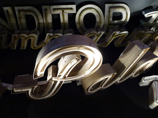
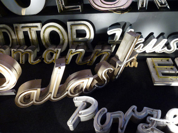
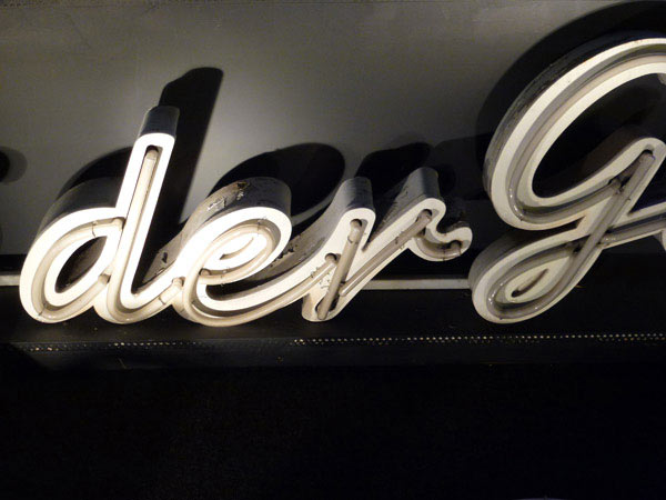
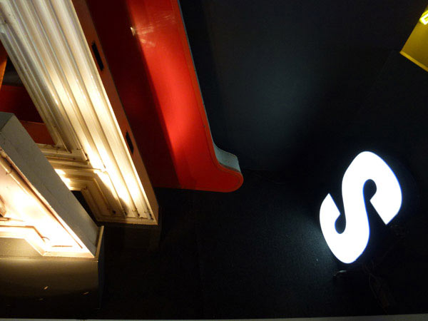
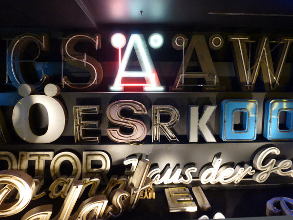
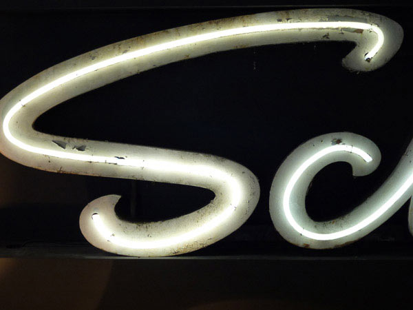
A small museum in Berlin (Buchstabenmuseum) showing letters rescued from buildings. My point-and-click style of photography makes it all look like 70s photorealism — which annoys me. A lovely touch on entering: you’re given a little torch to carry around so you can check details.
x
Sharpened minds
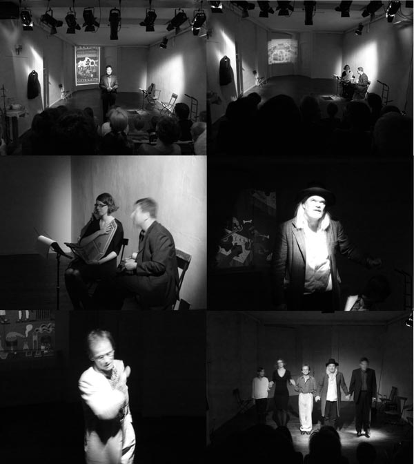
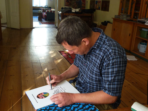
Henning Wagenbreth’s theatralisch-illustrativ-musikalische buch-premiere was in a tiny Berlin theatre that held an audience of about 50. Henning played mandolin and his partner, Sophia Martineck, played chord harp while 2 actors, Albrecht Hirche and Günther Lindner played the pirate and pharmacist in Robert Louis Stevenson’s The Pirate and the Apothecary: translated into German and illustrated by Henning Wagenbreth, published by Peter Hammer Verlag as Der Pirat und der Apotheker.
An abridged version appears in Desktop Magazine Dec/Jan 2013 (an issue on the future of design)
Sharpened minds
Every view of the future is a prediction and an imagining. All clues that suggest what the future may be like are informed by our current situation: the way we see ourselves positioned in the world, and how we relate to it.
One way of arriving at a mainly predicted view of the future is by having an analytical view of the world. When I think about the analytical way, it disheartens me because the most prolific and relentless everyday, everyminute analysers of the future are not scientists, and certainly not designers, but people who work within the sphere of finance and marketing. They view the world as a thing we can do stuff to and take stuff from. The world is understood as a separate entity and their language is the abstract, distancing language of the corporation. They talk about identifying potential needs and creating desires. the analysis of trends and predictions about the effects of new technologies, shortages and surpluses, and all the current indicators of how the world may turn out for their ever-demanding stakeholders. This is a way of thinking about the world that many branding industry designers —perhaps forgetting that sense of wonder, a sense of the absolute gift of the things around them as children—have accepted without much reflection on the way it has removed the joy from aspects of their work or dulled their design thinking.
Another way in which a view of the future can be arrived at is by having a more poetic view of the world—where the viewer and the world are one-in-the-same. This is a place where we need, and desire, to think about what we do to it/ourselves and what we take from it/ourselves. Not just for the survival of its plants and animals or the quality of its air and water (that’s another angle entirely) but because it gives us a deeper, more world-connected sense of lived reality: a sense of the gift of things and an incidental satisfaction in knowing that at least an identifiable part of our lives is lived without being overtly thought of as the tail-end of someone’s strategy or forecast — and our sense of self worth is not so incessantly, wearingly geared to what we can afford to consume.
In my current and limited explorations—talking to creative people about their practices, their desires and their own futures—I have noticed some current indicators that reveal that many designers are wanting a different future to that of the analysts and strategists. One indicator is the growth of small, independent publishing houses. Another is the return to smaller, more compact (even more profitable) working scenarios: the return of the atelier, where studio, showroom, production facilities and often living spaces are combined—not always through economic necessity, and often because ‘this is the way we like to work’ or ‘this is the way we do better work’. Another is less silly reverence for, but casual (bordering on ambivalent) acceptance of, technology—a ‘some bits are me, others aren’t’ attitude that indicates a new maturity in design values.
Another indicator is designers having a much deeper interest in the world with active careers over several disciplines or simply trying new things because they feel right.
Some examples from where I’m writing at the moment (Berlin):
Architect Gabi Schillig (who once worked at Sydney’s Harry Seidler & Associates) became less interested in buildings and more fascinated by non-permanent, open structures and the interface between the body and its surroundings. She moves around a lot, particularly Europe, working between architecture, writing, textile design, performance and conceptual art.
gabischillig.de
Illustrator, Henning Wagenbreth, recently launched his new book about a Welsh pirate by putting on a musical / theatrical show in a tiny Berlin theatre—something he had never attempted before, but he happened to have learned to play the mandolin in East German youth camps and his partner could play the chord harp so with two actors and some projection help they gave it a go, and it was beautiful.
wagenbreth.de
theater-on.com
Poetic thinking is not strategic, but it reads the world through indexes that corporations, with their relentless culture of consumer happiness, rarely use: displacement, incongruity, impermanence, unexpected media, ambiguity, uncertainty, the false starts and dead ends of creative process, the beauty of emptiness, new thoughts on where the body ends and the world starts, or using, in Schillig’s words, ‘actions as levers that shift perception of the everyday’. All wonderful resources for better designing that are, I believe, ways of thinking that come naturally to designers and a reason, I’m guessing, that many of them chose that career.
The trend I’m seeing is that no-one is talking much about trends. However some designers are finding new touch-stones to ‘the real’: more reflection on the things that count and what is real and more reading of the world through sharpened minds. More critical thinking. Less uncritical acceptance.
There is one indicator for the future of design that worries me personally but I know it can be overcome: the shrinking (or non-existent) space in design magazines for primarily written articles exploring design issues that go beyond straight project reporting. It’s indicative of, not just a legitimate editorial desire for concise writing, but the increasing hegemony of flip-book-fast, often passivating imagery, the reduction of design insights to design trends, and of how marketing is taking up more than its fair share of space—that could be used for deeper forms of attentiveness, a fuller sense of reality and the ‘living through’ of things not directly attached to a strategy.
So far in the Australian design media, there is little acceptance of, or space made for, criticism and reflection. The writer Susan Sontag’s comment on one of the tasks of literature,’…to formulate questions and construct counter-statements to the reigning pieties’ applies equally well to one of the tasks of design — and some of the clues I have noticed suggest that, in the near future, we may be designing with much sharpened minds. This is my prediction and imagining.
Graeme Smith, 2012
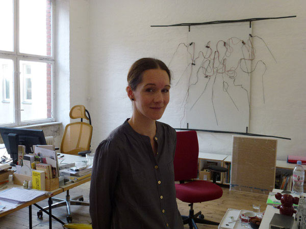
Three Kreuzberg studios
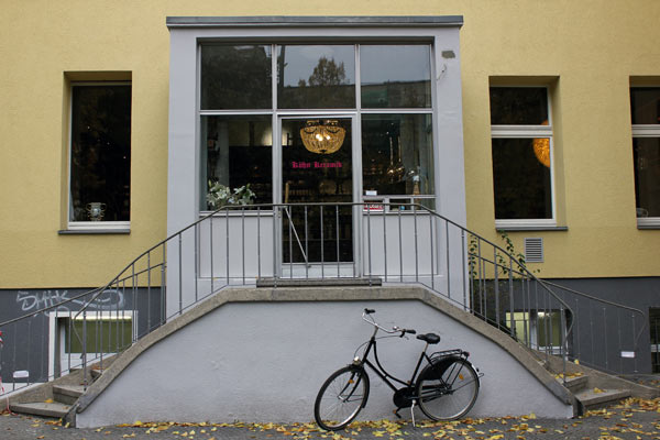
Bernhard and Claudia from Kühn Keramik took over a 19th century pharmacy for their new ceramics showroom and workshop. Generations of the same family of pharmacists had been operating there for many years—right up until 2012. The original joinery was retained for displaying the work. A spiral staircase in a back room takes you down to an airy workshop—windowed to the street and well ventilated for their three kilns.
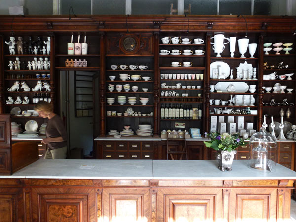
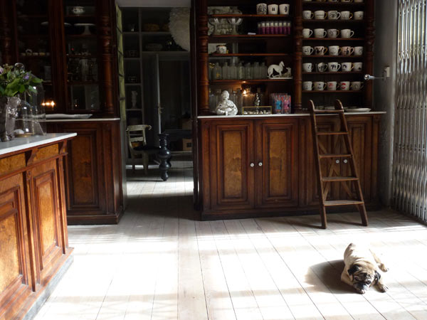

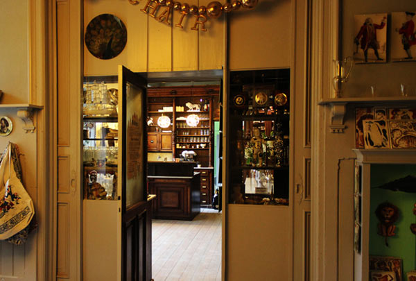
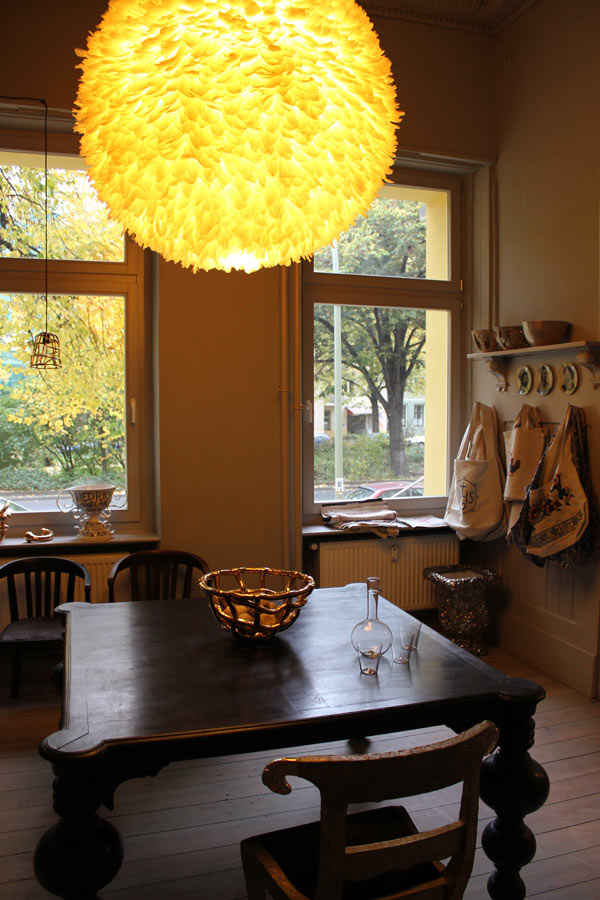

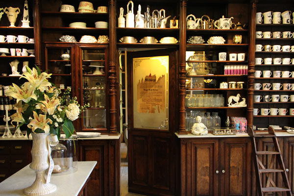
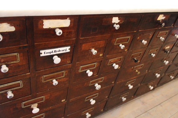
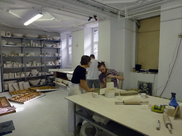
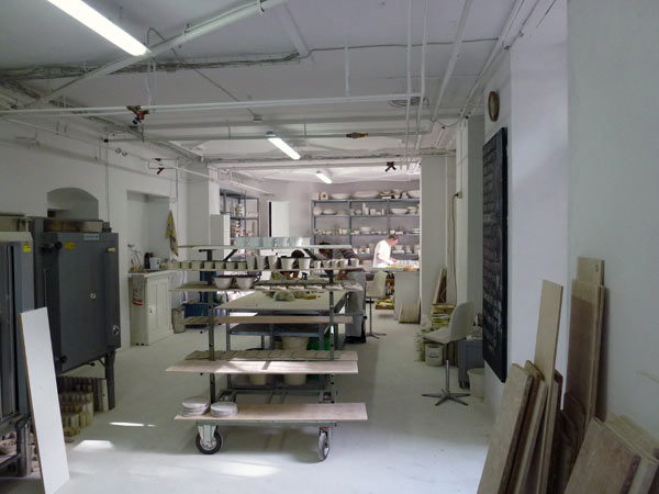
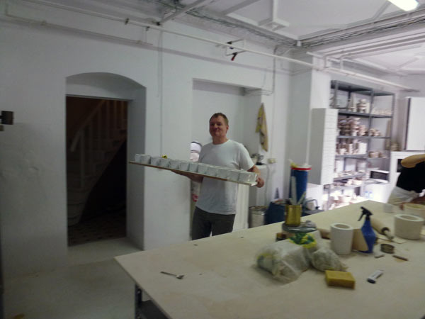
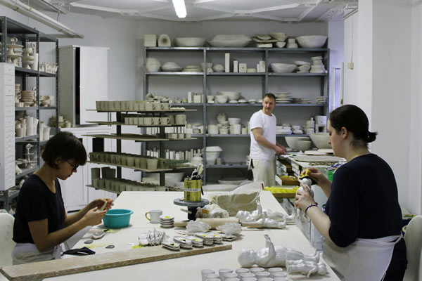
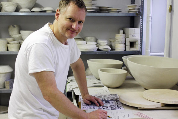
Bernhard likens his workspace to a bakery, and it does have that feel.
x
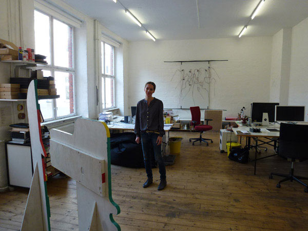
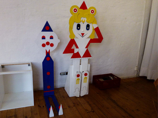
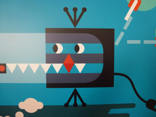
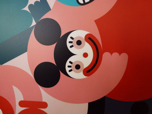
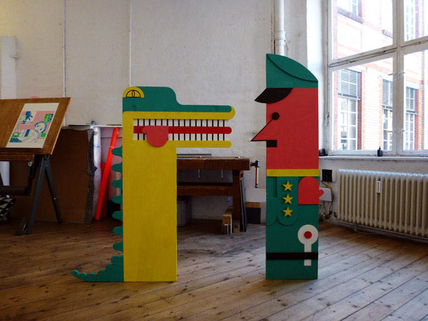
Kathi Käppel is an animation director / illustrator who shares this simply set out studio in Kreuzberg with an architect and an eyewear designer. Much of her work is in character design—in flat colours and geometric shapes.
x
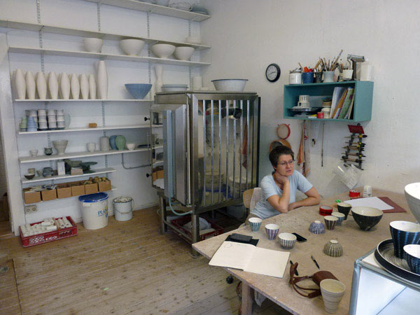
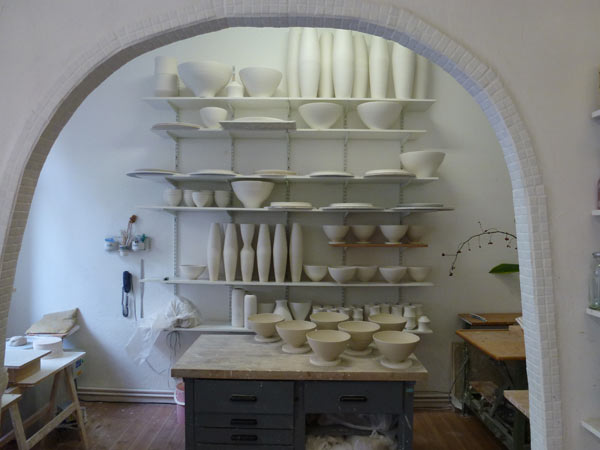
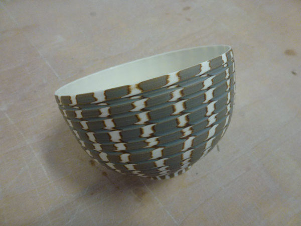
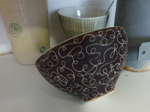
Anna Sykora’s shopfront atelier, Anna Sykora Porzellan. Although almost everything she does is sold through distribution it’s nice to be able to walk in straight off the street—into a working studio.
x
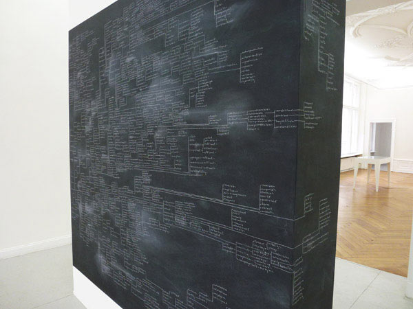
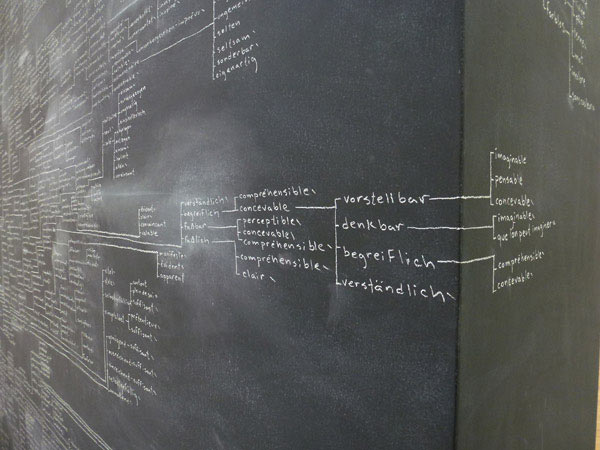
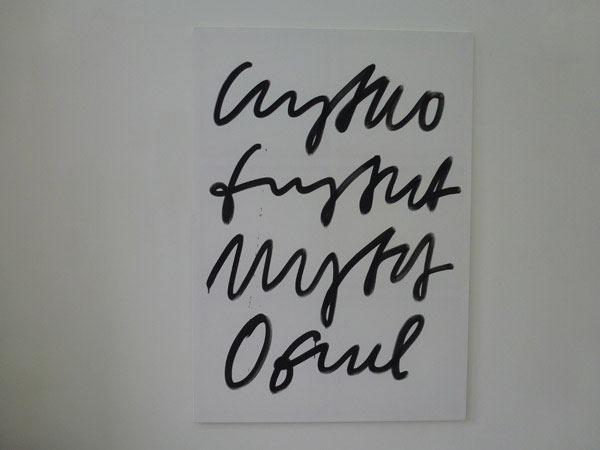
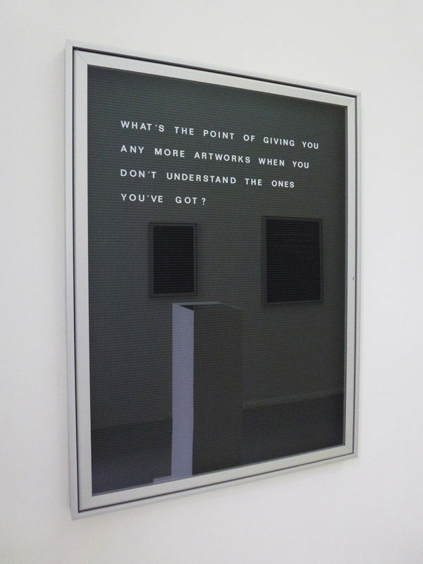
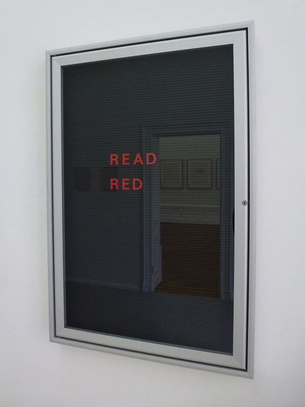
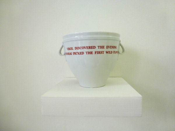
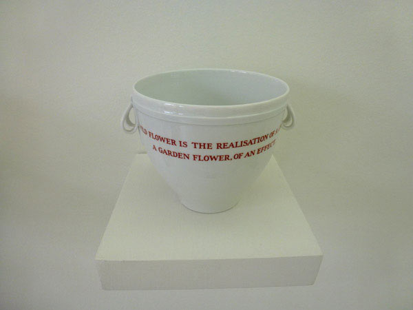
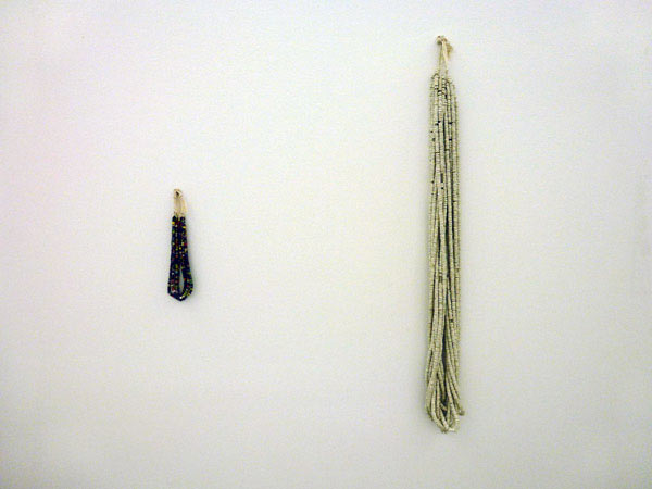
From the Age of the Poets
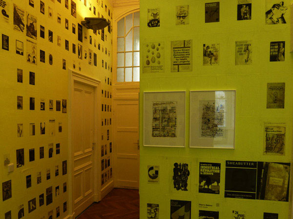
Taken from the introductory text for the exhibition by Aanant & Zoo:
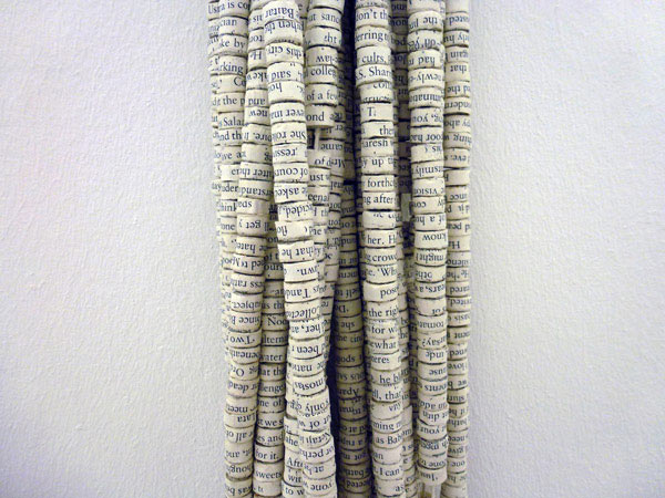
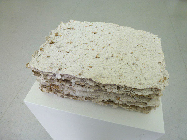
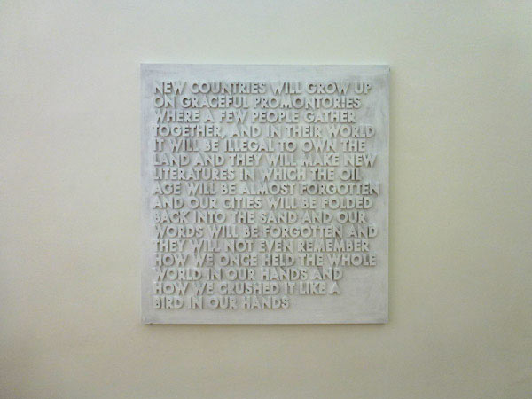
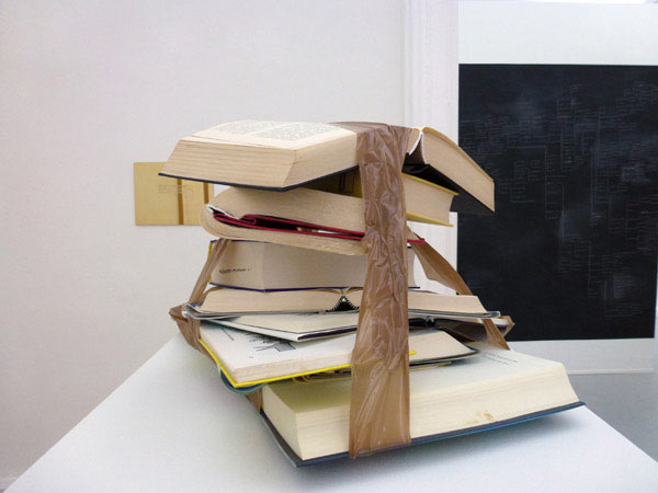
‘The gallery Aanant & Zoo dedicates the exhibition From the Age of the Poets to the interplay between the wonder of language, truth, the possibility of mis- or not understanding and poetry as a legitimate access to the world.’
Artist listing from Aanant & Zoo:
Johanna Calle, Luis Camnitzer, Hanne Darboven, Michael Dreyer, Friederike Feldmann, Ian Hamilton Finlay, Dora García, Simryn Gill, Peter Greenaway, Channa Horwitz, Bethan Huws, Vlado Martek, Henri Michaux, Edwin Moes, Robert Montgomery, Michael Müller, Aribert von Ostrowski, Kasper Pincis, Falke Pisano, Gerhard Rühm, Mike Ruiz, Max Schaffer, Carl Trahan, Cy Twombly, Geerten Verheus
From the Age of the Poets
Aanant & Zoo, Berlin
07.09.2012 – 20.10.2012
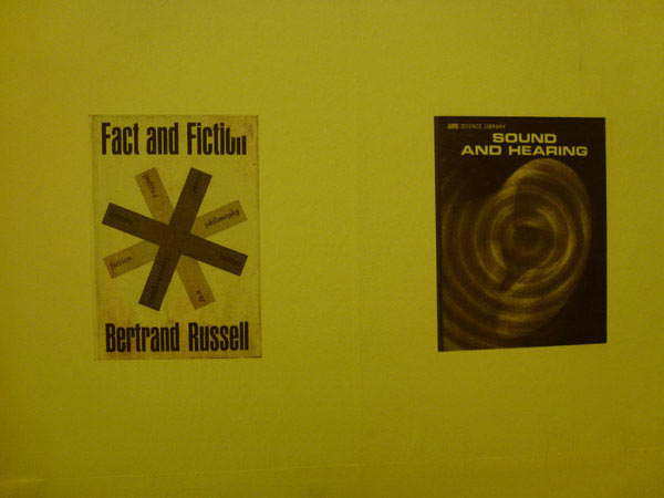
Above and below:
Entry treatment for the exhibition
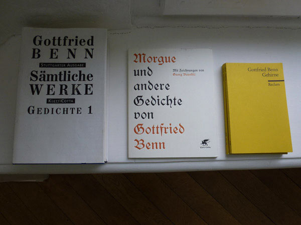
x
Stattbad revisited
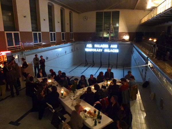
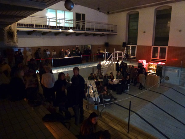
Neue Berliner Räume closed the Robert Montgomery exhibition, Echoes of Voices in the High Towers, with a dinner and book launch at Stattbad — a former public pool building in Wedding.
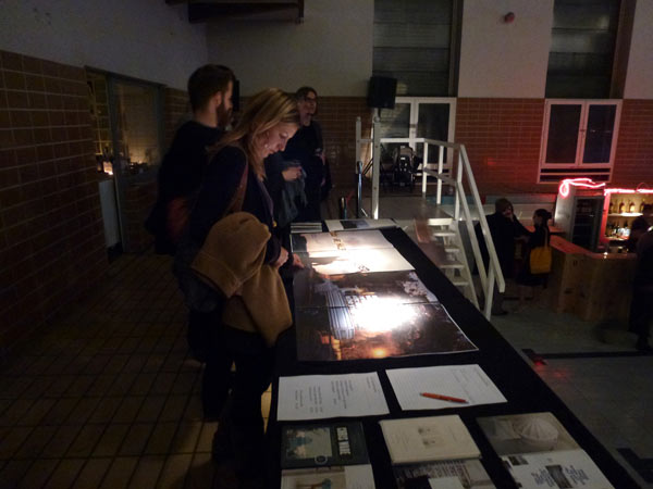
Large format book (50x34cm) on the exhibition by the publisher, Mono Kultur — those people from Berlin who do that very small format magazine of the same name that a surprising number of Australians seem to be familiar with.
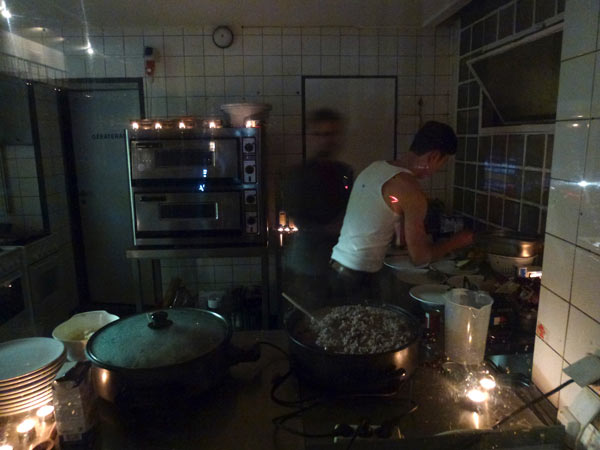
Cooking up a risotto in the Schwimmenmeister’s office.
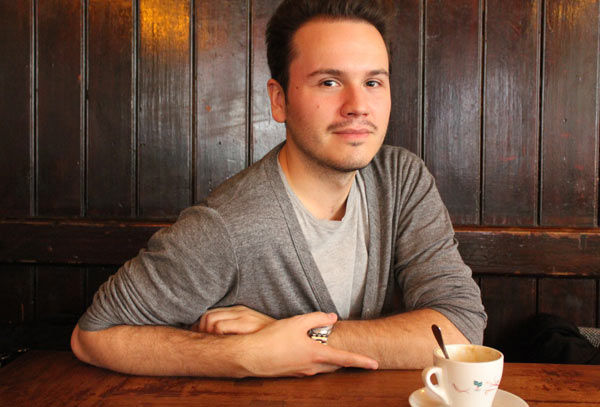
Manuel Wischnewski from Neue Berliner Räume.

