
Just up
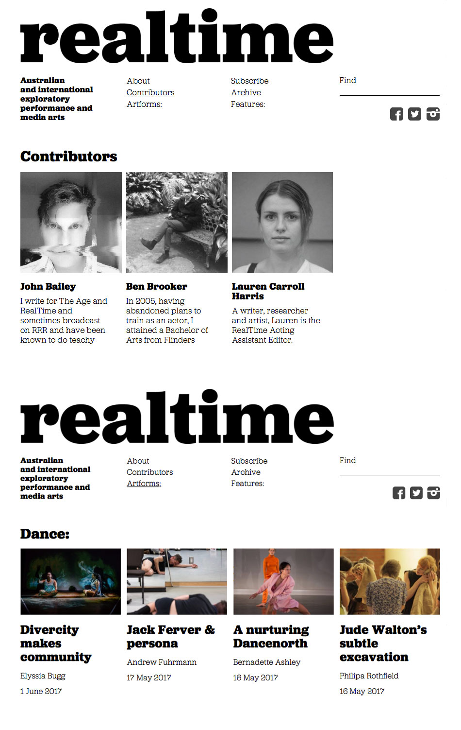
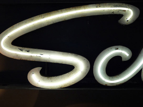
A new site by Melbourne digital designer Lee Wong (The Mighty Wonton) and myself for RealTime: Australia’s critical guide to national and international contemporary arts. As a place to visit it’s easy to move through and explore, with lots of functionality and a massive archive.
Artforms:
Theatre
Contemporary Performance & Live Art
Dance
Film
Media Arts
Aboriginal & Torres Strait Islander Art
Visual Art
Sound Art
Contemporary Classical & Experimental Music
Festivals
Art Politics
Editorials
Features:
RealTime Audio
RealTime Video
RealTime Traveller
RealTime Dance
Media Art Archive
Deep Archive
Among the compliments, this one from the Australian Dance Theatre: ‘Love the new site — very cool in a kind of organised distortion.’
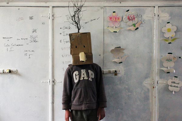
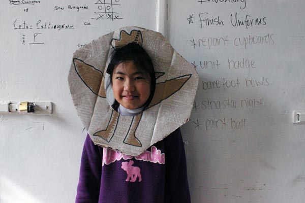
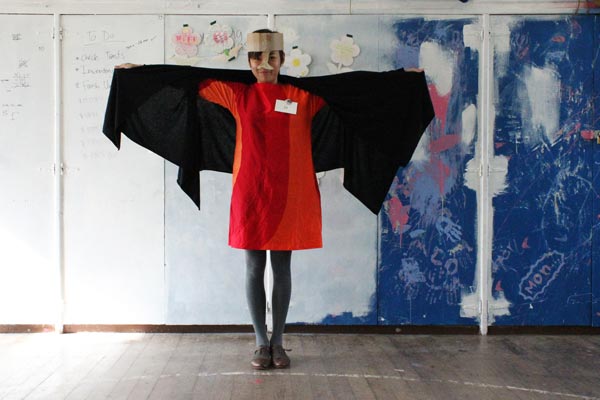
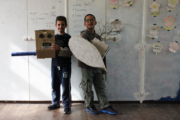
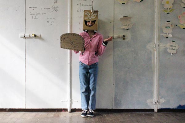
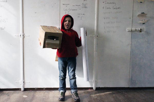
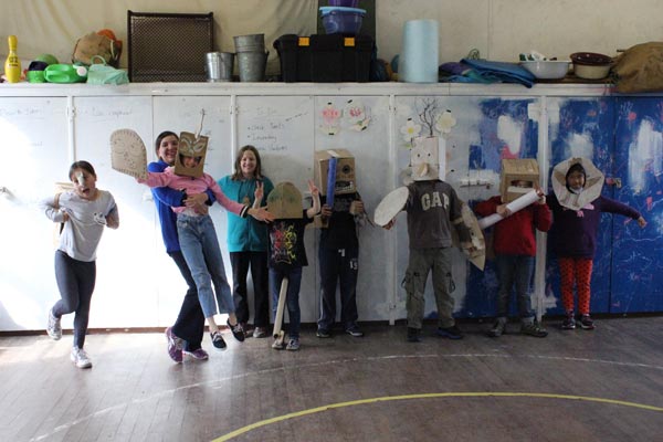
Mask
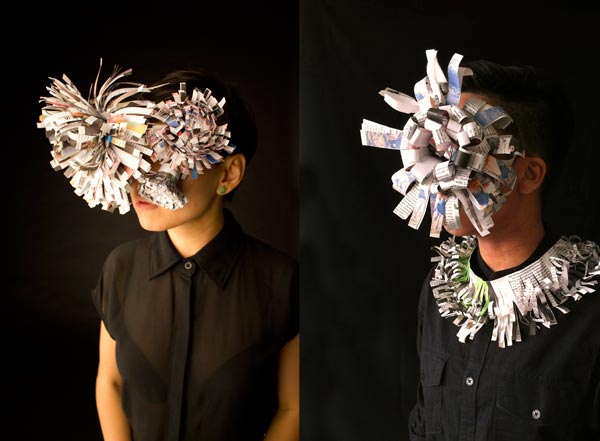
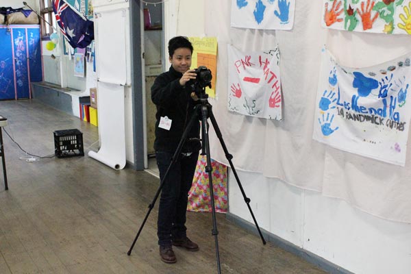
My two friends and work buddies (pictured above) have produced some beautiful images for an arts magazine. The cover picture will appear soon with the publishers as models. Here Beatrice and Su-An test drive some of the elements that make up the constructions.
Mask making and styling, Beatrice Chew, researcher designer.
Photography, Su-An Ng, animation filmmaker.
General idea, GS.
Visit RealTime. Read the cover story.
David Gentleman drawing
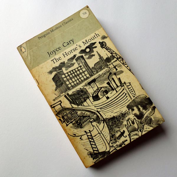
Found this beautiful drawing by David Gentleman on the cover of a 1964 Penguin.
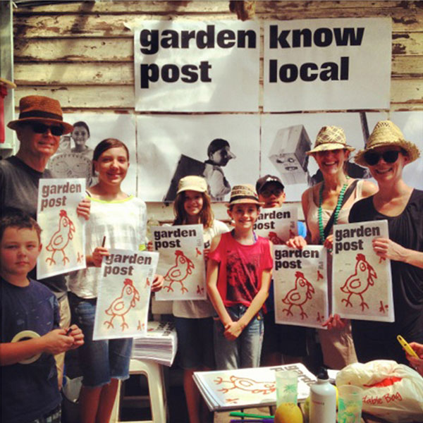
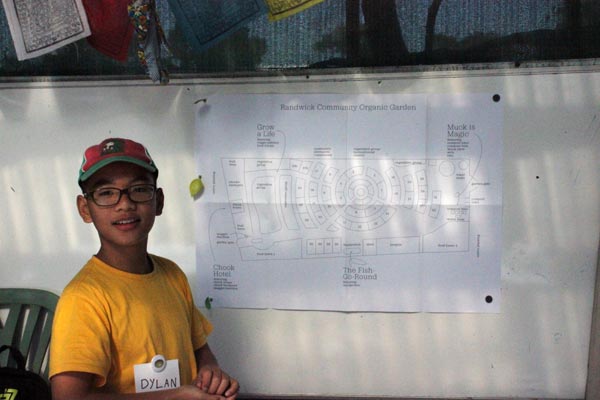
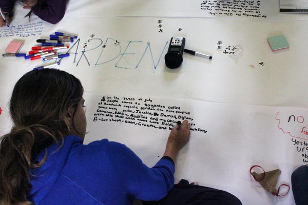
Garden Post
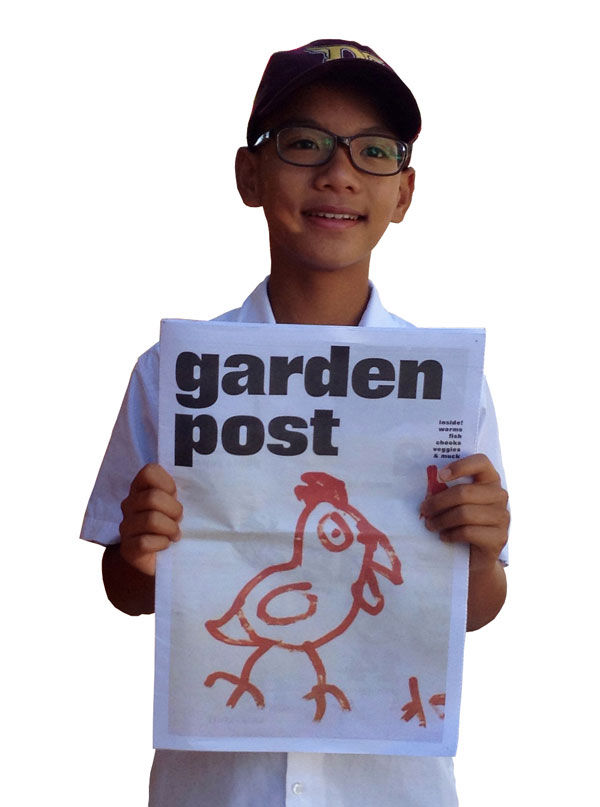
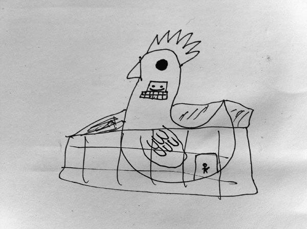
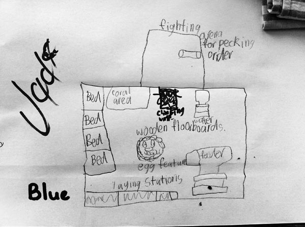
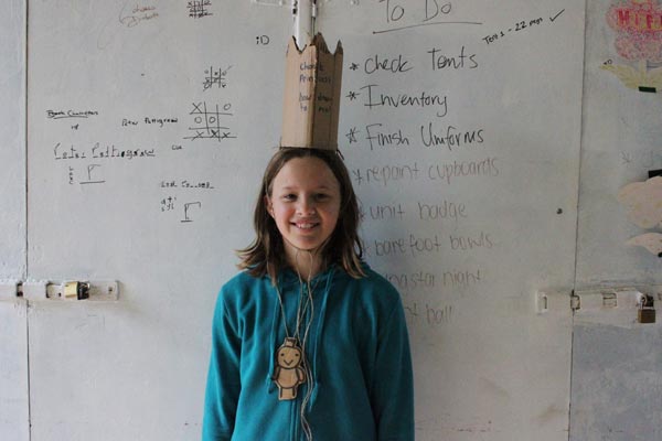
The ‘know local’ newspaper, Garden Post, was written, illustrated and photographed by ten cub reporters from the City of Randwick. It was launched on Sunday 20 October at the Randwick Community Organic Garden.
Above: Dylan holds up the cover showing his lively drawing of one of the garden’s chickens.
Photograph by Dylan’s mum.
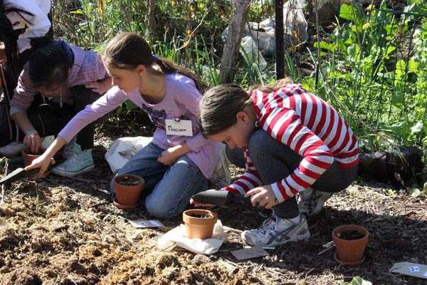
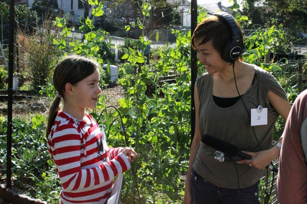
Below: Some of the Garden Post team and Lauchlan—a sort of amazingly clued-up garden cicerone.
Instagram photographs by Nikki.
The Newsroom project was sponsored by Randwick City Council as part of its Cultural Community Grants program developed by the council to encourage happy and connected local communities through creative arts and cultural projects.
x
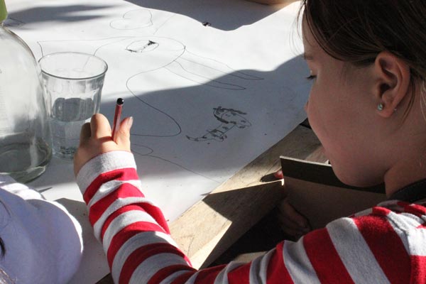
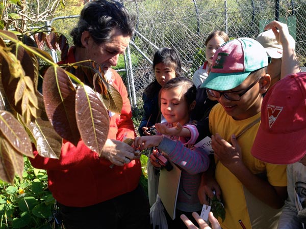
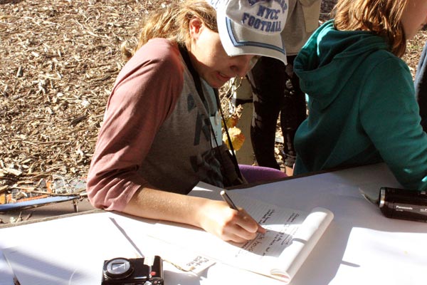
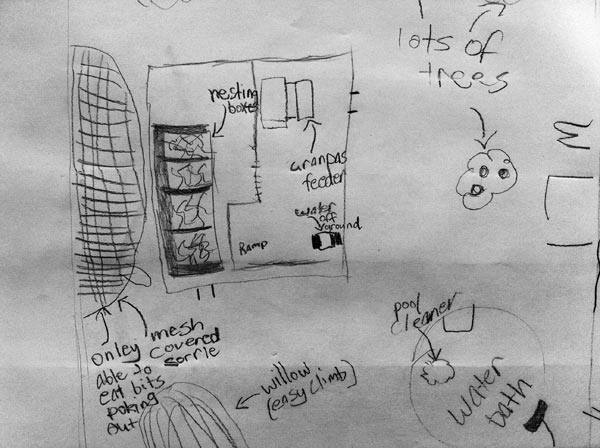
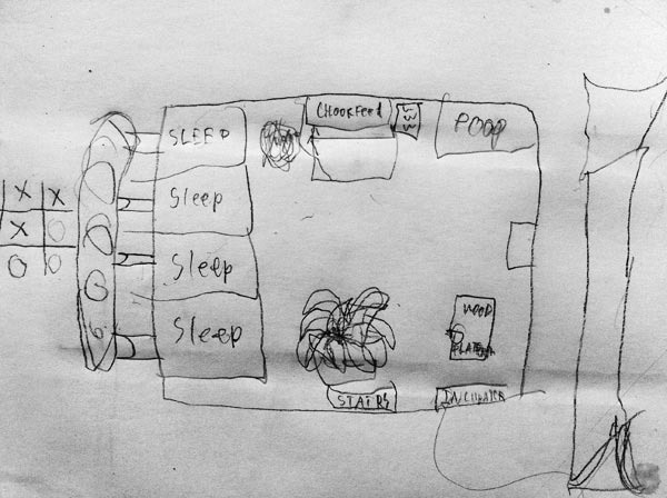
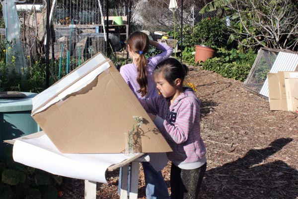
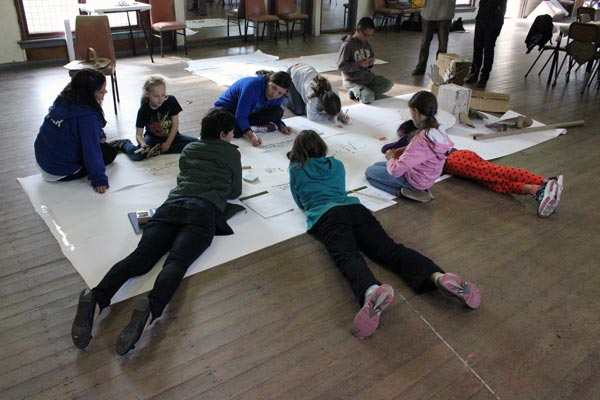
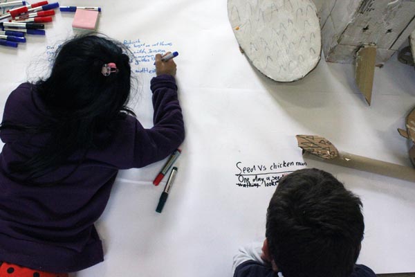
A ‘know local’ workshop for kids
Our 2 day, weekend activity for kids (8–12 years) was about developing skills in storytelling and image-making and at the same time, learning about the local habitat. In this case, local habitat meant a community garden in Randwick. The workshop was initiated and developed by our working unit, The Patch, sponsored by The City of Randwick and supported by The Shack Youth Services and the people of Randwick Community Organic Garden. A newspaper featuring their work will be launched in September.
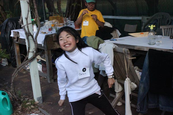
For their sponsorship and support: The Randwick City Council. For the Randwick Community Organic Garden: Lauchlan Giddy, Jessica Perini and Richard Pang. For The Shack: Wade Mathias and Jennifer Cockburn-Hillis. For The Patch: Heidi Dokulil, Beatrice Chew, Su-An Ng, Richard Peters and myself. For those cameras: thank you to the people who donated their pre-owned digitals. For the screen printing: Stefan Kahn. For that lovely, crusty bread: Brasserie Bread and Bourke Street Bakery. For the Newsroom: Alice, Cameron, Derus, Dylan, Ethan, Gabriella, Harmani, Jade, Jessica and Madeleine.
Some pictures from Saturday and Sunday follow. Read more at The Patch.
x
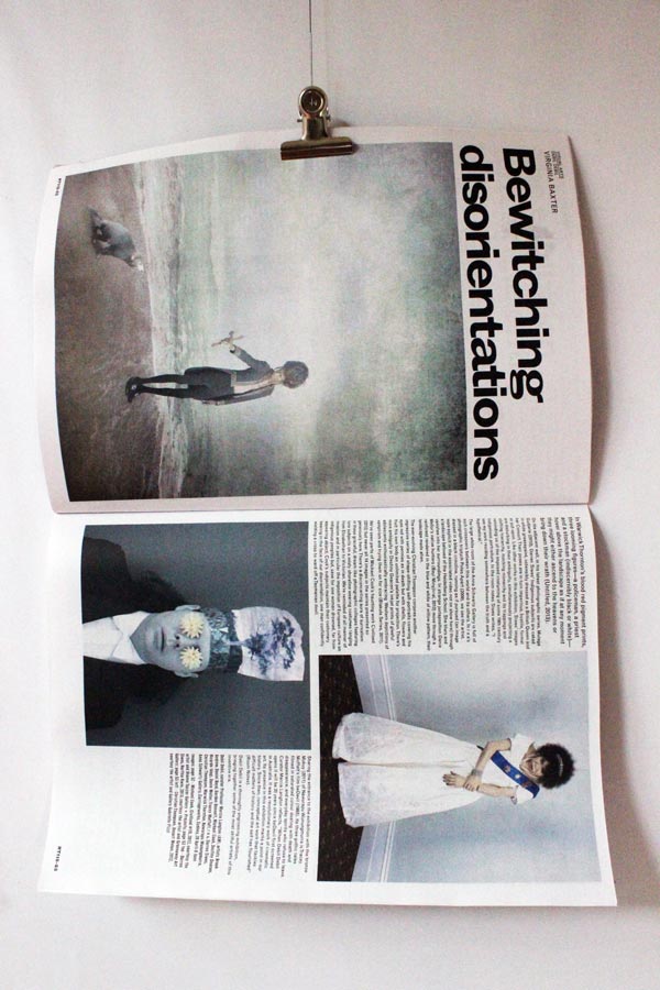
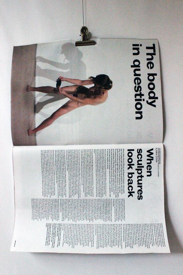
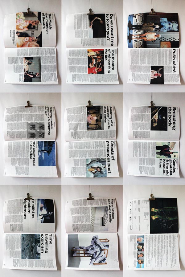
RealTime third time
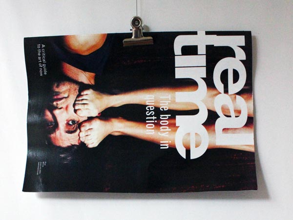
It’s nice to be asked once to design an arts magazine but a rare thing to be asked to also do the subsequent redesigns—two in all—the latest being June/July 2013, which is a fresh look at the design produced by Monika Domaschenz and myself in 2006. All page layouts shown are by Gail Priest.
RealTime: a critical guide to the art of now.
x
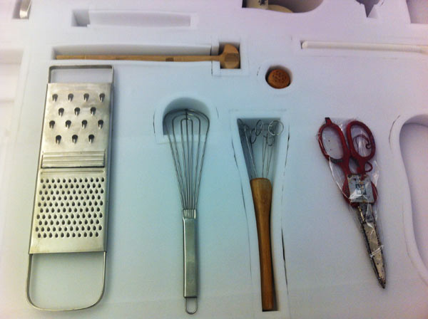
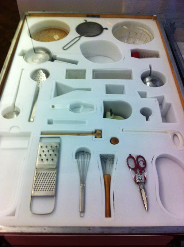
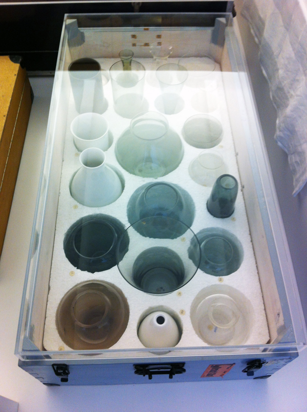
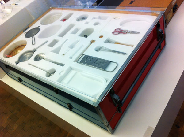
Boxed sets
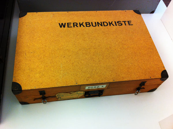
Boxed sets produced for schools by Deutscher Werkbund. At Berlin’s most fascinating museum, Museum der Dinge (Museum of Things).
The text on the object label reads:
The Werkbund Boxes
“For we not only shape things, but things also shape us”
(Deutsche Warenkunde, 1955)
Familiarity with “good” form was meant to be learned from childhood on. Several of the Werkbund’s state chapters developed boxed sets of teaching materials that were loaned to schools in the 1950s and 1960s. Schoolchildren were given the opportunity to “grasp” everyday products of industry and craftsmanship and to discuss various aspects of modern design. They were supposed to develop an eye for the shape of “good” things and at the same time test their utility and get to know their material characteristics. The boxes devoted to dining culture in particular demonstrate yet again the Werkbund’s ambition, persisting well into the 1960s, to influence peoples’ lifestyles through education in “good form”. The “beautifully set table” was supposed to encourage or stabilise an intact family. In the course of the social upheaval around 1968, this agenda was criticised even within the Werkbund.
x
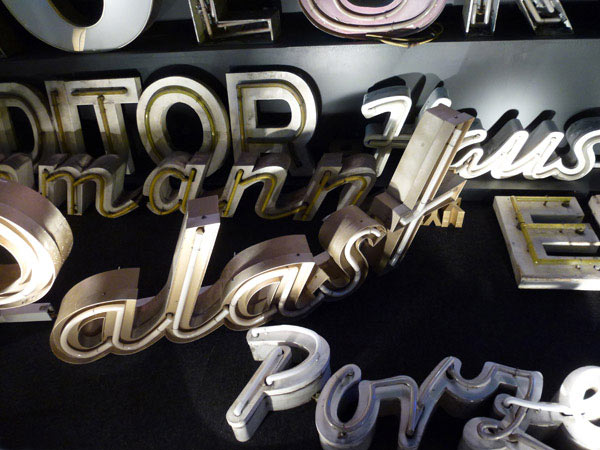
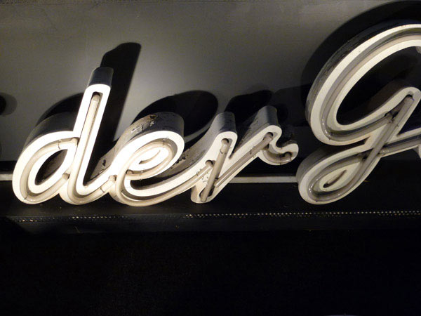
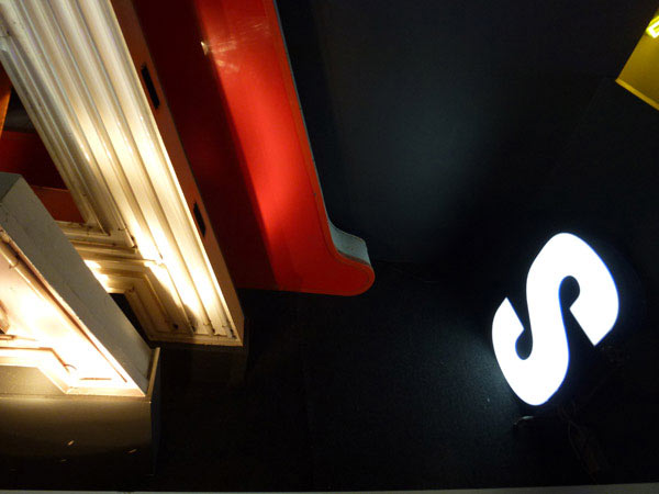
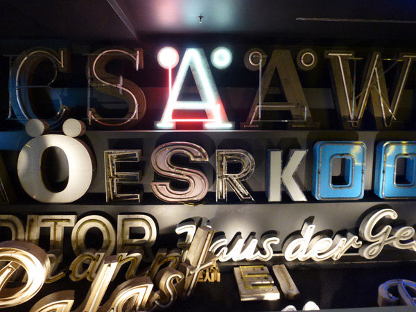
Type museum
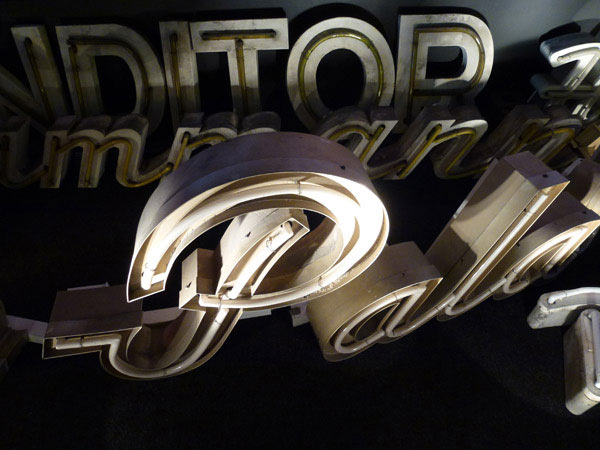
A small museum in Berlin (Buchstabenmuseum) showing letters rescued from buildings. My point-and-click style of photography makes it all look like 70s photorealism — which annoys me. A lovely touch on entering: you’re given a little torch to carry around so you can check details.
x
Sharpened minds
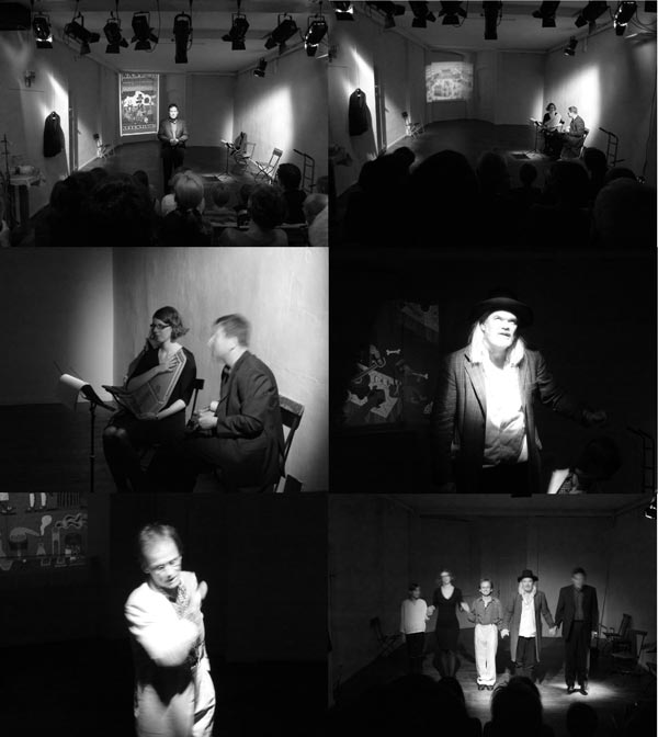
Henning Wagenbreth’s theatralisch-illustrativ-musikalische buch-premiere was in a tiny Berlin theatre that held an audience of about 50. Henning played mandolin and his partner, Sophia Martineck, played chord harp while 2 actors, Albrecht Hirche and Günther Lindner played the pirate and pharmacist in Robert Louis Stevenson’s The Pirate and the Apothecary: translated into German and illustrated by Henning Wagenbreth, published by Peter Hammer Verlag as Der Pirat und der Apotheker.
An abridged version appears in Desktop Magazine Dec/Jan 2013 (an issue on the future of design)
Sharpened minds
Every view of the future is a prediction and an imagining. All clues that suggest what the future may be like are informed by our current situation: the way we see ourselves positioned in the world, and how we relate to it.
One way of arriving at a mainly predicted view of the future is by having an analytical view of the world. When I think about the analytical way, it disheartens me because the most prolific and relentless everyday, everyminute analysers of the future are not scientists, and certainly not designers, but people who work within the sphere of finance and marketing. They view the world as a thing we can do stuff to and take stuff from. The world is understood as a separate entity and their language is the abstract, distancing language of the corporation. They talk about identifying potential needs and creating desires. the analysis of trends and predictions about the effects of new technologies, shortages and surpluses, and all the current indicators of how the world may turn out for their ever-demanding stakeholders. This is a way of thinking about the world that many branding industry designers —perhaps forgetting that sense of wonder, a sense of the absolute gift of the things around them as children—have accepted without much reflection on the way it has removed the joy from aspects of their work or dulled their design thinking.
Another way in which a view of the future can be arrived at is by having a more poetic view of the world—where the viewer and the world are one-in-the-same. This is a place where we need, and desire, to think about what we do to it/ourselves and what we take from it/ourselves. Not just for the survival of its plants and animals or the quality of its air and water (that’s another angle entirely) but because it gives us a deeper, more world-connected sense of lived reality: a sense of the gift of things and an incidental satisfaction in knowing that at least an identifiable part of our lives is lived without being overtly thought of as the tail-end of someone’s strategy or forecast — and our sense of self worth is not so incessantly, wearingly geared to what we can afford to consume.
In my current and limited explorations—talking to creative people about their practices, their desires and their own futures—I have noticed some current indicators that reveal that many designers are wanting a different future to that of the analysts and strategists. One indicator is the growth of small, independent publishing houses. Another is the return to smaller, more compact (even more profitable) working scenarios: the return of the atelier, where studio, showroom, production facilities and often living spaces are combined—not always through economic necessity, and often because ‘this is the way we like to work’ or ‘this is the way we do better work’. Another is less silly reverence for, but casual (bordering on ambivalent) acceptance of, technology—a ‘some bits are me, others aren’t’ attitude that indicates a new maturity in design values.
Another indicator is designers having a much deeper interest in the world with active careers over several disciplines or simply trying new things because they feel right.
Some examples from where I’m writing at the moment (Berlin):
Architect Gabi Schillig (who once worked at Sydney’s Harry Seidler & Associates) became less interested in buildings and more fascinated by non-permanent, open structures and the interface between the body and its surroundings. She moves around a lot, particularly Europe, working between architecture, writing, textile design, performance and conceptual art.
gabischillig.de
Illustrator, Henning Wagenbreth, recently launched his new book about a Welsh pirate by putting on a musical / theatrical show in a tiny Berlin theatre—something he had never attempted before, but he happened to have learned to play the mandolin in East German youth camps and his partner could play the chord harp so with two actors and some projection help they gave it a go, and it was beautiful.
wagenbreth.de
theater-on.com
Poetic thinking is not strategic, but it reads the world through indexes that corporations, with their relentless culture of consumer happiness, rarely use: displacement, incongruity, impermanence, unexpected media, ambiguity, uncertainty, the false starts and dead ends of creative process, the beauty of emptiness, new thoughts on where the body ends and the world starts, or using, in Schillig’s words, ‘actions as levers that shift perception of the everyday’. All wonderful resources for better designing that are, I believe, ways of thinking that come naturally to designers and a reason, I’m guessing, that many of them chose that career.
The trend I’m seeing is that no-one is talking much about trends. However some designers are finding new touch-stones to ‘the real’: more reflection on the things that count and what is real and more reading of the world through sharpened minds. More critical thinking. Less uncritical acceptance.
There is one indicator for the future of design that worries me personally but I know it can be overcome: the shrinking (or non-existent) space in design magazines for primarily written articles exploring design issues that go beyond straight project reporting. It’s indicative of, not just a legitimate editorial desire for concise writing, but the increasing hegemony of flip-book-fast, often passivating imagery, the reduction of design insights to design trends, and of how marketing is taking up more than its fair share of space—that could be used for deeper forms of attentiveness, a fuller sense of reality and the ‘living through’ of things not directly attached to a strategy.
So far in the Australian design media, there is little acceptance of, or space made for, criticism and reflection. The writer Susan Sontag’s comment on one of the tasks of literature,’…to formulate questions and construct counter-statements to the reigning pieties’ applies equally well to one of the tasks of design — and some of the clues I have noticed suggest that, in the near future, we may be designing with much sharpened minds. This is my prediction and imagining.
Graeme Smith, 2012
Design Needs Downbeat

White Phoenix by Tamae Hirokawa, Ito Jakuchu Inspired Exhibition, Tokyo Designers Week.
Tokyo Designers Week and Design Tide
Design Tide, 2012
Tokyo Midtown Hall
Akasaka, Minato-ku, Tokyo
31 October – 4 November 2012
Tokyo Designers Week, 2012
Meiji Jingu Gaien, Aoyama, Tokyo
30 October – 5 November 2012
Every year, starting late October, there are two events in Tokyo for (mainly product) designers to show their work. There are many overlaps between Design Tide and Tokyo Designers Week. The time and place overlaps. Design Tide happens at roughly the same time as Tokyo Designers Week, and the distance between them is walkable if you’re feeling energetic, or just a few stops on the Metro, so it’s easy to do the two. Their aims overlap (promotional, trade and developing design careers), as does their audience demographic (designers, producers, entrepreneurs, design students). All this means that comparisons are inevitable; if not from the general design media—which is frequently more reportorial or overtly promotional than reflective or critical—but at least within the minds of the people who visit or participate in both.
Tokyo Designers Week is bigger and more wide ranging than Design Tide. It covers more (emerging and established designers, artists, students, manufacturers, suppliers, conceptually serious works and the crazily kawaii, young producers, experienced makers, aggressive promoters of interesting new technologies and silly gadgets, and the creatively mobile), and perhaps for this reason, it comes across as an unwieldy, confusing grab bag of events and approaches.
This has not been such a bad thing in previous years, when an abundance and diversity of exhibitors, and probably, more money for production and travel, not just in Japan but Europe, North America, Australia and the rest of Asia meant that along with the predictable and the perfunctory there were some gems. This year there was much less work from young designers from foreign places and it removed from the mix that nice quality of surprise —originating from different places around the world—that made TDW attractive. What happened to those small design groups from the UK? Established & Sons and Timorous Beasties (TDW 2008) — or their 2012 equivalents? Where were the Dutch? In past years TDW promised, to those from afar, an interesting mix of quiet brilliance, love-to-hate hubris, humour, remarkable ideas and the charmingly kooky that made paying the airfare and hotel bill worthwhile.

Design Tide is more compact, more organised and structured, more carefully edited and selective. It concentrates almost exclusively on emerging or ‘undiscovered’ designers and there appears to be an effort made during selection to choose works that are conceptually grounded. Also grounded conceptually is the interior design of the venue each year. In 2012 Makoto Orisaki’s beautiful forest of bubble wrap trees gave the hall a delicate, otherworldly magic that softly complemented the work on the long timber tables and plinths and visually tied the whole show together.


Two of these tables held work that I was personally attracted to for two different reasons. One because of the sheer group effort of 8 Norwegian designers (Foodwork) and the well-crafted, formal cohesiveness of their objects,


the other through the depth of its exploration of the traditional Jewish Friday meal—cohesive in theme only and widely, enjoyably disparate in the way each designer addressed it as a solo project. The latter, called Around a dinner table, was by a group of Israeli designers and artists and curated by Design Museum Holon.


By far the two longest long tables were curiously occupied by one of the world’s corporate giants. In a large, dedicated space the Coca-Cola Company presented Bottleware. Two starkly lit white benches on either side of a long corridor showed a before/after production exercise. On one side: a mass of granulated Coke bottles. On the other: a sort of abbreviated evolutionary sequence, starting with the Coke bottle and ending in a range of Coke-bottle-green bowls ranging from small (Dip Dish ¥5,250) to large (Bowl L ¥14,700). Even if the bottles used are downgraded, as the Coke-branded Bottleware site suggests, it’s still a flimsy story on recycling or even up-cycling. Although the product and the exhibition display was designed by Nendo, the product, the site, the exhibition and the support material were all branded Coca-Cola. Coca-Cola is a Design Tide sponsor, so you have to wonder, what percentage of Bottleware is a design exhibition and what percentage is a Coca-Cola campaign?

At least Tokyo Designers Week was brazenly upfront with its corporate and trade show elements. The fluff and dubious promotions (Ice Pearl: a smoking area heavily promoting a new cigarette product by Virginia S, Phillip Morris) were easy to identify and therefore easy to avoid, on the search for more relevant exhibits. There were some good bits but disappointingly, not enough of them came from that core of designers whos careers and ideas were most in need of exposure.

In the professional section, the well known furniture and product designer, Toshiyuki Kita, had a chair and stool made from woven water hyacinth fibres and produced in collaboration with a Thai manufacturer.


Hikaru Yamaguchi from Yamaguchi Prefectural University, presented a leather and aluminium laptop bag and Hagi Glass, a range of timber and handblown glass vessels. Even if you didn’t like the look of these objects (I did), the craft in them was exceptional and the finishes perfect.


Alongside the professional section was an exhibition of models by 50 prominent Japanese architects which was extensive enough and fascinating enough to realistically be a reason in itself for visiting the TDW site.


One of the the most engaging sections was an exhibition of works by designers and artists inspired by the Edo-period painter of birds, animals and flowers, Ito Jakuchu. Ito Jakuchu Inspired was in a black-walled area at one end of the central hall, and I was not the only visitor spending a lot of time there, not just because of the visual richness of the work, but I suspect also because of the relief the enveloping darkness of the space provided, from the brightly lit, trade show aesthetic of the main venue. Something else was present in the darkness too: the delightful, liberating spirit of the work. A wide range of techniques and media including sculpture, graphics, installation, animation, film, publishing and fashion— much of it the result of exquisite and seductive combinations of craft and technology—reminded me more than anything else at TDW of the many things I like, as a designer, about Japan.
Overall, however, Tokyo Designers Week and Design Tide in 2012 did not feel as rich or as broad and deep as I would have liked it to be. Not in the conceptual strength of much of the work, or in the number of (genuine) exhibitors, or in the number of people attending. The latter impression may have only been because I visited each event on its first day.
Someone more informed than me — on the connections between the current state of the world and the activity of designing may have already worked it out: why both events were thinner than previous years (my last visit was back in 2008). Japan, and the world, have had plenty of other things to be focussed on in the last few years and some people have forwarded this as a reason. I disagree. The people and the talent, the ideas and the output, are still going strong. What isn’t are these design-related trade events.
Around the time I was drafting the two preceding paragraphs and worrying about their negativity, I caved in to the inevitable and checked the web to see what others were saying. Maybe it was just me. Maybe I was mistaken. And reading through the online reports on both events you would have to think so because while there is no shortage of upbeat reportage, listings of things cool and everything-is-wonderful promotional spin, there was hardly any level of reflection, let alone useful criticism, and in this, there is also much to worry about: this unreal disparity between what is published about design events in the form of reporting and promoting, and what is thought, but rarely published, in the form of contemplation and criticism.
Few people seem to want to take a position and are apparently ok about allowing upbeat spin to fill media spaces that could also be used for conveying thoughts and ideas and even a bit of mind-honing negativity. Design needs downbeat.
x
A downbeat design quote
‘Mainstream commercial design now is treated as the idiot child of the branding industry.’
Deyan Sudjic
The Language of Things, Penguin, 2009
x


Namiko Shinohara’s rabbits, TDW Young Artists Japan Exhibition. Upbeat kawaii meets slightly spooky downbeat.

Natsuko Kogure’s delightfully titled Monkey octopus Nudibranch elephant, Ito Jakucho Inspired Exhibition, TDW.