Atak revisited, Berlin
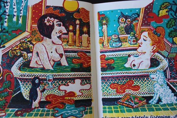
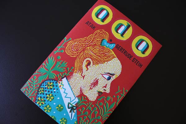
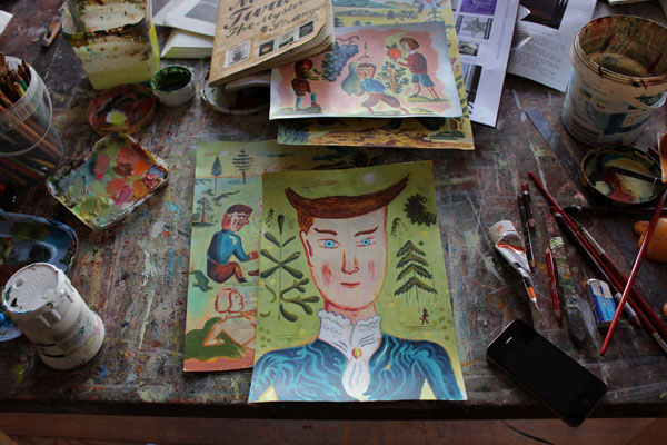
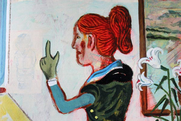
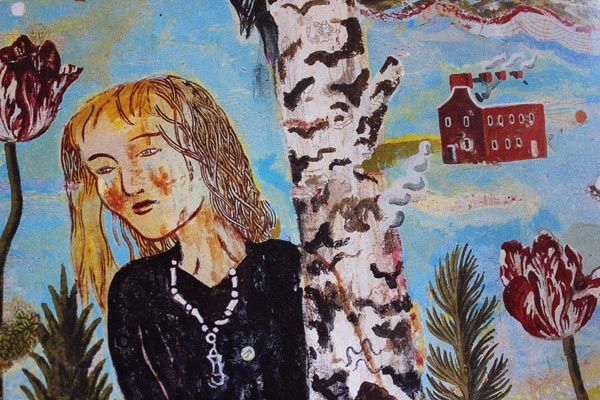
Ada. Gertrude Stein’s word portrait of Alice B Toklas. Hand separated artworks by Atak.
Publisher: Nobrow, London.
Next:
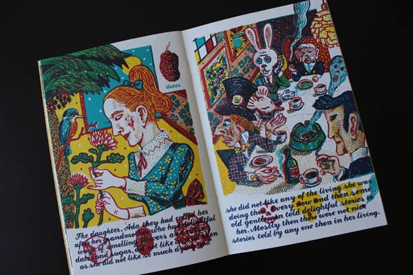
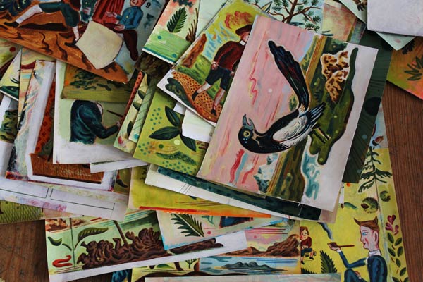
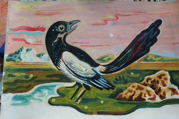
Work in progress for The Mysterious Stranger by Mark Twain.
Berlin Haushoch, Berlin
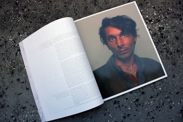
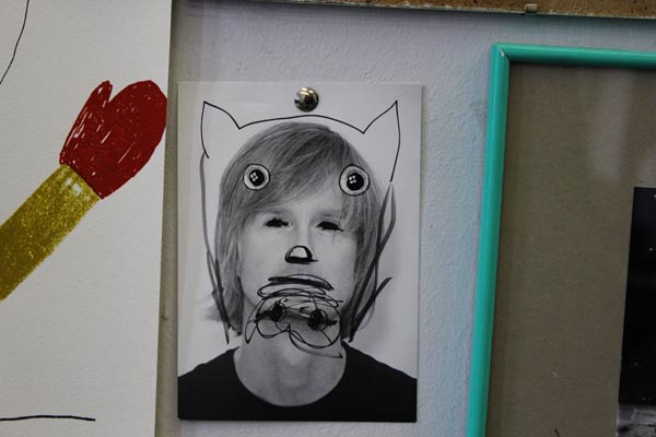
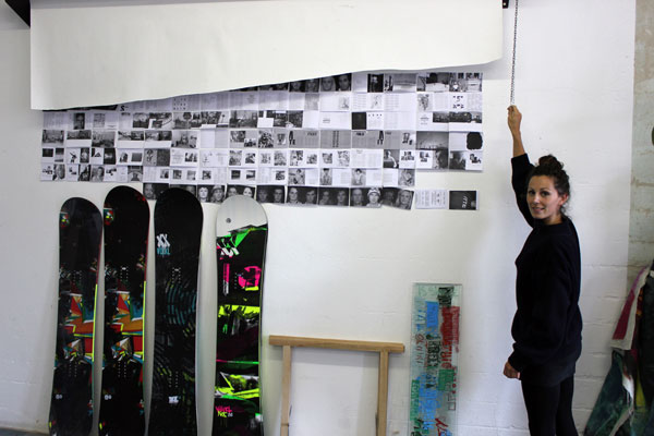
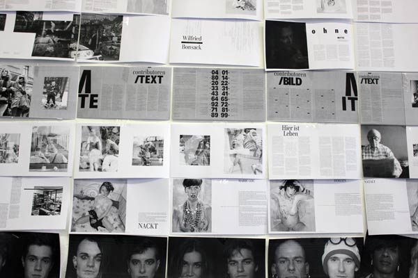
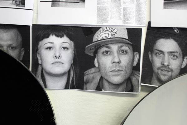
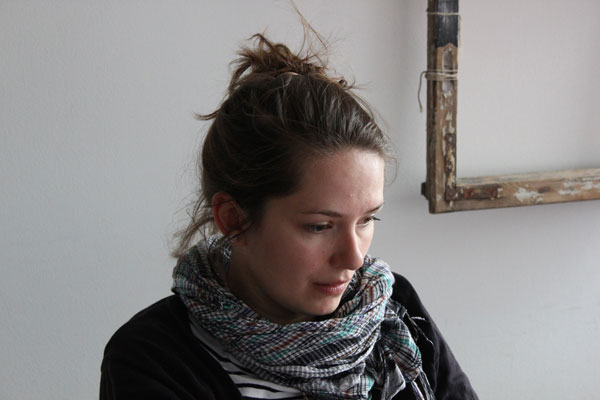
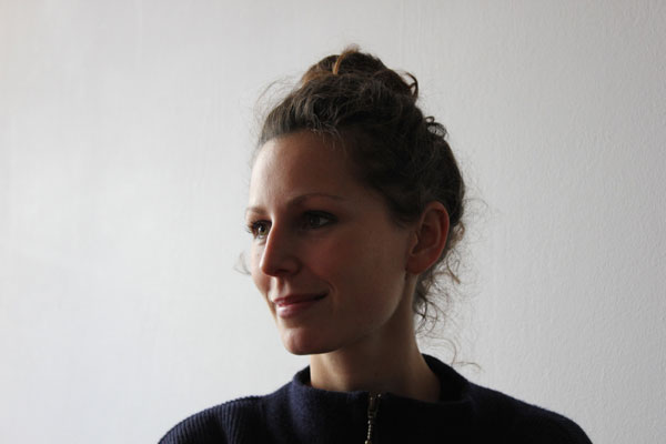
Through the Goethe Institute in Sydney I discovered a magazine called Berlin Haushoch, designed, edited, photographed and largely written by three people: Ana Lessing, Alexandra Bald and Esra Rotthoff.
Each issue covers the people and daily life of one district of Berlin and takes a year to produce.
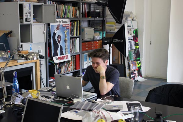
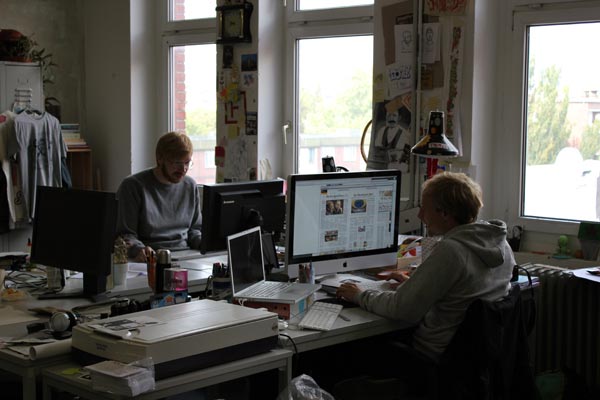
While all good editors become immersed in their material, the people from Berlin Haushoch go several steps further: they set up their studio in the part of the city they want the issue to cover and work there for a year.
They told me that the name is untranslatable but I haven’t given up yet! House high? Highly? Decisively?..
More—in more depth—on Berlin Haushoch soon.
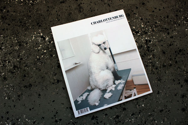
Issue 3 on Charlottenburg.
x
Books, books, books; Leipzig
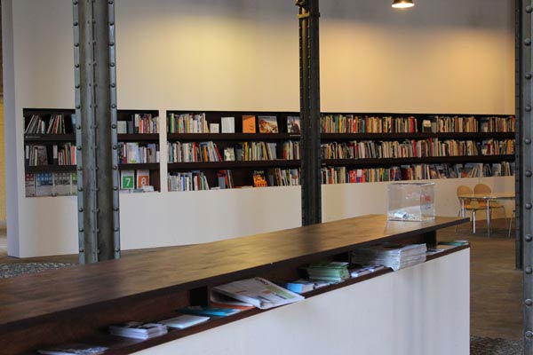
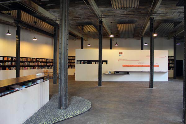
Library of Halle 14, Spinnerei.
Leipzig is the place for publishing, book art, book design and printing. One of the reasons I need to return.
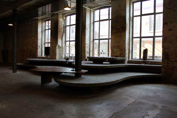
Atak, Berlin
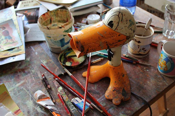
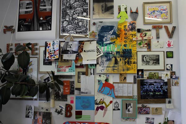
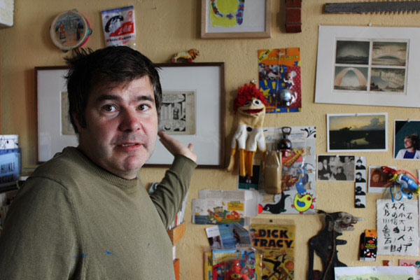
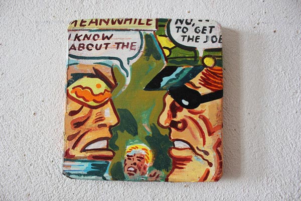
In Sydney I bought a book on Gertrude Stein’s word portrait, Ada, by an artist known professionally as Atak, but also called Georg Barber. I looked him up and visited his studio in Prenzlauer Berg. The walls are covered with the most fascinating things.
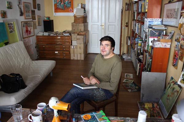
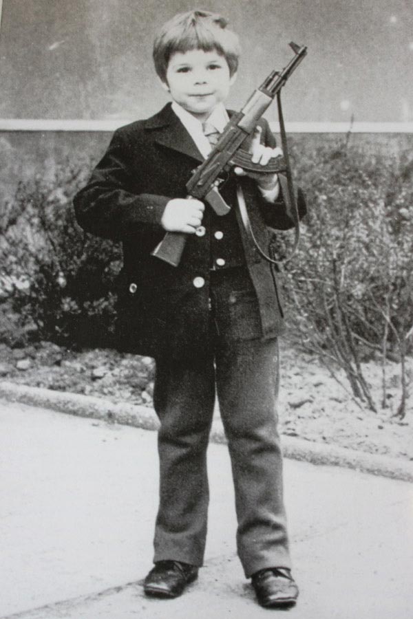
As a kid—holding what looks like a toy AK-47.
He grew up in East Germany and took inspiration from Punk and music. I’m guessing that being a punk at that time and place would not have gone down so well with the people in power. He worked in a comic shop, then started a dark publication called Renate —the title being a piss-take on typical names of ‘womens interest’ magazines. Now he’s Professor of Illustration at the art academy Burg Giebichenstein in Halle.
Currently he’s working on a book on Mark Twain’s unfinished, last story.
More later.
Freight
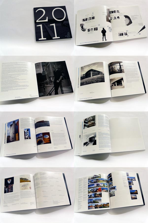
This catalogue was designed for the New South Wales Architecture Awards which were announced a few days ago. Inevitably — with these simpler, quieter works —someone will ask where the design is… and I don’t know how to answer in a succinct way.
I could tell them about the way a sentence is set, and how it wraps around the curve of the paper or how I want someone to look while holding it in their hands or how a particular font brings back memories of elegant typewritten forms. But I don’t.
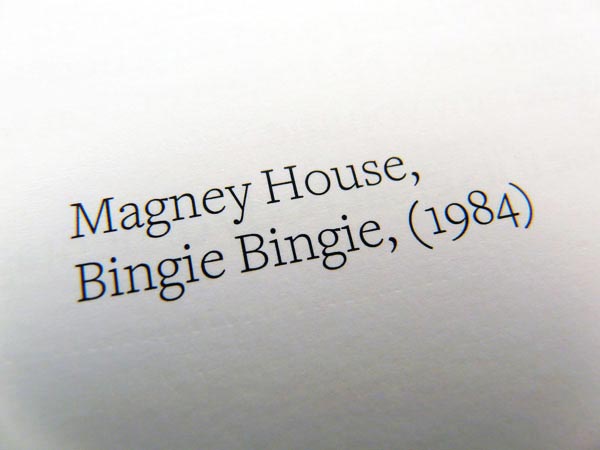
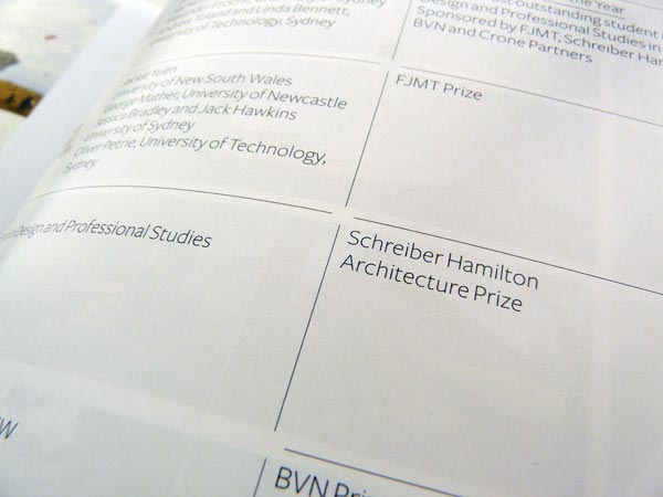
The type is Freight Text and Sans. Art director: Graeme Smith. Editor: Peter Salhani.
x
Folio
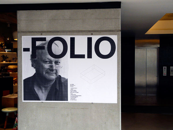
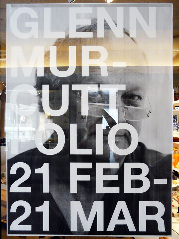
Series of plan-printed A0 posters for a month-long viewing of a beautiful folio on the works of architect, Glenn Murcutt, published and designed by 01 Editions, Sydney, with writing by Kenneth Frampton, Juhani Pallasmaa and David Malouf.
Poster design: Graeme Smith
Folio: Glenn Murcutt, Architect by Kenneth Frampton
ISBN 0-9775931-0-x
Publisher / designer: 01 Editions, Michael Tommasi, Liisa Naar
Photographer: Pierre Toussaint
Please visit Workshopped, 8 Hill Street, Surry Hills, Sydney or 01 Editions.
x
Thank you, fog
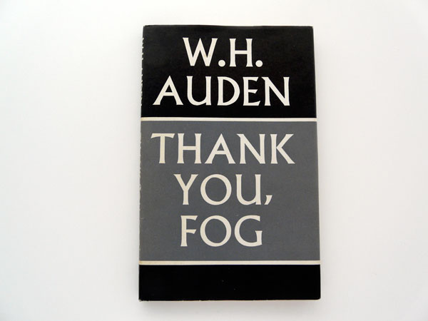
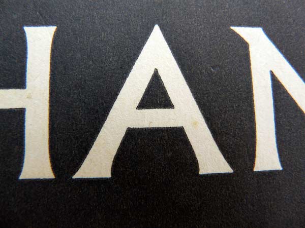
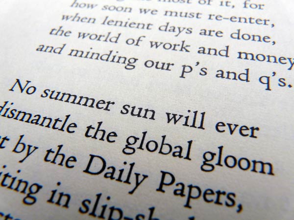
Found a 1974 copy of Faber & Faber’s last poems by W H Auden. The title is set in Berthold Wolpe’s powerful ‘chiselled’ display face, Albertus, and most likely it’s his cover design too—as he was their in-house designer until 1975.
x

