Pocketbook
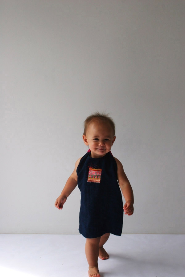
Minorities Kids
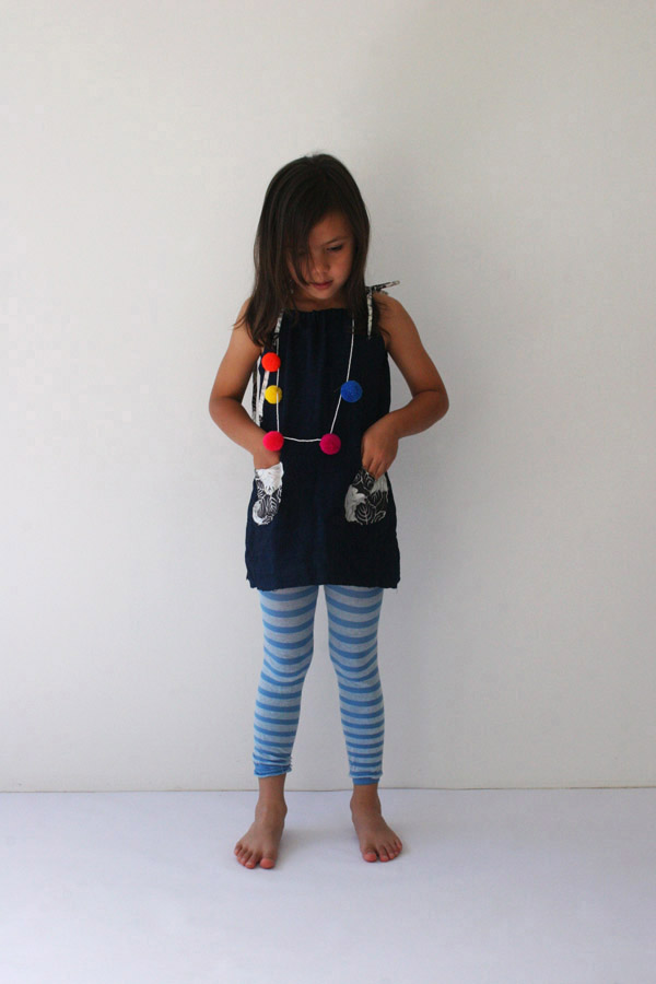
In 2004, with very little money, Samorn Sanixay and Kaisy Sophabmixay built a boarding house for disadvantaged weavers just outside of Vientiane, Laos, and purchased old looms from a rundown factory. They called the workshop Eastern Weft.
Textiles are created entirely by hand. They are hand spun, hand dyed with locally sourced colours and then hand woven on traditional floor looms. Eastern Weft works in harmony with nature, using materials available in season. All this results in a textile maker with a very small carbon footprint.
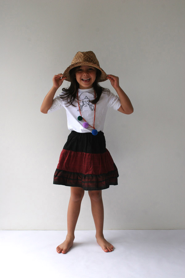
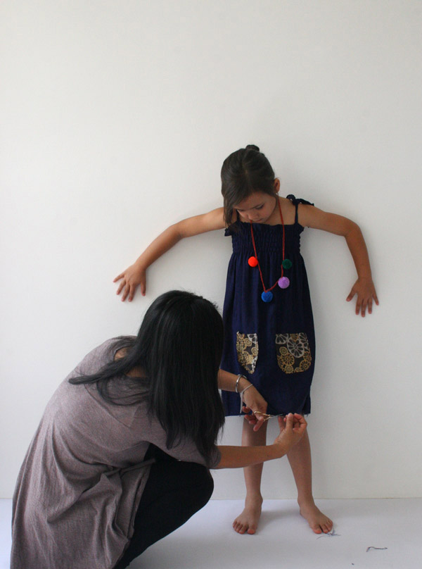
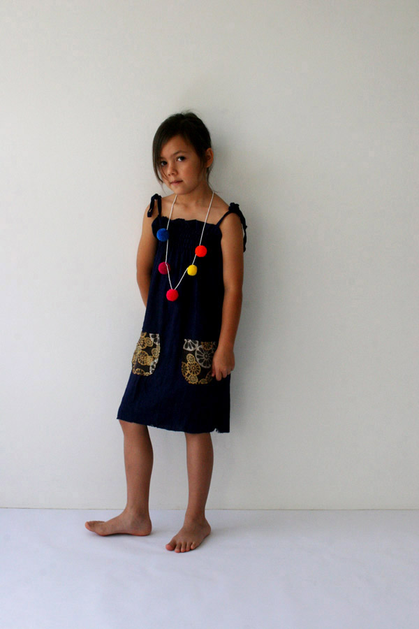
Minorities Kids is a label by Eastern Weft, designed by Samorn Sanixay and often inspired by the works of Lao ethnic groups. Skirts and dresses are made from fabric off-cuts and remnants or from traditional textiles—mostly produced by hill tribe minorities. Hence the name.
Eastern Weft promotes individual creativity and decision-making in the workplace and is a member of the Fair Trade Association of Australia and New Zealand.
A large new range of women’s and men’s scarves will be launched soon in Australia.
Photography: Stella and Astrid for Minorities Kids. Photographer: wclee. Art director: Graeme Smith. Designer/stylist: Samorn Sanixay.
x
Small screen people

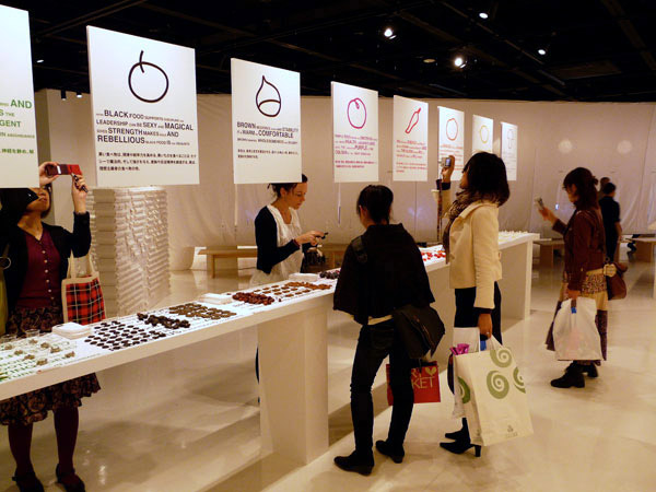
On the small screen of my camera I saw five more people, each looking—on small screens—at this gorgeous installation for all of the senses, called Eating + Design, by Marije Vogelzang, Axis Gallery, Tokyo.
x
Net bag
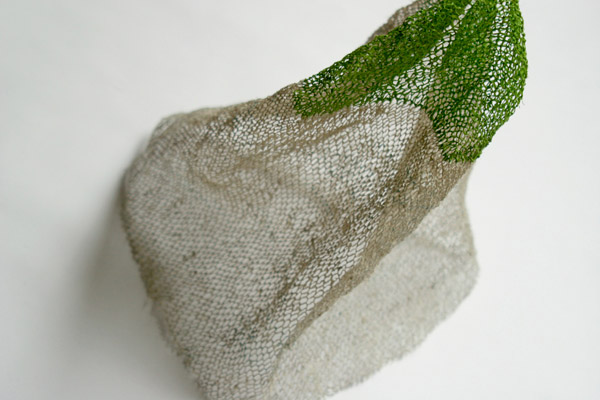
Netting bag, Eastern Weft weaving cooperative, Laos.
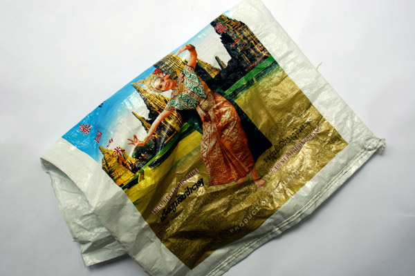
Woven from Thai rice sacks; beautiful, strong and pleasingly tactile.
Photographer: wclee
x
Gazing at the Contemporary World
Gazing at the Contemporary World:
Japanese Photography from the 1970s to the Present
In my head, I have this observation about what it is poets do (distil amazing sense from ordinary meanings) from Emily Dickinson.
Incongruous as it may seem to use a job description for poets written by a decorous 19th century American to begin a review on contemporary Japanese photography—it’s one of the pieces of language that comes to mind as I look at these photographs; and it does connect (for me) to another quote, from photographer Nobuyushi Araki, on one of the first object labels in the exhibition: about capturing an energy that exists in ordinariness.
Can you guess what the cop said to me that time? It was a classic: “Why are you taking pictures when there’s nothing special happening?” For him, a photograph was something you took when something special was going on. He thought a photo had to be of something out of the ordinary, so he couldn’t see why anyone would take a picture if there wasn’t anything happening. Why photograph the totally ordinary everyday stuff when nothing’s actually happening out there? He put his finger right on what I was doing, or what I wanted to do.
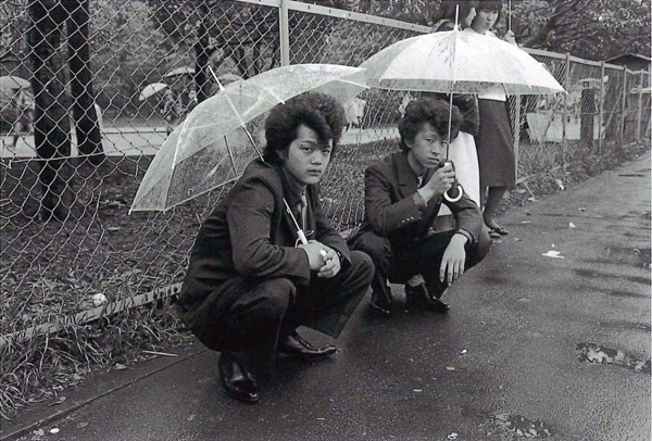
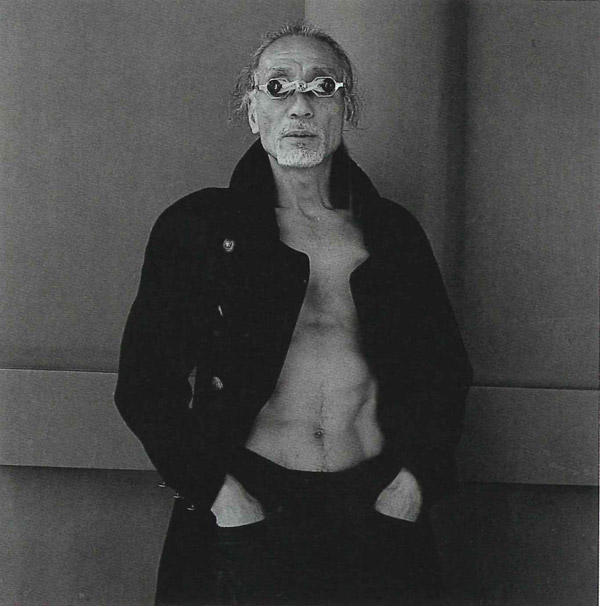
A 60s-style bus, out there somewhere in a soft, dark, enveloping landscape in a picture titled Kariudo (Hunter, 1972); a stylish looking, hands-in-pockets butoh performer (2001); the sweat-crinkled back of a summer dress from the Subway Love series (1962–73); vaguely recognisable city skylines less built than ones now well-known, and four girls presumably out for the night, crouched on a Shinjuku pavement in 1981. Those early 80s hairstyles, the shoes, the makeup, all create an initial moment for me, of ‘where was I when this happened?’ that quickly converts to ‘where are they now?’—indicating the beginnings of a slow and poignant contemplation of the absence of things, often things commonplace, that is sometimes labelled ubi sunt. A ‘where are’ experience.
Some exhibitions of photography seduce and pull you in, but the most transforming also push back, making you fall back more on your own ways of dealing with the image. My own reaction to these photographs, and why they appeal—or should I say affect me—is that so many of them are suffused with this beautiful, quiet, introspective sense of the loss of everyday things, particularly in those nothing-special, non-happenings that are mostly thought of as ordinary.
~
Gazing at the Contemporary World: Japanese Photography from the 1970s to the Present is an exhibition currently on at the Japan Foundation, Sydney. It was curated by Rei Masuda, Curator of Photography, The National Museum of Modern Art, Tokyo.
Japan Foundation Gallery
Level 1, Chifley Plaza, 2 Chifley Square, Sydney
22 February–4 March 2010
Monday–Friday and Saturday 27 February
11.00am–4.00pm
Photography reproduced by kind permission of the Japan Foundation
George Hashiguchi, Rainy Sunday from the series The Look, 1981
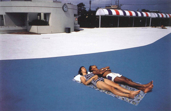
Mitsugu Ohnishi, from the series The Long Vacation, 1983–91
Hiroh Kikai, A Performer of Butoh dance from the series Persona, 2001
x
Safe spaces for taking risks

In most visual communications companies, graphic design firms, branding consultancies—call them what you will—much emphasis is placed on making connections with the values of the client. While understanding the values of a client and working hard to convey them is a necessary (and obvious) task for a communicator for commerce, I want to suggest that another responsibility also applies: you need to connect to your own values as well.
This post started as an idea to give three new UTS graduates some presence on our industry association’s website*. I saw their major project work in two stages of development, listened to what they said about it, liked it, then decided to show it with some brief notes attached. It wasn’t only that the results of their work were worth showing; something else in the way they tackled projects in a personal way—sometimes building around a seemingly arbitrary framework, sometimes working through an obsession, discovering correspondences or simply beginning with something that felt right—made me think about how easy it is in an industry environment to pass by the rich sources for designing that already exist in our heads, our memories and within the intimate realm of our senses. It’s a pity that the spaces made in design colleges for healthy experimentation are not always found in companies that design communications. In my own experience, my personal take on the world, and in particular the experiments, including a long, long list of false starts and dead ends and some pretty dumb but never-the-less transporting (they took me to somewhere better) notions have been the unanticipated origins of works that—I think—really did work because people recognised something of themselves in something in me. In essence, design as a social connection.
Of course, the word ‘experimental’ when you’re dealing with a conservative client feels risky. The idea of generating lots of dead ends and false starts unsettles when the deadline is unreasonable, the fee lousy, and another lease payment looms; and the thought of giving someone a space within a commercial project to find themselves or to connect with their own values can sound scarily considerate. But it’s precisely these ‘safe spaces for taking risks’ as one UTS lecturer put it to me, that, when built into commercial practice make for keener observations, more sparkling distillations, more useful syntheses and often mean the difference between a stale but on-brief job and an extraordinary result. How many times have you heard the term ‘on brief’ used to justify the dead-boring, or as a box-ticking excuse to forget it…too hard…move on?
I have a feeling that a powerful desire to experiment is already wired in to the psyche of all graphic designers, and for that matter everyone, but they sometimes find it hard to satisfy it because little opportunity has been left to shift the boundaries of the space allowed for thinking. Should I also mention…rigid briefs that presuppose too many things, bottom-line mantras, clients who have been convinced of the necessity for big, swaggering logos and silly colour schemes, the pseudo-science that thrives in many aspects of branding, pyramid-shaped diagrams by pop-strategists, and the notion that branding can solve pretty-well everything from low sales of me-too products to shaky personal relationships and win acceptance by the people for unjustifiable wars?
I just did.
Personal values in designing is worth talking about more—in a place with more space than this blog.
Graeme Smith February 2010

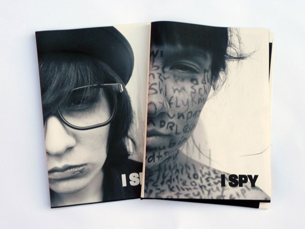
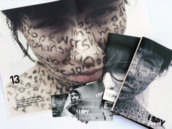
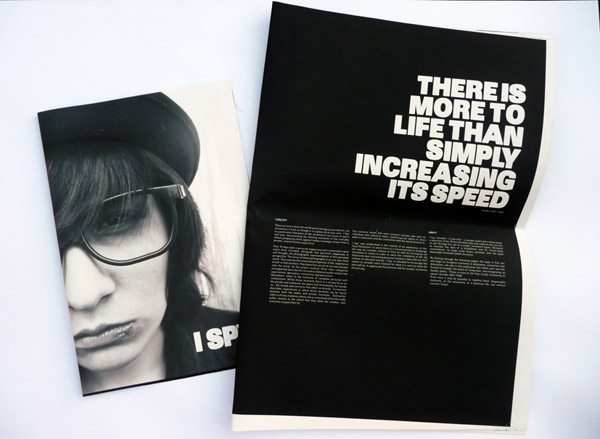
‘I Spy’
Emma O’Brien
UTS Visual Communications graduate 2009
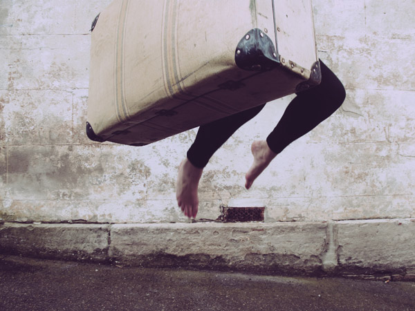
A one-off printed publication to explore the connections and disconnections between self (personal life moments) and collective global experience. Although it needs no relevance to real world publishing, for anyone requiring it, it has an aim that some publications could be enriched by—to get people to consider each moment by noticing things differently. O’Brien set up a framework for generating and identifying categories of experience by playing off the personal against the global.
GS: So what do you think you got out of working through this method? Do you think it’s going to influence the way you work in the future?
EO: Yes. Because doing it this way it got me to notice things differently and took me on different tangents and ways I hadn’t explored before in other projects—and I liked the way it was a bit airy-fairy at the start until I got the idea towards the end and it all came together.
GS: What do you think the advantage is in noticing things differently?
EO: I think from it, not necessarily more, but better ideas are likely to come. You’re just not going down the same path you always would. You’re letting yourself open up to things and the results are more interesting.
Design and photography: Emma O’Brien
Images supplied by the designer (includes introductory image)
© Emma O’Brien
Next
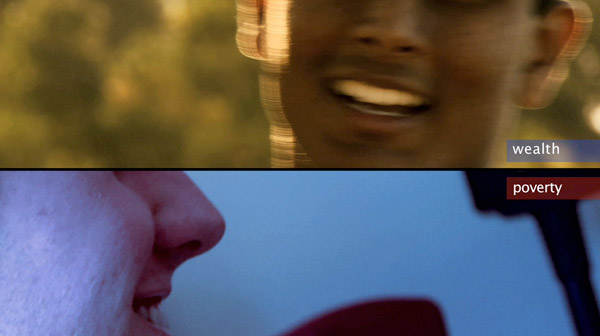
‘Wealth and Poverty’
Helani Sarath-Kumara
UTS Visual Communications graduate 2009
A video campaign, primarily for wealthy countries, to encourage people to reconsider ideas of rich and poor, and to eventually effect a change in attitude.
GS: What’s it about?
HS-K: It’s to get people to see the similarities. That lives are similar. To get people to look at their own lives and the practices they lead and not always be searching for more. In my research I found that your wants slowly turn into your needs. Then when your needs are taken care of you get new wants that become needs. It’s like this never-ending cycle of consumerism.
Film and direction: Helani Sarath-Kumara
Music: Jacob Stretton
Video supplied by the designer/filmmaker
© Helani Sarath-Kumara
Next

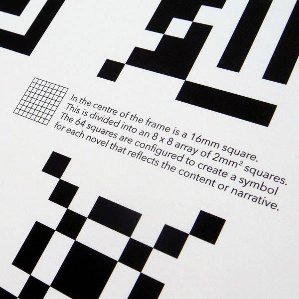
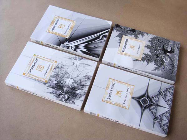
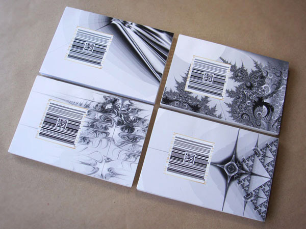
‘Binary Books: The Cyber Collection’
Kristina Flanagan
UTS Visual Communications graduate 2009
A range of existing science-fiction titles, redesigned to elevate them away from prejudices and low-brow perceptions associated with the genre.
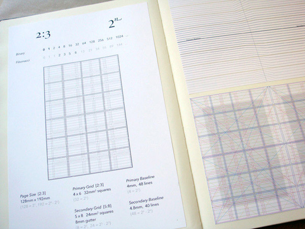
GS: I noticed in your work process you had a few minor obsessions… grids?…numbers?…the Fibonacci series?…
KF: At first I copped a bit of flak for that, which is quite ironic, because it’s the first time I’ve ever used a grid in any of my design work. It’s not something I would have even espoused before…I’ve always thought grids were quite restrictive and a little bit anal retentive…but I guess with this project all the research I did into computer technology, binary…really felt like the way to go because computers are very structured, mathematical, logical, symmetrical…and also classic book design is very heavily grid-based. I thought there was a nice connection between the very mathematical structures within computer technology and literature.
Design and photography: Kristina Flanagan
Images supplied by the designer
© Kristina Flanagan
*agda.com.au
Botanicals

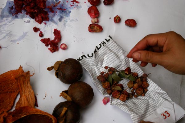
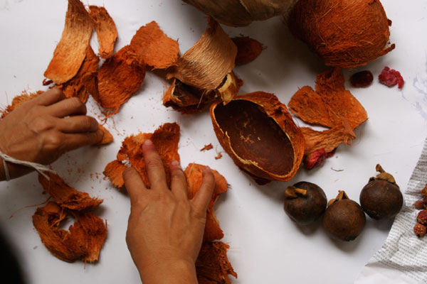
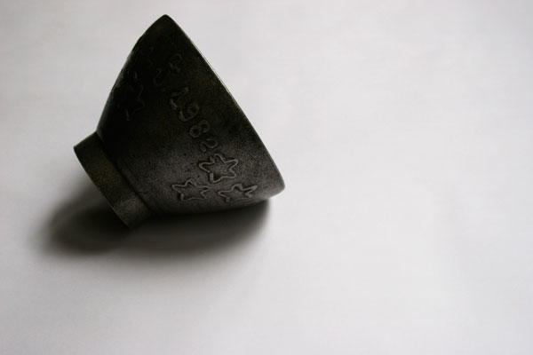
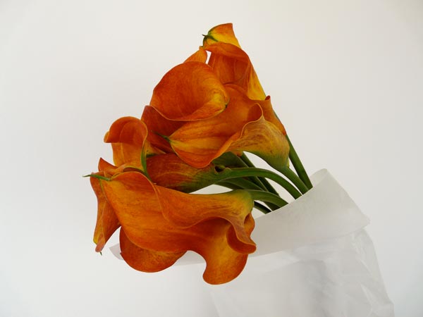
Lao textile dye botanicals for Eastern Weft.
Photographer: wclee. Art director: Graeme Smith. Stylist: Samorn Sanixay.


x

 28 January 2010