
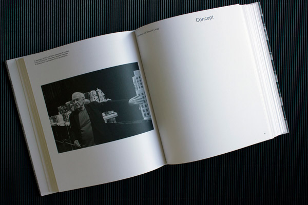
Gehry in Sydney
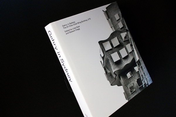
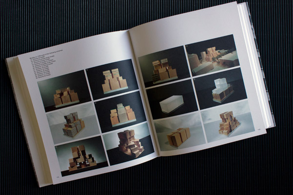
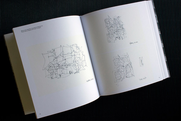
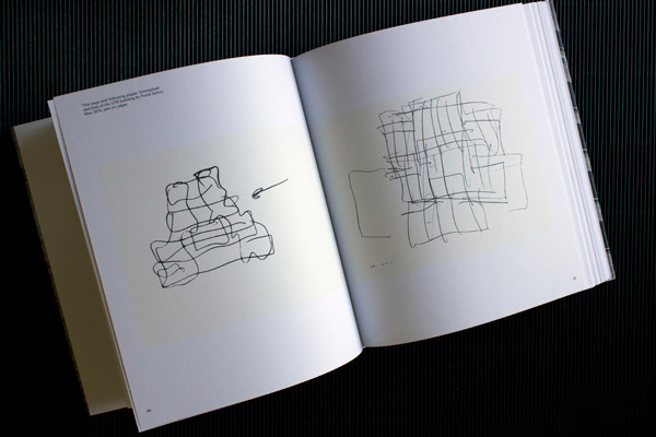
Just out: a book I have been working on with managing editor Liisa Naar for UTS. Gehry in Sydney is about a recent UTS building project. The university commissioned US architect Frank Gehry (Guggenheim Museum Bilbao) to design the Dr Chau Chak Wing building for their business school in Ultimo, Sydney.
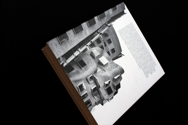
Most graphic designers of print are familiar with the anxiety attached to making decisions (other peoples’ more than theirs, I think) on what to put on the cover of a publication. So much risk—for some—seems to ride on the choice and positioning of the elements, and often what one finishes up with is a conceptually deficient, consensus-built assemblage that misses the mark in relation to all the writing and the image-making and the thinking that may be found inside. Cover photography is particularly vulnerable to the pressures applied to designers by these nervous guardians of the book’s public acceptability. Predictable images rule.
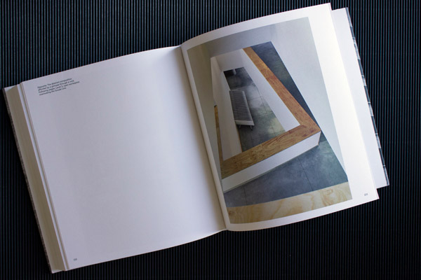
Working with a more enlightened client, I was delighted when this one turned out to be an exception. Many city buildings (some of them deservedly) become targets for the ‘icon shot’ style of documentation: dramatic, forced-perspective, hard-edged verticals thrusting up into the purest of blue skies suggesting… the predictable. To me, Gehry’s building embodies a less invasive, more personal type of seduction (if ‘seduction’ it is) and in this it has much going for it as a visual experience.
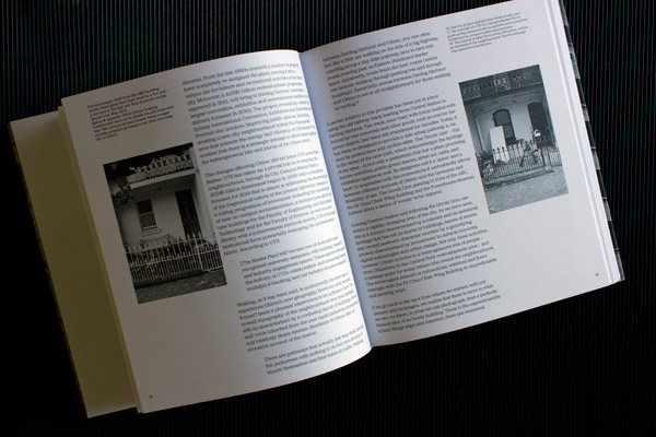
On walking around the site I found that the building’s beautiful shapes, textures and rhythms could be enjoyed from within a smaller frame of viewing and often, just square-on, or close to it, from a higher observation point with less perspective — such as the elevated walkway opposite. From there you can appreciate the pattern of the brickwork and its earthy textures, and the almost musical compositions of square, box-framed windows against those ‘impossible’ curves. Michael Nicholson’s crisp monochrome photographs capture this with quietness, and zero swagger: the visual poetry in brick that will live on, possibly beyond the career span of its world famous designer.
Gehry in Sydney
The Dr Chau Chak Wing Building, UTS
Edited by Liisa Naar and Stewart Clegg
Cover design and book concept design by Graeme Smith
Cover photography by Michael Nicholson
x
Stairs
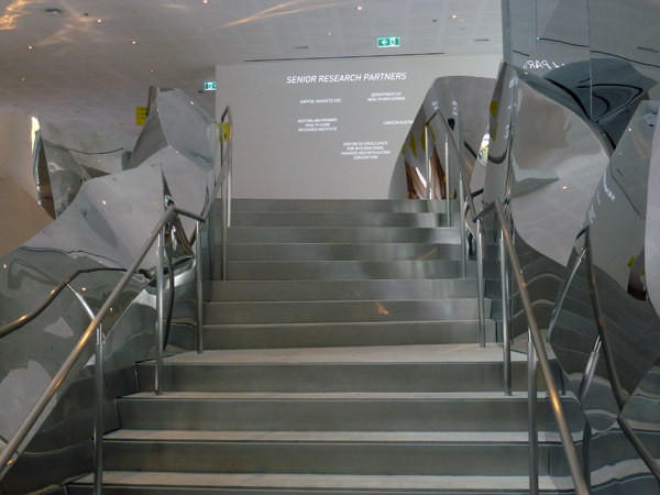
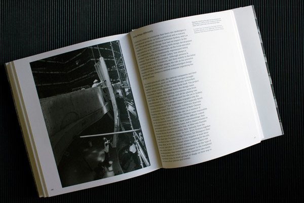
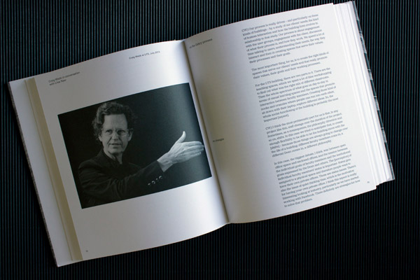
Gehry in Sydney is the title of a book I have been working on with Managing Editor and writer, Liisa Naar, at the University of Technology, Sydney. The Gehry Partners designed Dr Chau Chak Wing Building (UTS Business School) in Ultimo, Sydney, has this beautiful staircase that is worth seeing when the building opens soon. Unfortunately my point-and-click level of photography is not up to capturing this. The professional photography in the new book will be.
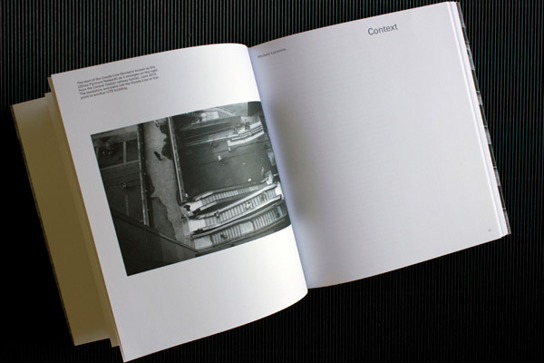
Gehry in Sydney
The Dr Chau Chak Wing Building, UTS
Edited by Liisa Naar and Stewart Clegg
Aesthetics of reading
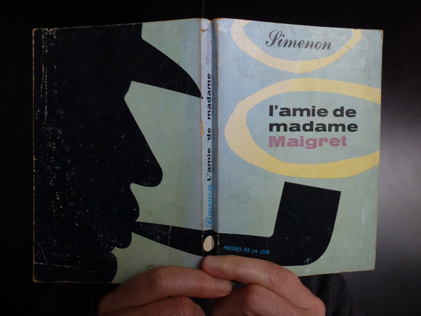 This charming 1957 cover may have once ‘dressed the set’ on public transport — en route to home or work. When people read off paper in trains and buses, seeing Inspector Maigret’s puffing silhouette in someone’s hand would have made my graphic designer day.
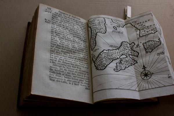
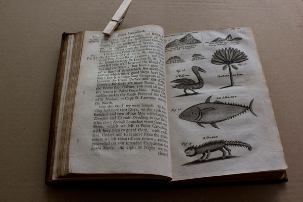
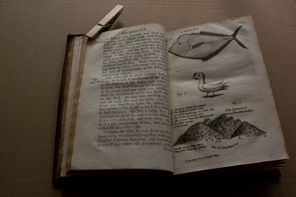
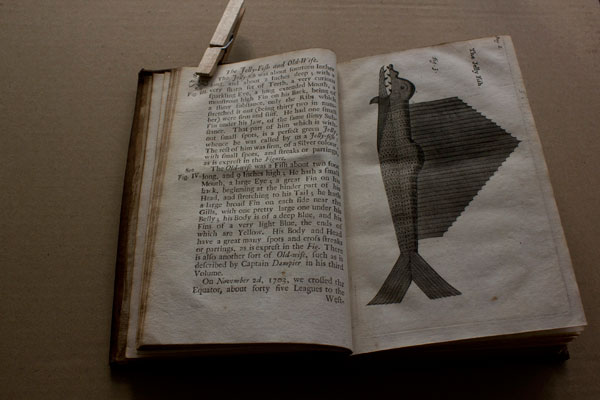
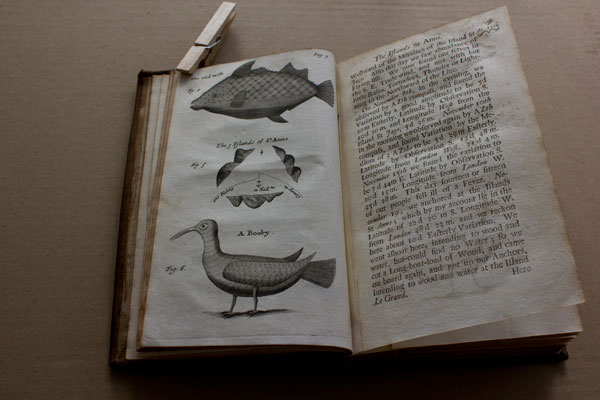
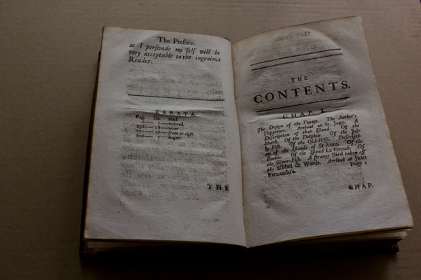
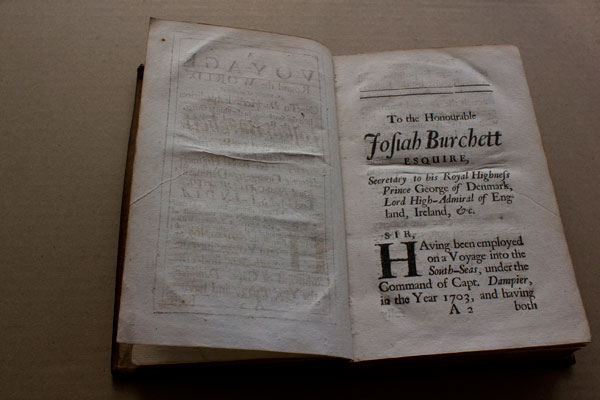
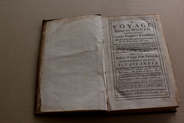
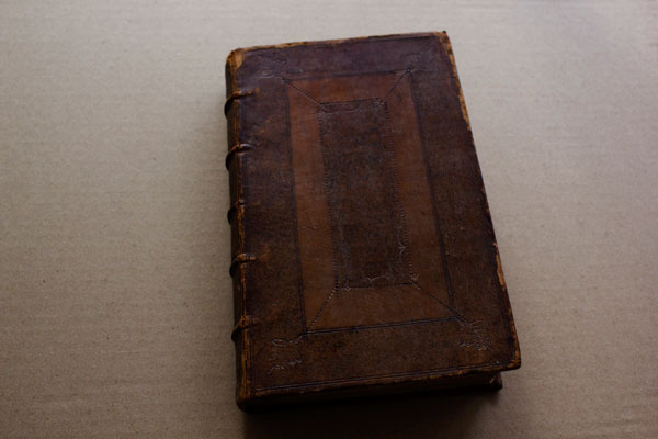
Mr Funnell’s voyage, 1703, 1704
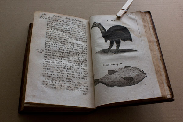
A Voyage Round the World by William Funnell, Mate to Captain Dampier.
Printed by W. Botham, for James Knapton, at the Crown in St Paul’s Church-yard. 1707.
Collection of Antonia Williams.
x
David Gentleman drawing
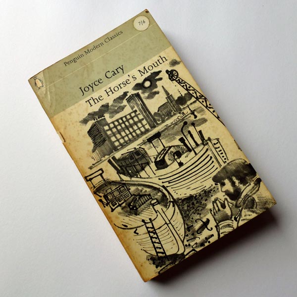
Found this beautiful drawing by David Gentleman on the cover of a 1964 Penguin.
Lubok revisited

Tierlein
Volker Pfüller
Named as one of the most beautiful German books, 2009, by Stiftung Buchkunst.
Printed as tricolour linocuts.


x

Lubok in Mexiko
Various artists
Released at the same named exhibition at Museo National de la Estampa, Mexico City, 2012.
Designed by Andrej Loll.
Four colour offset with black and white linocut-printed pages. I particularly like this juxtaposition.


x

Trapped in White Tiger Sanctum
Christoph Ruckhäberle
Text by Helmut A Müller.
Released in association with the same named exhibition, Hospitalhof, Stuttgart, 2010.
Printed from polymer plates.


x

Sag einfach Ja oder Nein!
Katja Schwalenberg
Printed as linocuts, 2009.


x

Kombi
Franziska Holstein
Released with the same named solo show, Galerie Christian Ehrentraut, Berlin, 2012.
Printed offset. Folded sheets held by an elastic band.


x

f/stop – The History of Now
Catalogue for the 5th f/stop Festival for Photography, Leipzig, 2012.
Designed by IG Grafik / Altevers / Detlefson / Fiedler / Koehn, Berlin with texts by Stephanie Siegel, Christin Krause, Thilo Scheffler, a.o.
Four colour offset.


x
Lubok Verlag

Lubok is an independent Leipzig publisher of (mainly) artists’ books. Particularly beautiful — in look, feel, even their smell — is their series of original linocut books printed by Thomas Siemon of the print workshop, carpe plumbum.

Henriette Weber at Lubok Verlag’s office in Leipzig.


Lubok 9
Christoph Ruckhäberle (Ed)
Linocuts by painting students at the Academy of Visual Arts, Leipzig, 2010.
Printed from the original linocut plates by Thomas Siemon on a Präsident-cylinder letterpress.


x
Miss Read and abc

Arrived in Berlin on 15 September at the end of Berlin Art Week and decided to catch Art Berlin Contemporary on its second to last day and was too jet lagged to take much in, but I liked the simplicity of their display and signing system — bootprints and all.


Not so great for display systems and signage was the artist book festival attached to it called Miss Read. Most publishers literally had to be interrogated to find out who they were and what they did —but it was worth it, and the real reason for my visit on the day. More on independent publishers later.
Pirate story

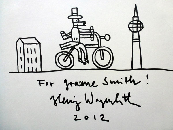
Henning Wagenbreth’s theatralisch-illustrativ-musikalische buch-premiere was in a tiny Prenzlauer Berg theatre that could only hold an audience of 50. Henning played mandolin and his partner, Sophia Martineck, played chord harp while 2 actors, Albrecht Hirche and Günther Lindner played the pirate and pharmacist in Robert Louis Stevenson’s The Pirate and the Apothecary: translated and illustrated by Henning. A nice way to launch a book — and a cute little bar downstairs of the same footprint size as the theatre. (My photography isn’t great because my point-and-click level of expertise doesn’t work for low lighting).


x

Working on some 3D blocks for a show called Memory Palace at the V&A, London.


Robert Louis Stevenson
Der Pirat und der Apotheker
Illustrated and translated into German by Henning Wagenbreth
Published by Peter Hammer Verlag