
November 2017
Colour revisited
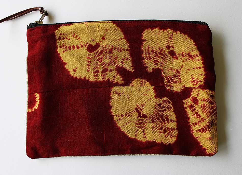
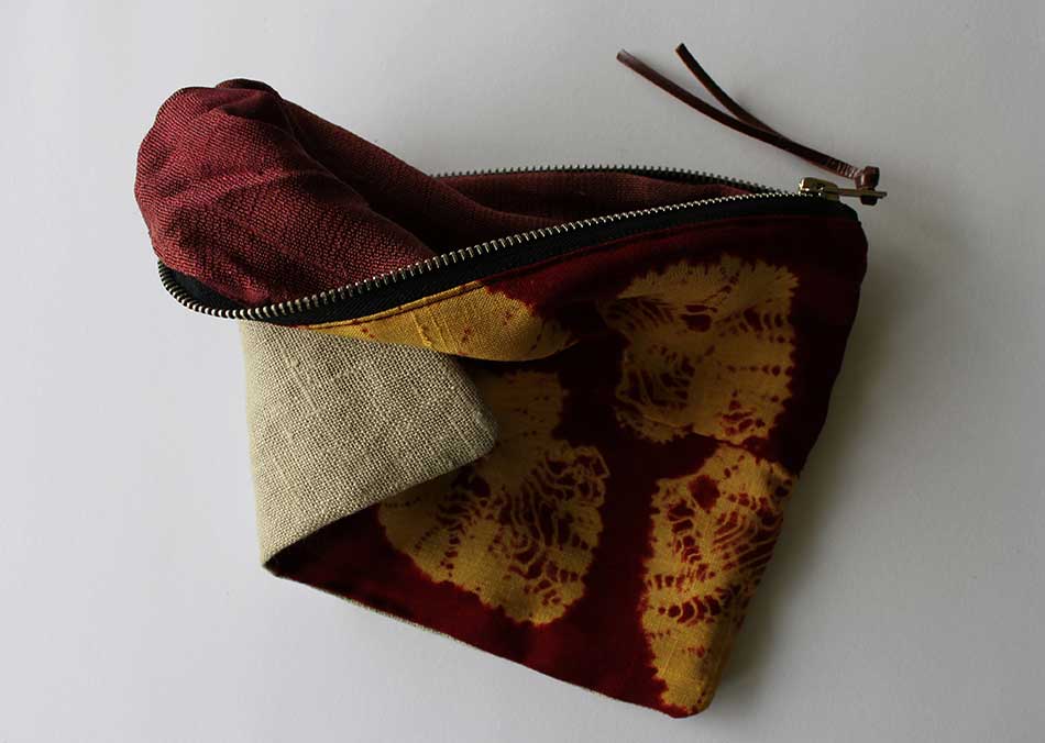
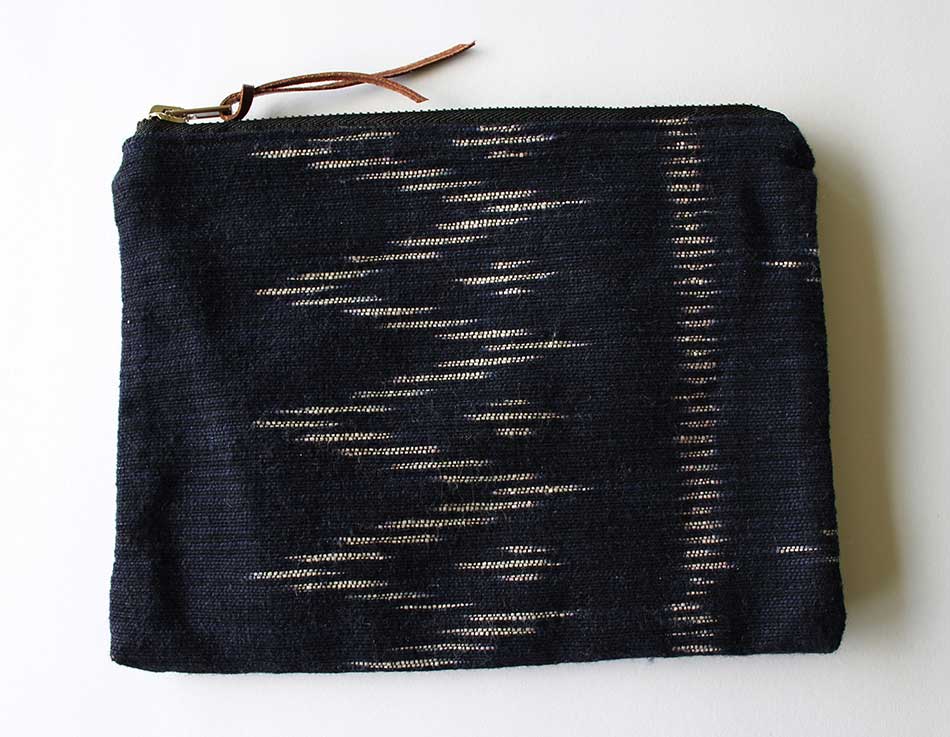
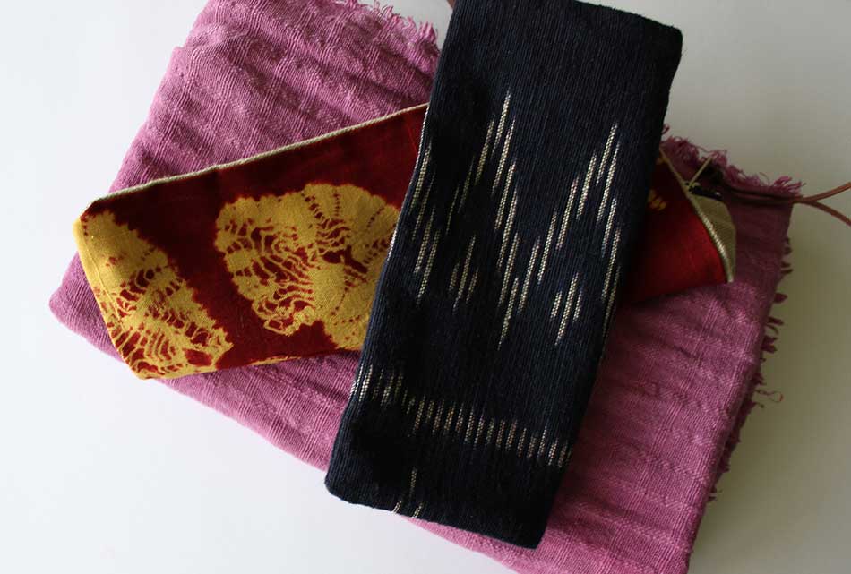
I must like these a lot because I can’t stop looking at them; at the original objects, I mean, not these flat, point-and-click photos that don’t capture the surface qualities, the shine of the silk and the subtle colour shifts as the light changes, the way the colours on the inside (the bits most people won’t see) sit so quietly with the rich colours that face the world outside.
Two silk zip-up bags (about 200mm x 150mm) and a scarf; all by Samorn Sanixay. They had me thinking about colour (so much of what I do is monochrome) and making a nostalgic visit (via web and memory) back to my old Windsor & Newton paintbox: alizarin crimson, cadmium red, pale cadmium yellow, light naples yellow neutralised with a bit of raw umber. The real life dyes are natural and often come from unexpected sources and things we walk past every day: mud and rust, for example. The pink is from the berries of a lilly-pilly in Samorn’s front yard.
x
Shades of Tanizaki
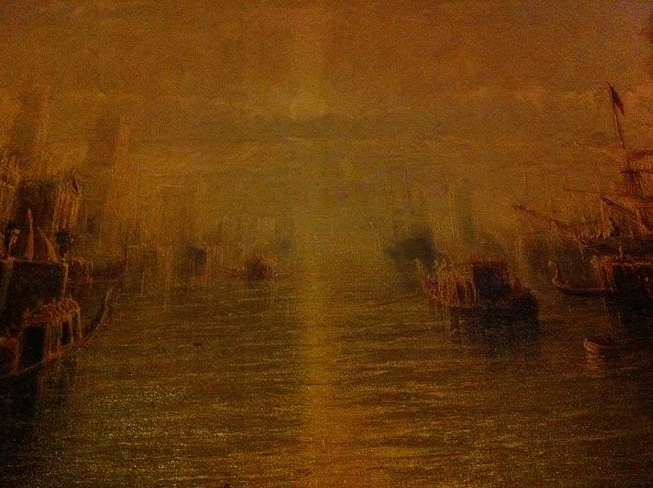
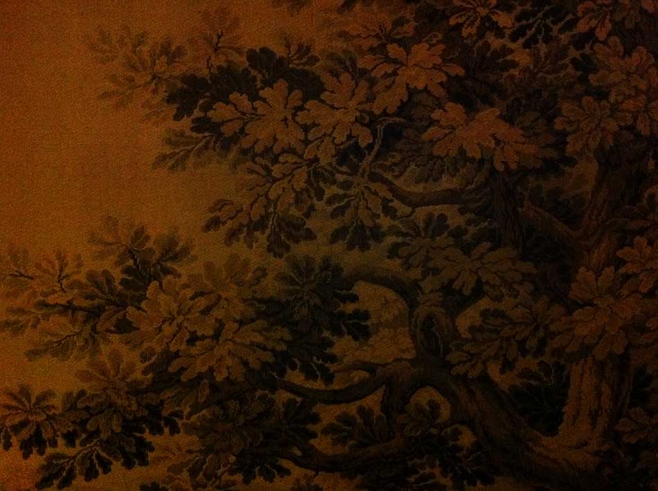
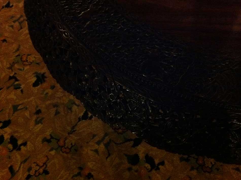
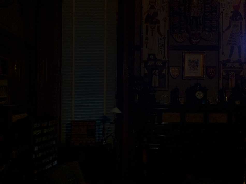
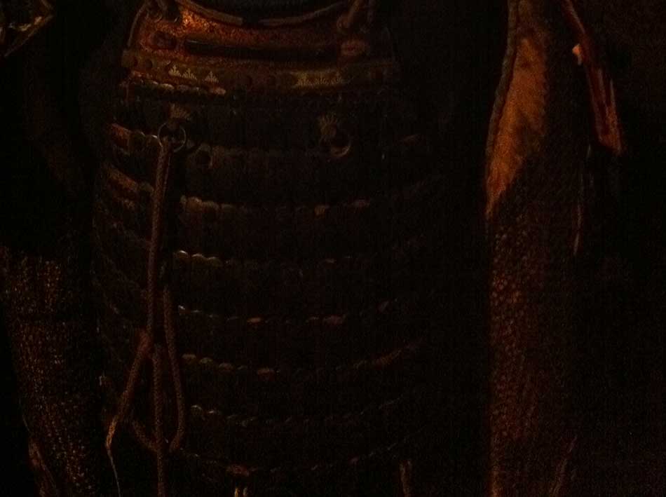
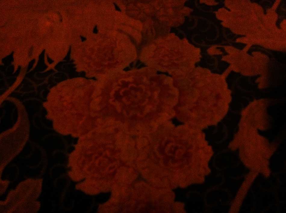
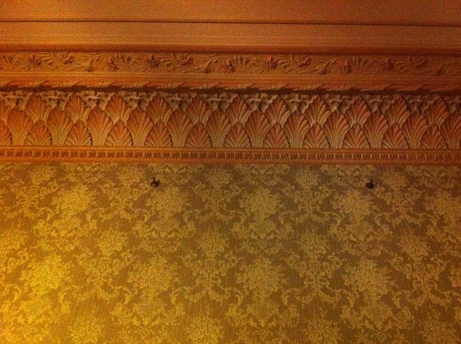 In the rooms of this grand house in the Clare Valley — deeply shaded and closed against the hot, dry summer of a South Australian Christmas — I was reminded of Junichiro Tanizaki’s book on traditional Japanese architecture and aesthetics: In Praise of Shadows; how lacquerware glowed so beautifully in those twilight interiors. Somehow, what we can’t see but know, suspect, intuit or guess is there, has a profound power over the senses.
x